Gene expression levels overlaid onto tSNE view
Helper values and functions
Let us first define some values useful to design colour scales:
range.exprs <- range(assay(sce.endo, "logcounts"))
col.treatment <- RColorBrewer::brewer.pal(9, "Paired")[c(9,3,4,1,2)]
names(col.treatment) <- gsub("_","\n",levels(sce.endo$TreatmentLabel))
Let us then define a few convenience functions:
- to fetch the gene ID associated with a gene name
geneNameToID <- function(x){
  geneId <- subset(rowData(sce.endo), gene_name == x, "gene_id", drop = TRUE)
  if (length(geneId) > 1){
    warning("Multiple IDs found. Use ID instead")
    return(data.frame(
      gene_name = x,
      gene_id = geneId
    ))
  } else if (length(geneId) == 0){
    stop("gene_name not found")
  }
  return(geneId)
}- to fetch the necessary expression and phenotype data
geneDataByName <- function(x){
  geneId <- geneNameToID(x)
  ggData <- data.frame(
    gene = assay(sce.endo, "logcounts")[geneId,],
    colData(sce.endo)[,c("Time","Infection","Status","TreatmentLabel")]
  )
  return(ggData)
}- to draw the figure, faceted by time
plotByNameFacetTime <- function(x){
  geneId <- geneNameToID(x)
  ggData <- geneDataByName(x)
  # return(ggData)
  ggplot(ggData, aes(TreatmentLabel, gene)) +
    facet_grid(Time~.) +
    geom_violin(
      aes(colour = TreatmentLabel, fill = TreatmentLabel),
      alpha = 0.2) +
    geom_jitter(
      aes(colour = TreatmentLabel), height = 0, width = 0.2,
      alpha = 0.5, size = 0.4) +
    scale_color_manual(values = col.treatment) +
    scale_fill_manual(values = col.treatment) +
    labs(
      title = sprintf("%s", x),
      subtitle = sprintf("%s", geneId),
      x = "Treatment",
      y = "log-counts",
      colour = "Treatment",
      fill = "Treatment") +
    scale_y_continuous(limits = range.exprs) +
    theme_bw() +
    theme(
      legend.key.height = unit(1.75, "lines")
    )
}- to draw the figure, for a single time point
plotByNameSubset <- function(
  x,
  time = c("2h","4h","6h"),
  infection = c("Mock","STM-LT2","STM-D23580"),
  status = c("Uninfected","Exposed","Infected")
  ){
  geneId <- geneNameToID(x)
  ggData <- geneDataByName(x)
  ggData <- subset(
    ggData,
    Time %in% time & Infection %in% infection & Status %in% status)
  # return(ggData)
  ggplot(ggData, aes(TreatmentLabel, gene)) +
    geom_violin(
      aes(colour = TreatmentLabel, fill = TreatmentLabel), scale = "width",
      alpha = 0.4) +
    geom_jitter(
      aes(colour = TreatmentLabel), height = 0, width = 0.2,
      alpha = 0.5, size = 0.4) +
    scale_color_manual(values = col.treatment) +
    scale_fill_manual(values = col.treatment) +
    labs(
      title = sprintf("%s (%s)", x, time),
      subtitle = sprintf("%s", geneId),
      x = "Treatment",
      y = "log-counts",
      colour = "Treatment",
      fill = "Treatment") +
    scale_y_continuous(limits = range.exprs) +
    theme_bw() +
    theme(
      legend.key.height = unit(1.75, "lines"),
      axis.text.y = element_text(size = rel(1.5)),
      panel.grid.minor = element_blank()
    )
}
Genes (alphabetical order)
The above convenience function make it straightforward to produce a figure for any gene of interest:
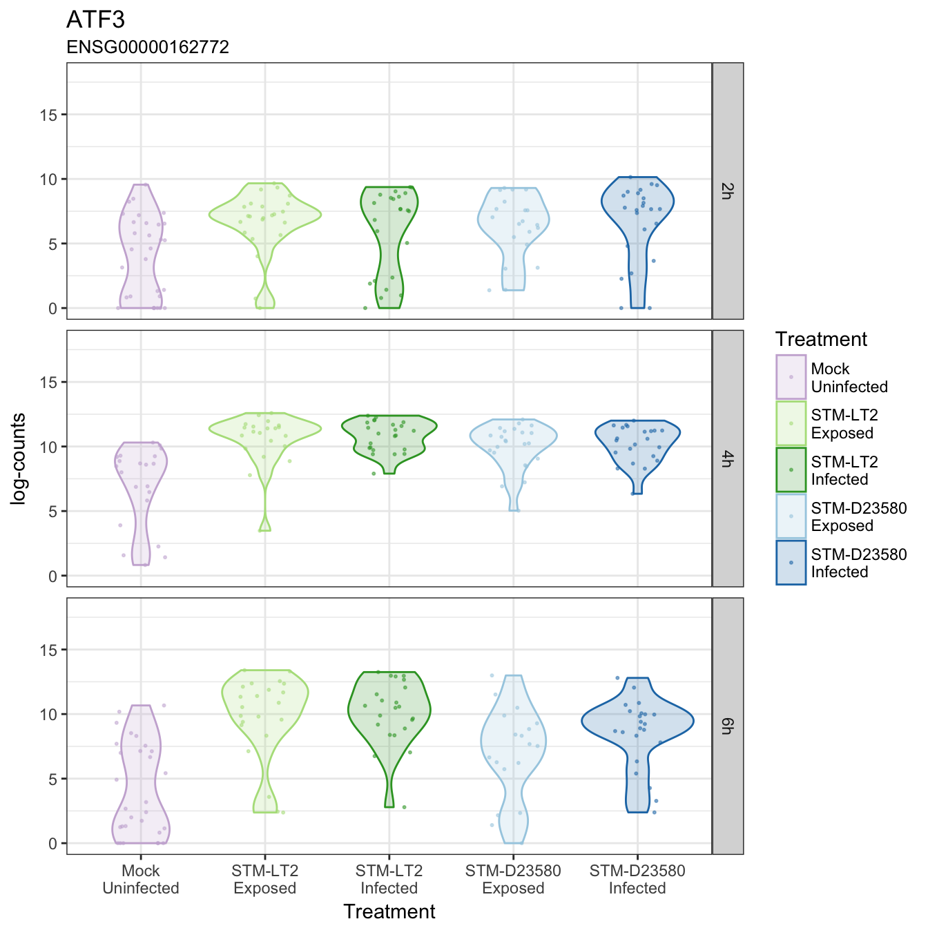
ATF3
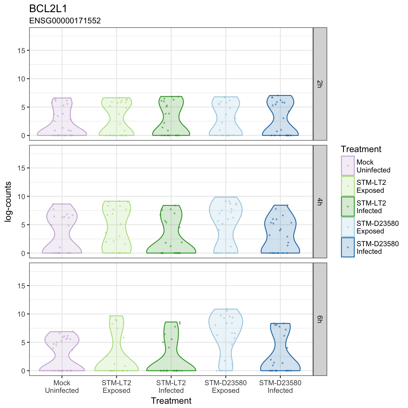
BCL2L1
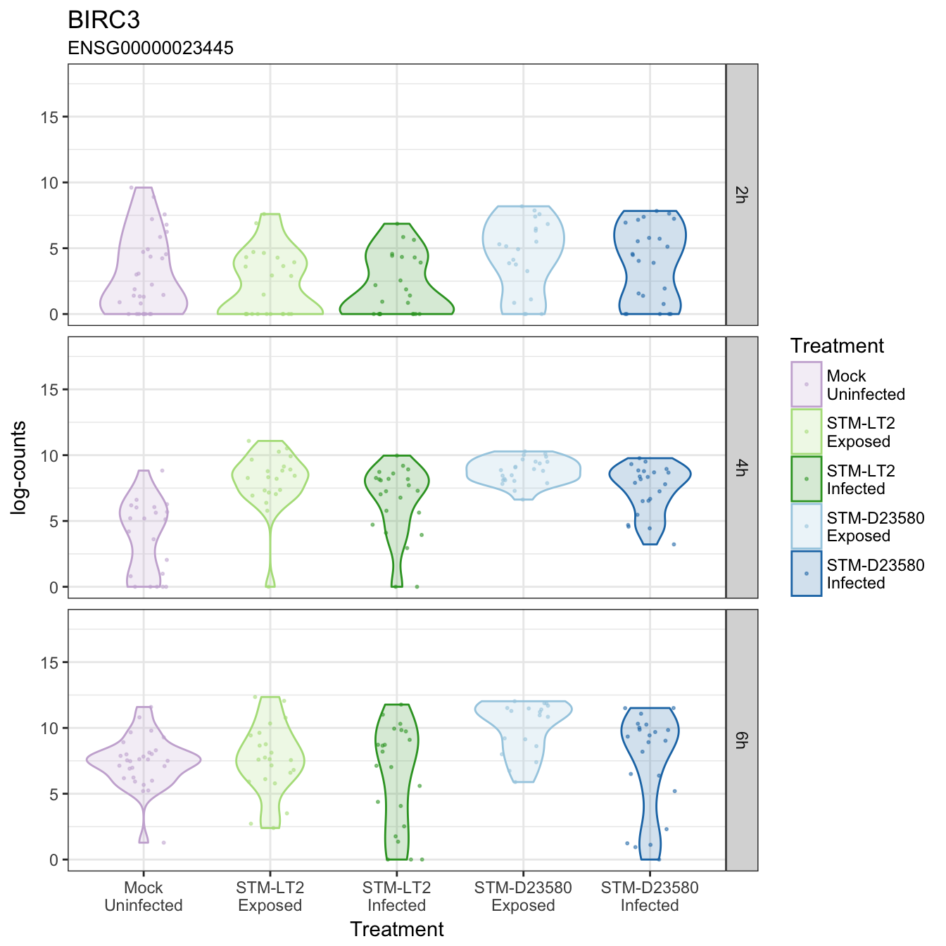
BIRC3
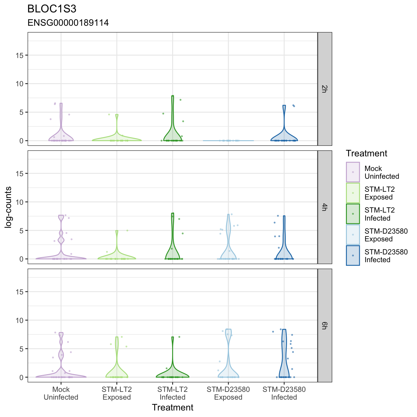
BLOC1S3
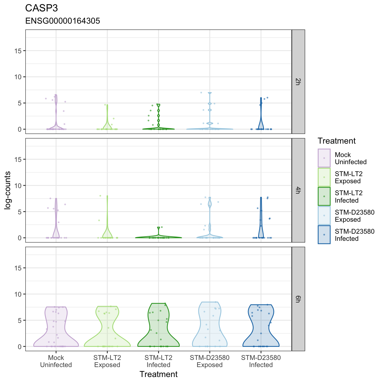
CASP3
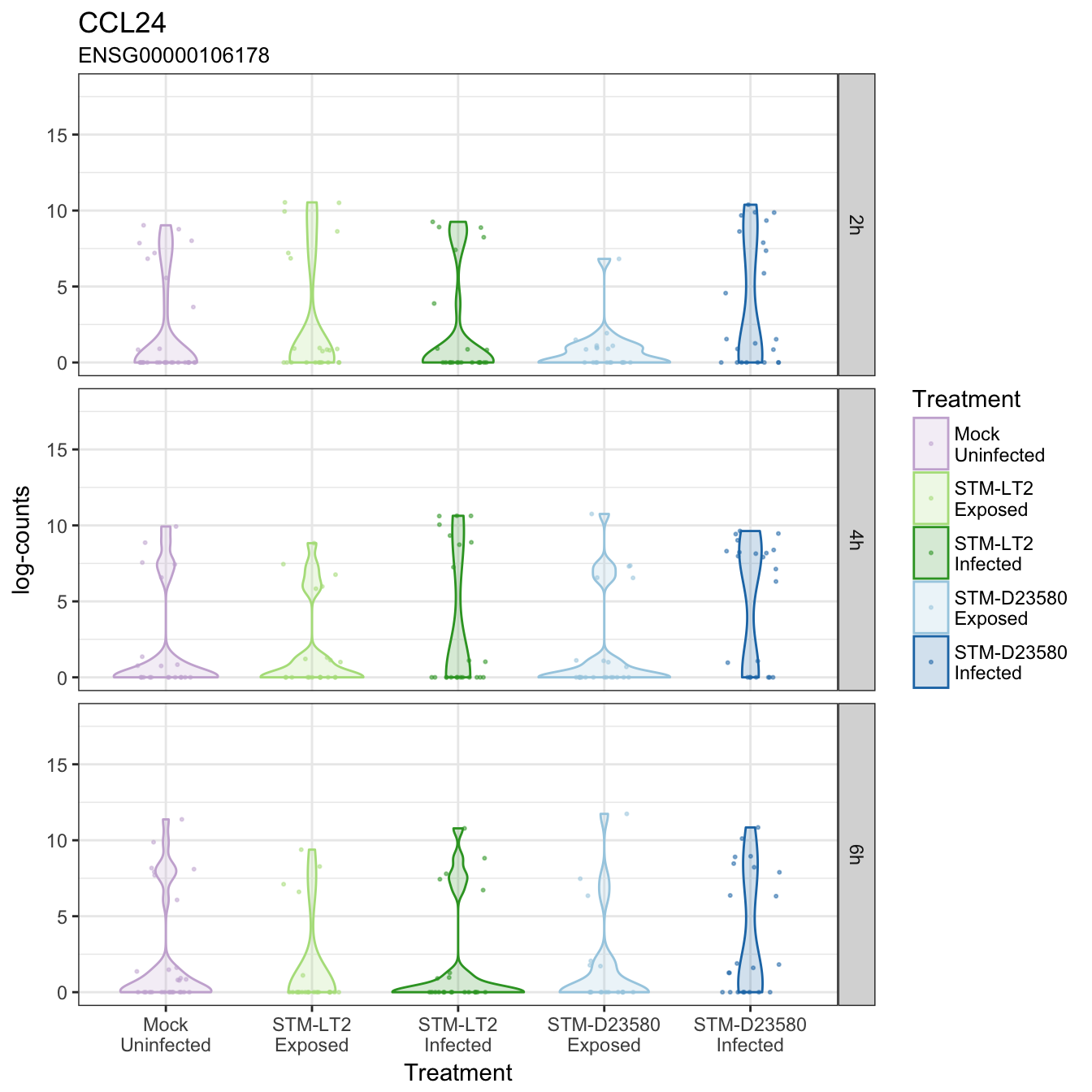
CCL24
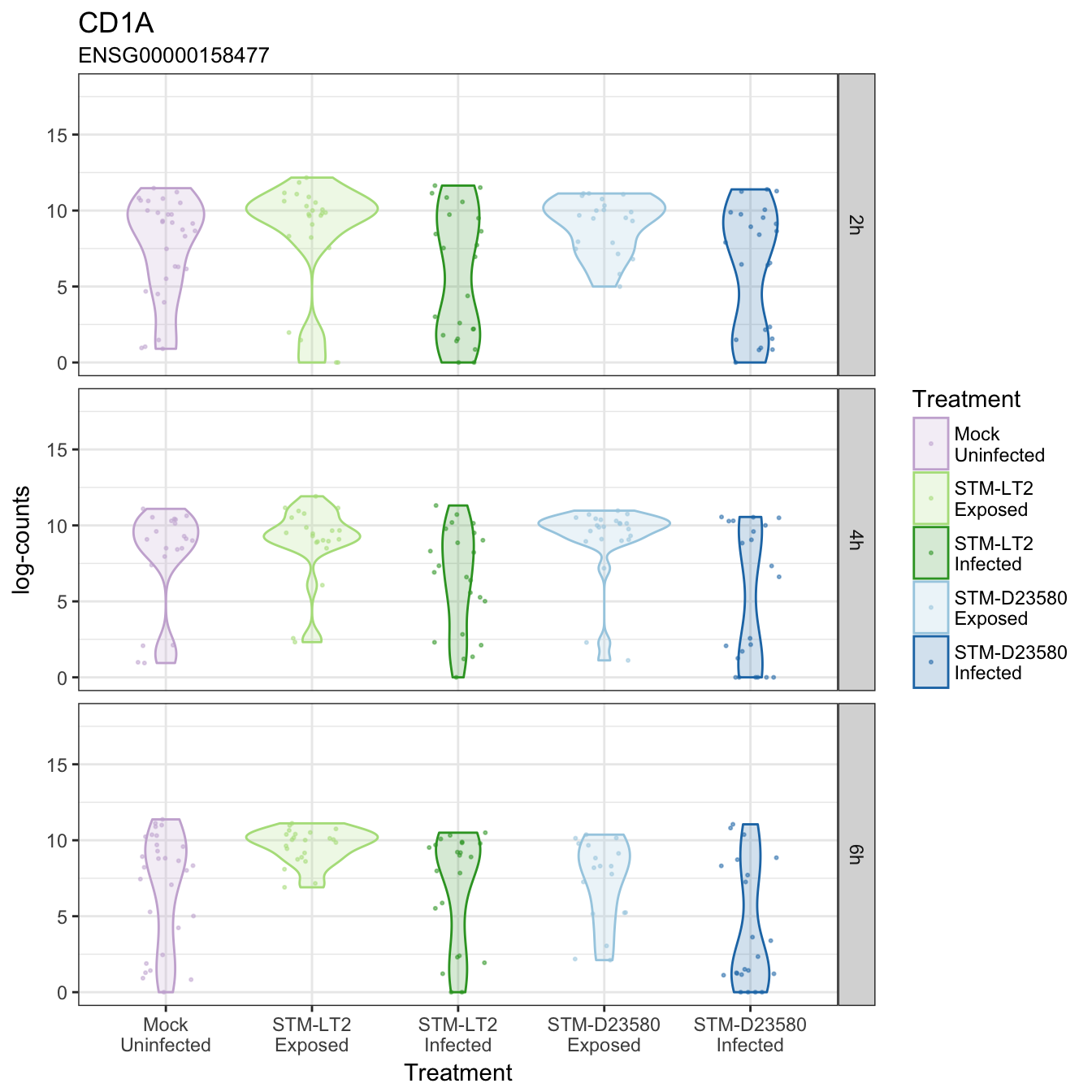
CD1A
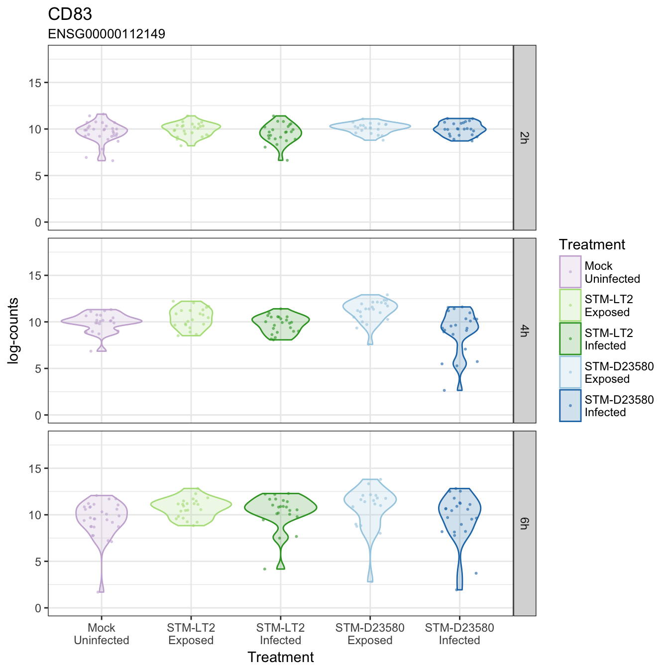
CD83
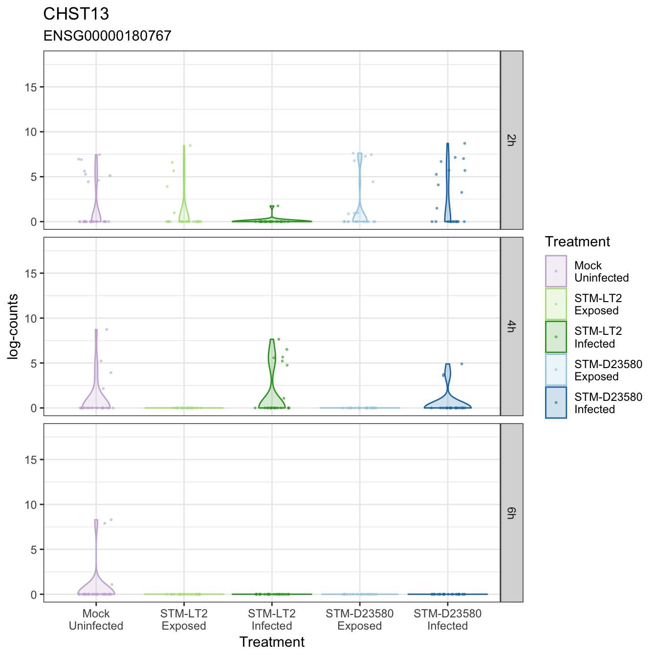
CHST13
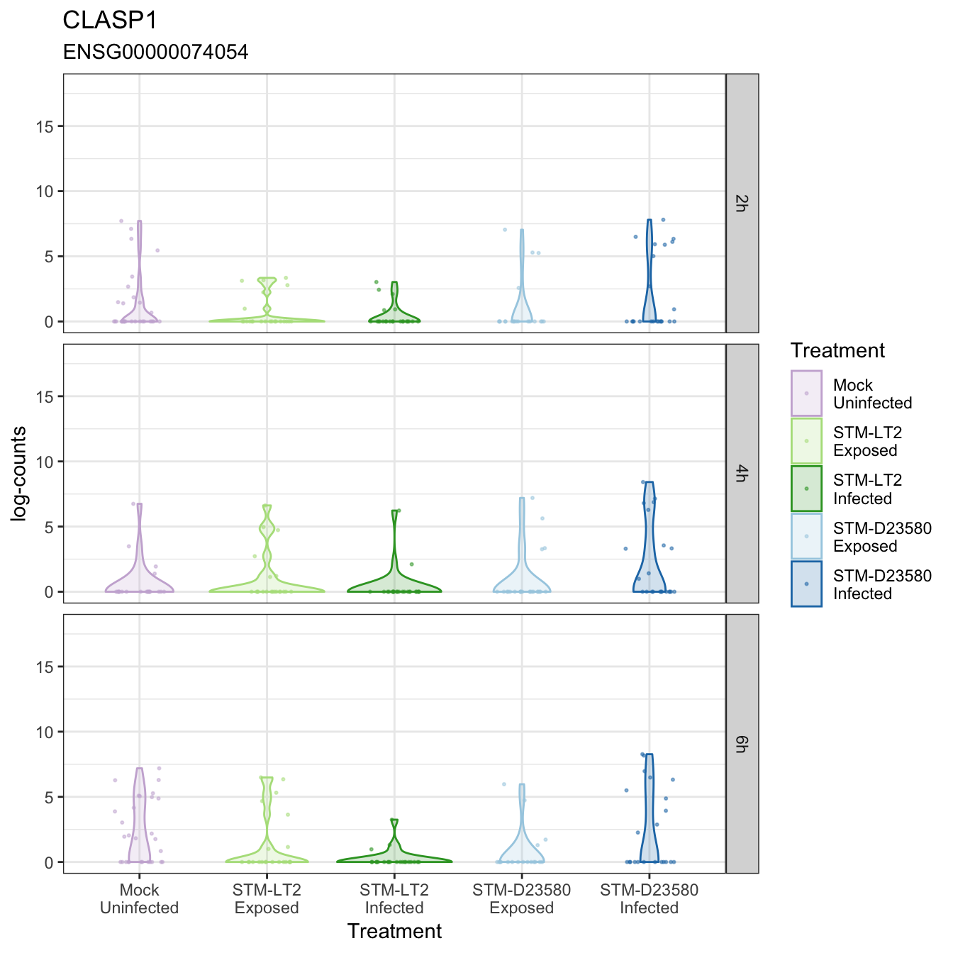
CLASP1
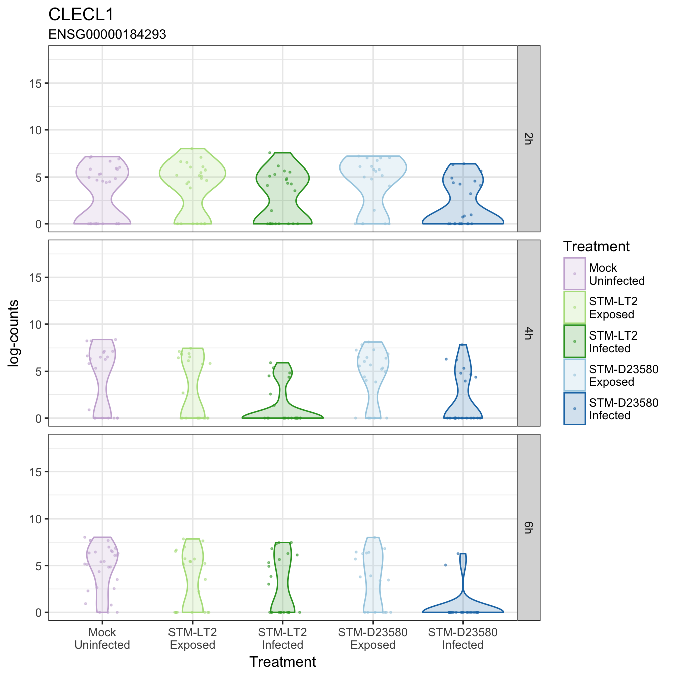
CLECL1
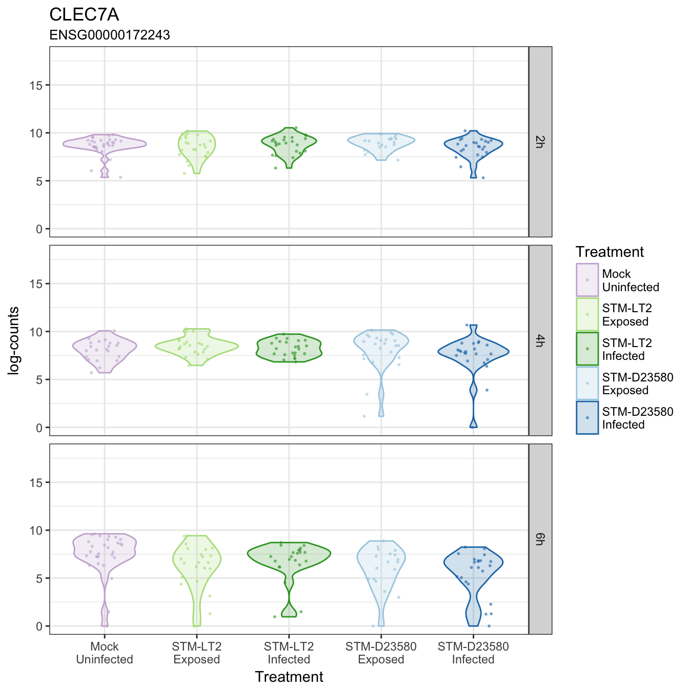
CLEC7A
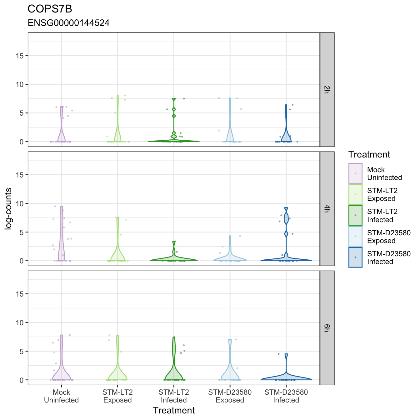
COPS7B
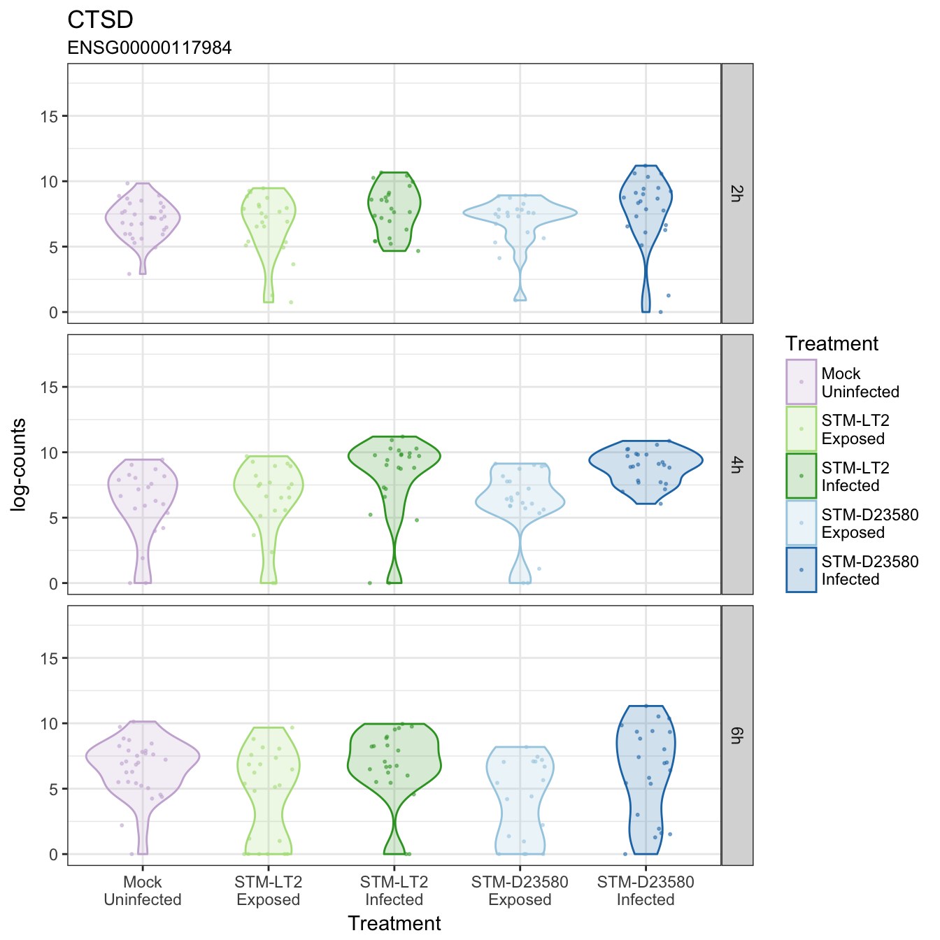
CTSD
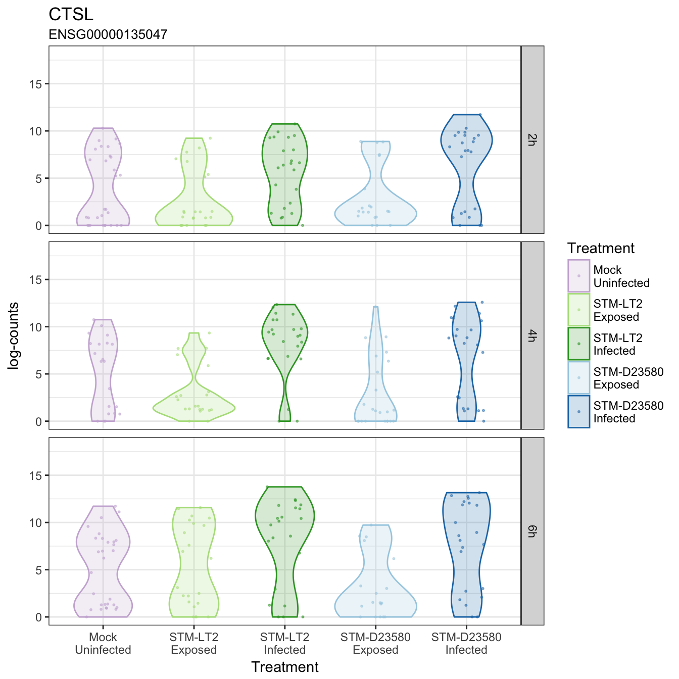
CTSL
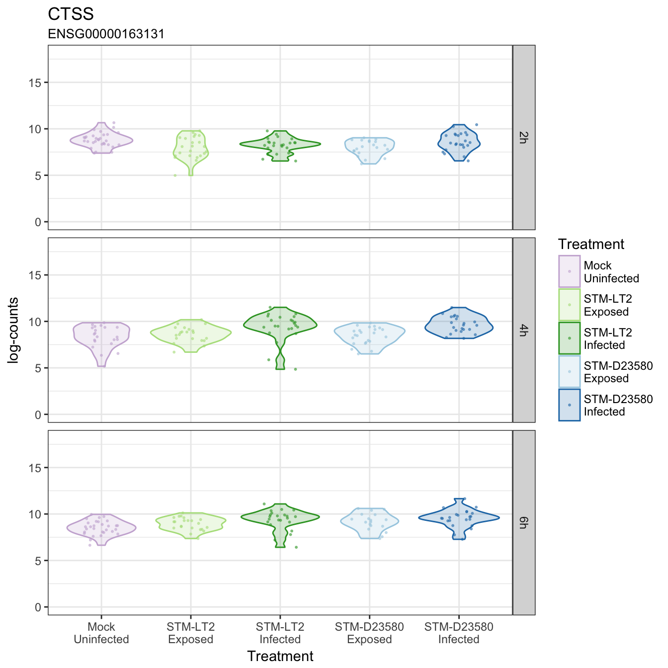
CTSS
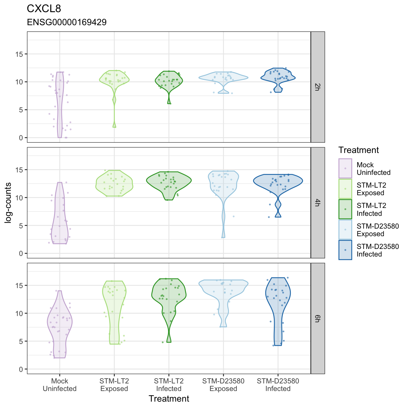
CXCL8
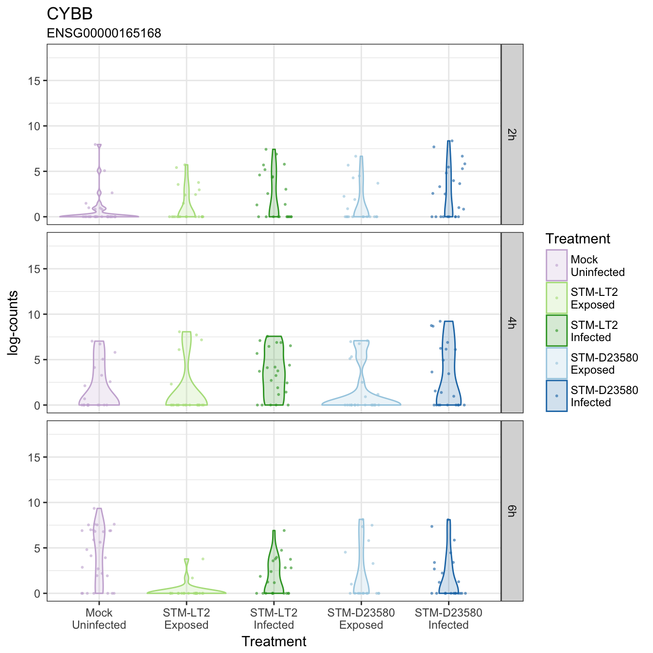
CYBB
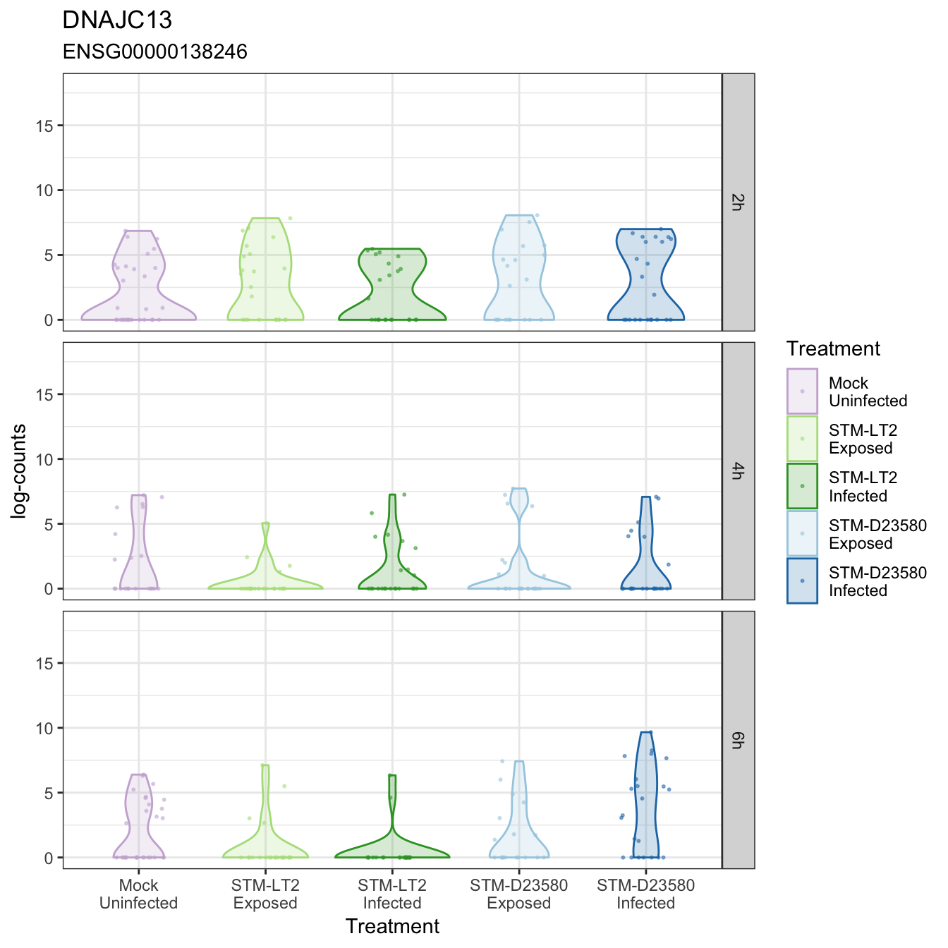
DNAJC13
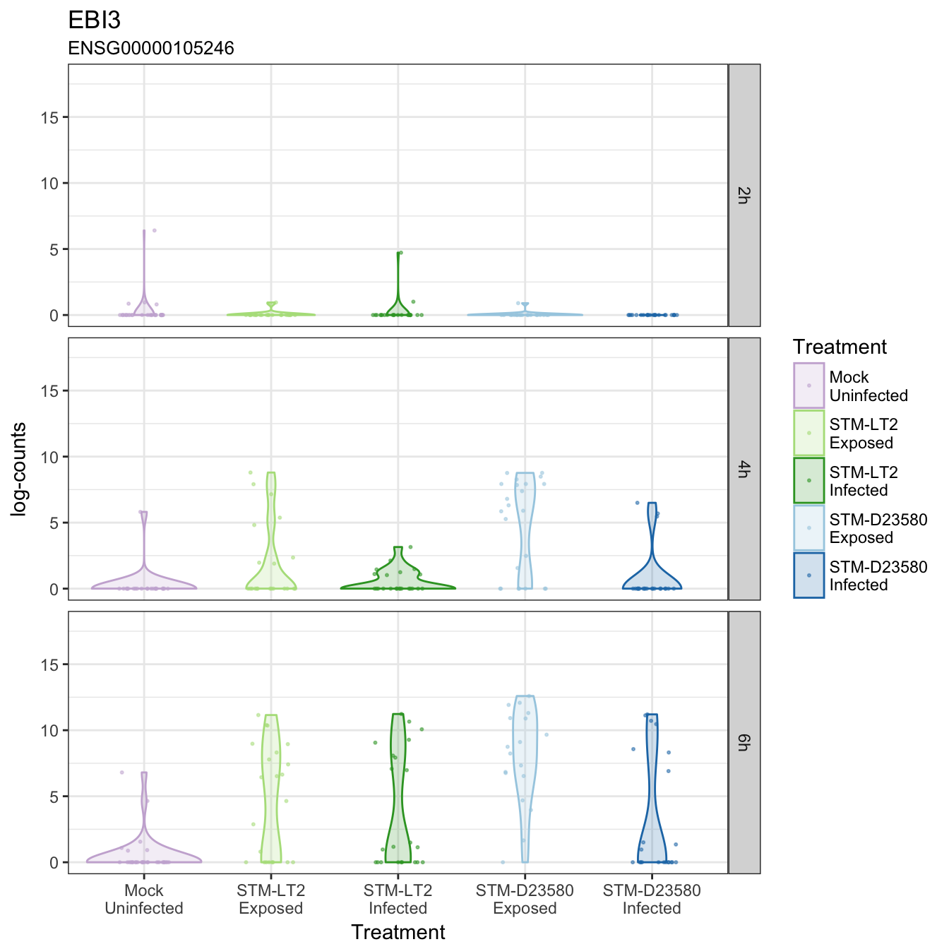
EBI3
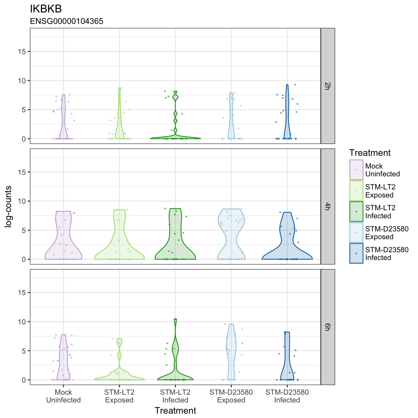
IKBKB
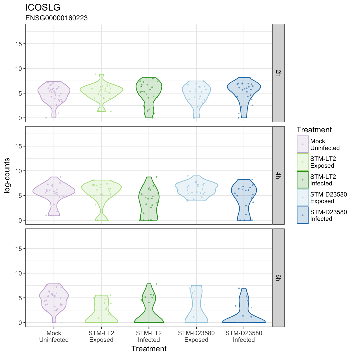
ICOSLG
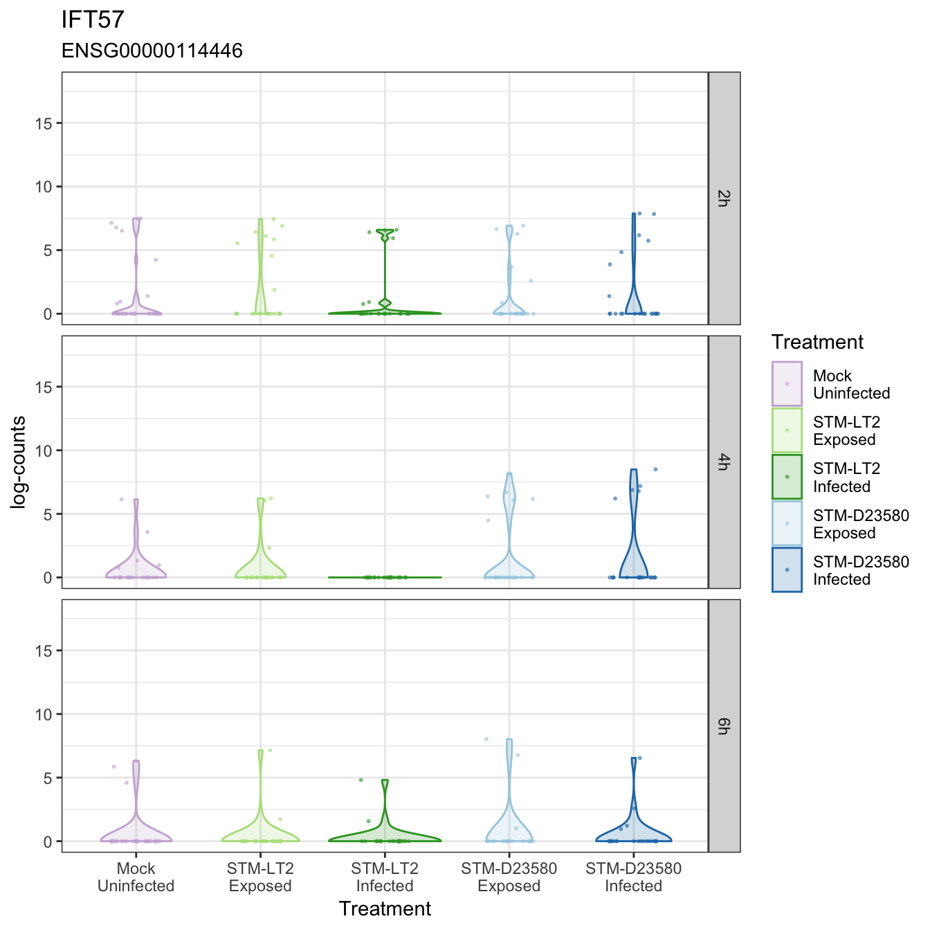
IFT57
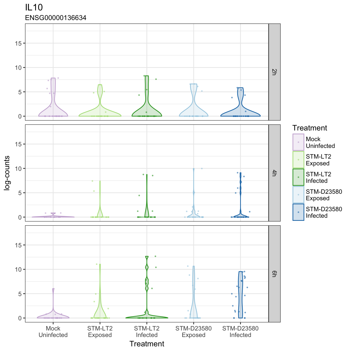
IL10
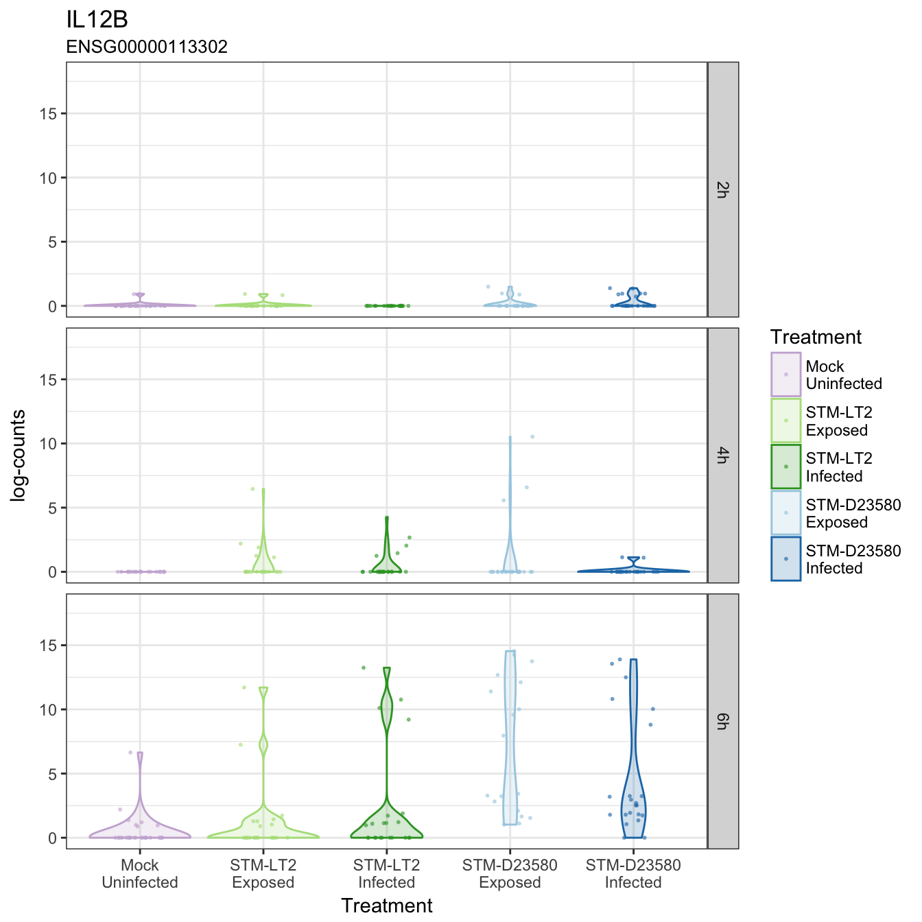
IL12B
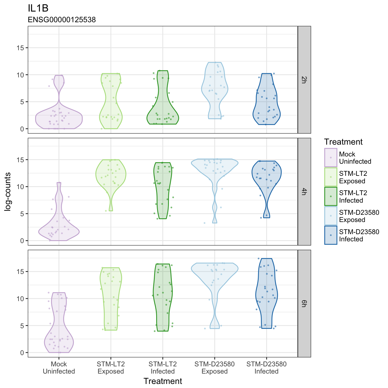
IL1B
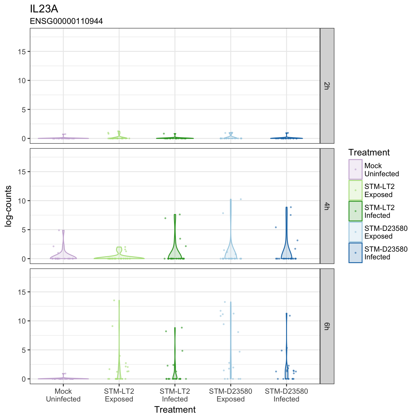
IL23A
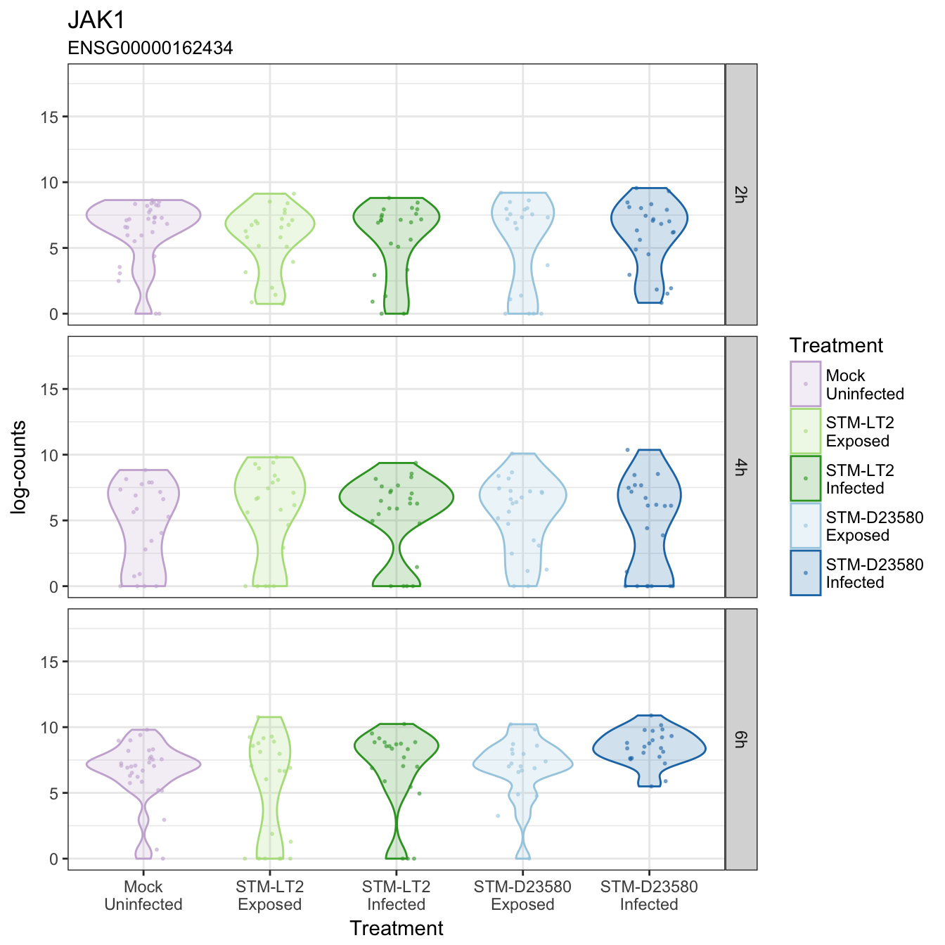
JAK1
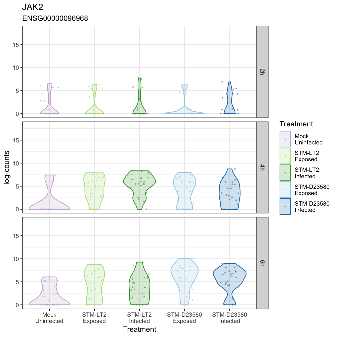
JAK2
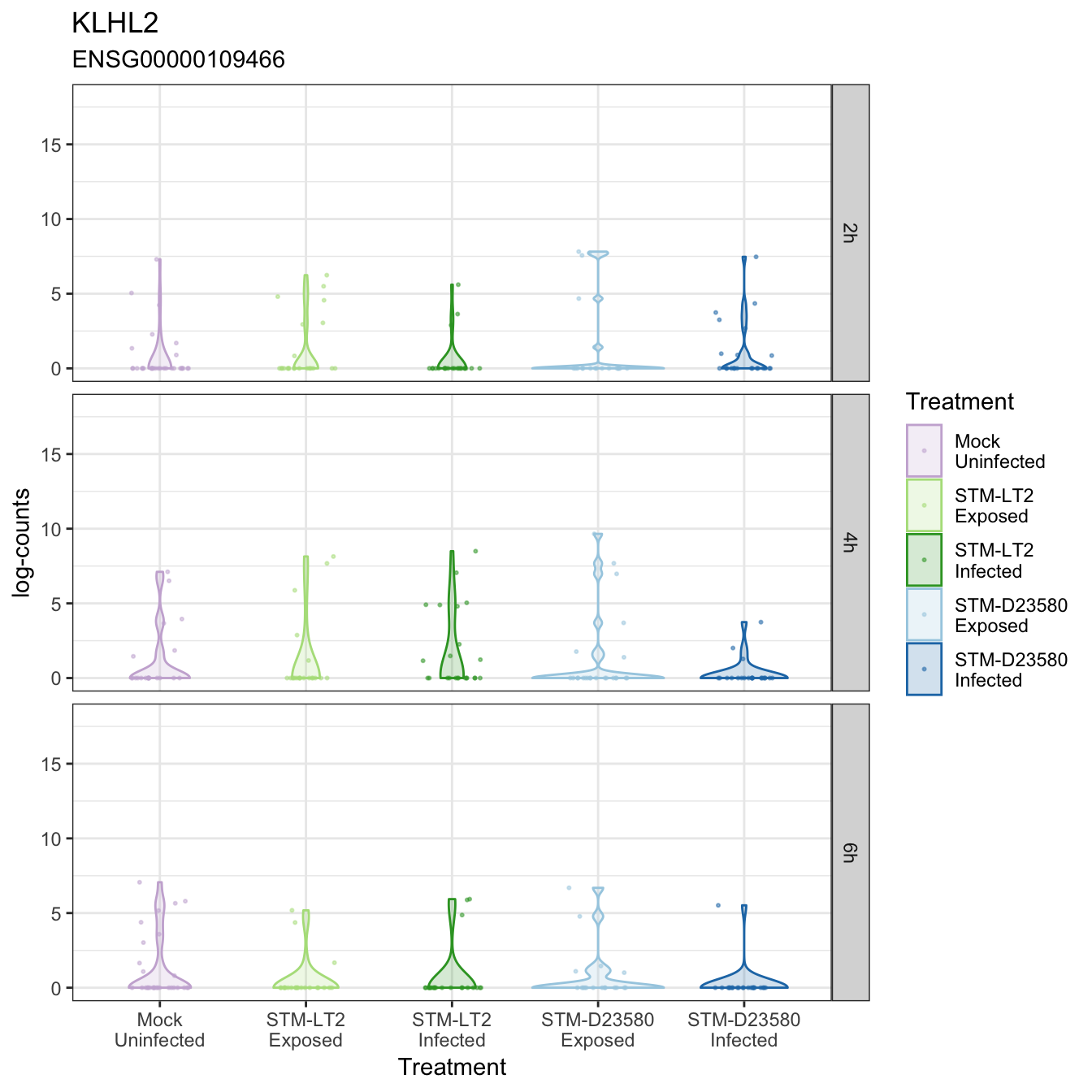
KLHL2
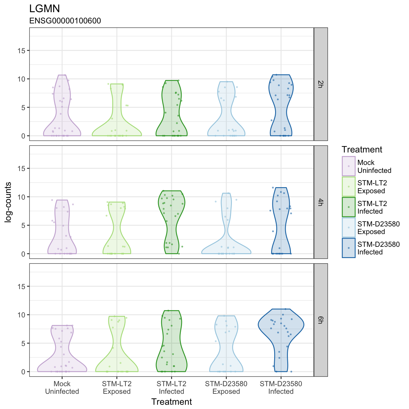
LGMN
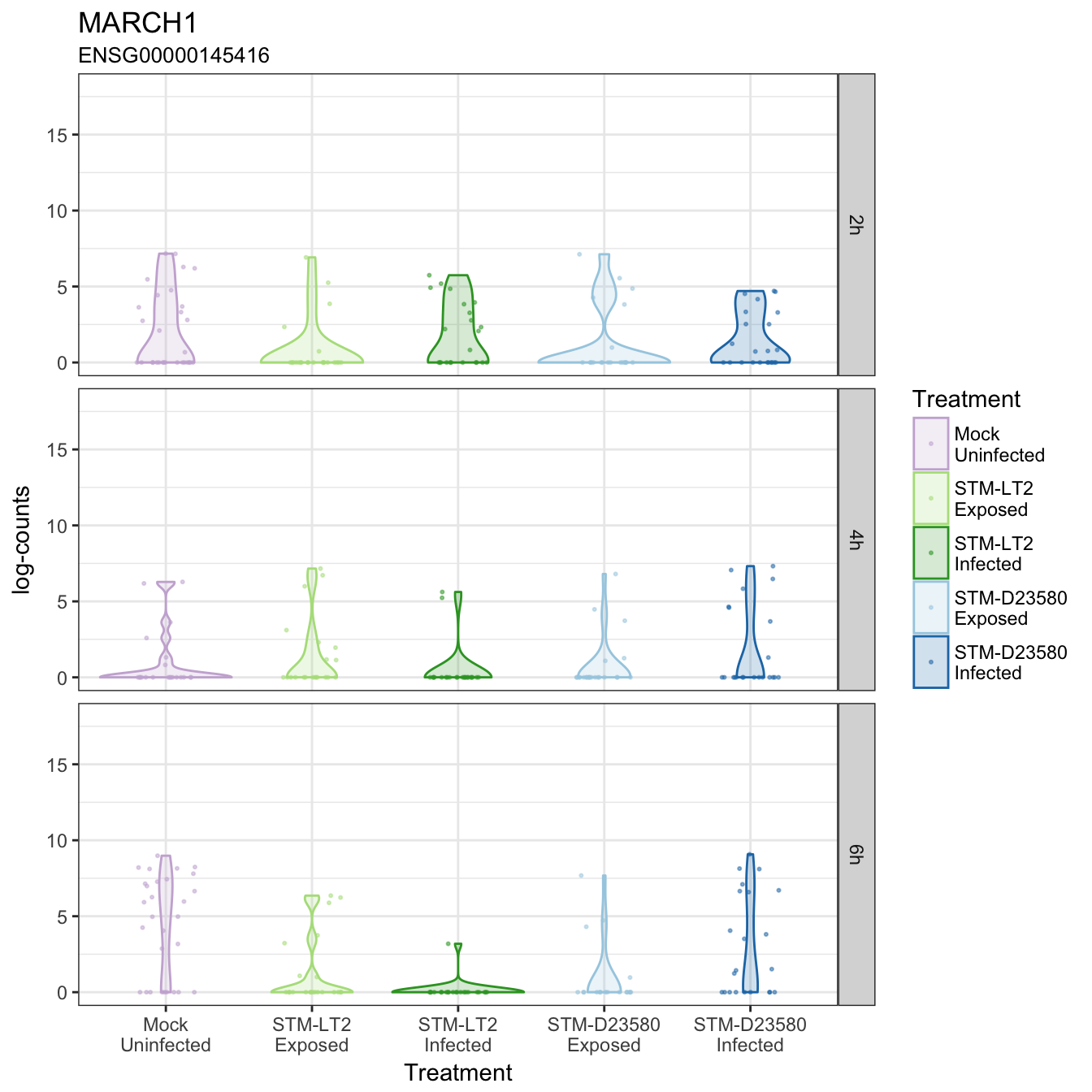
MARCH1
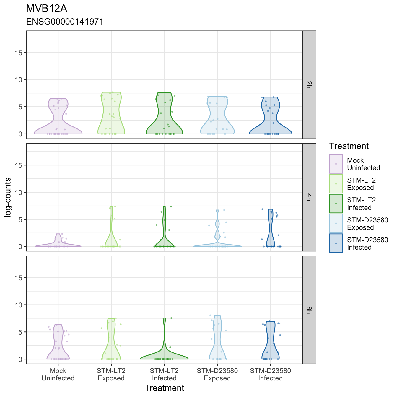
MVB12A
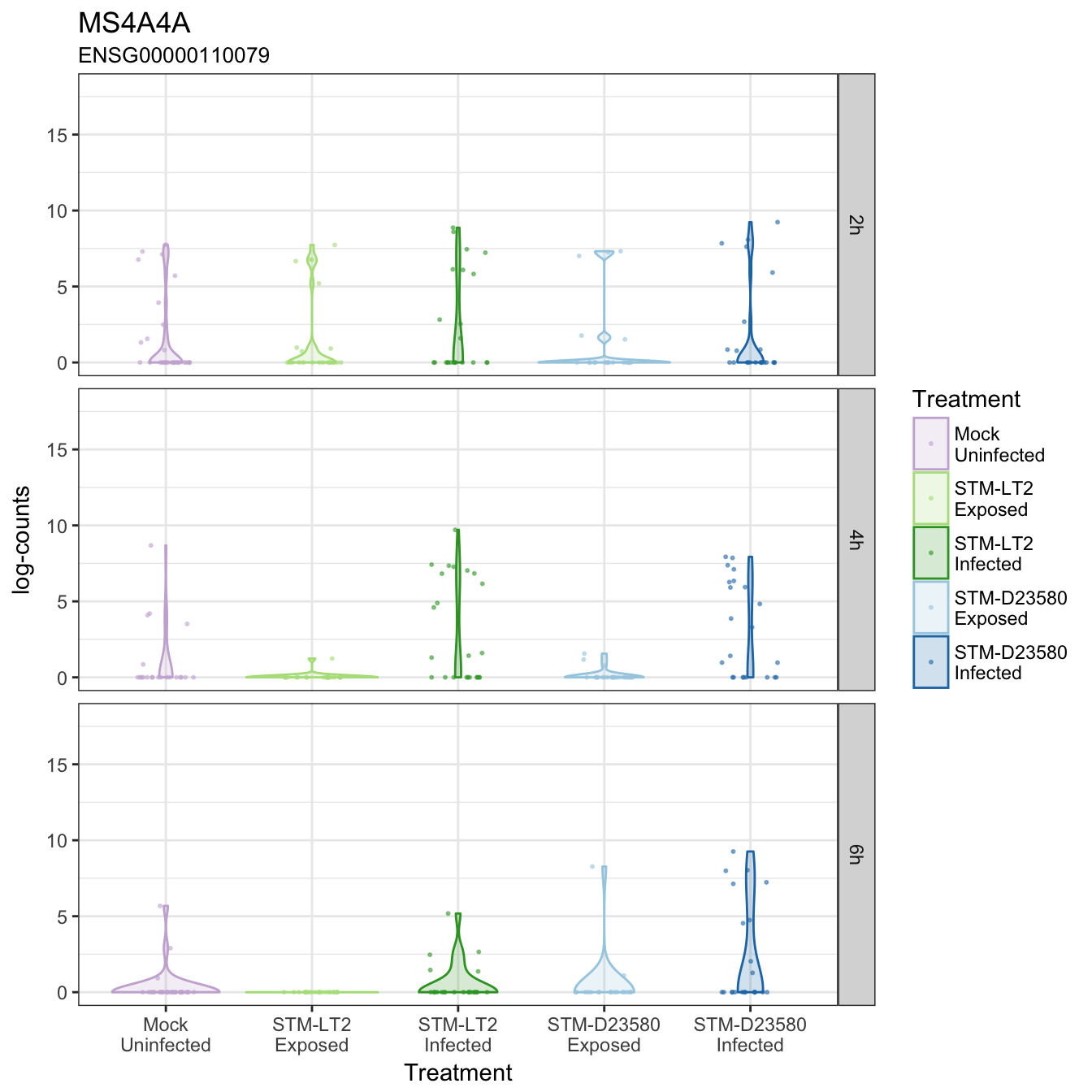
MS4A4A
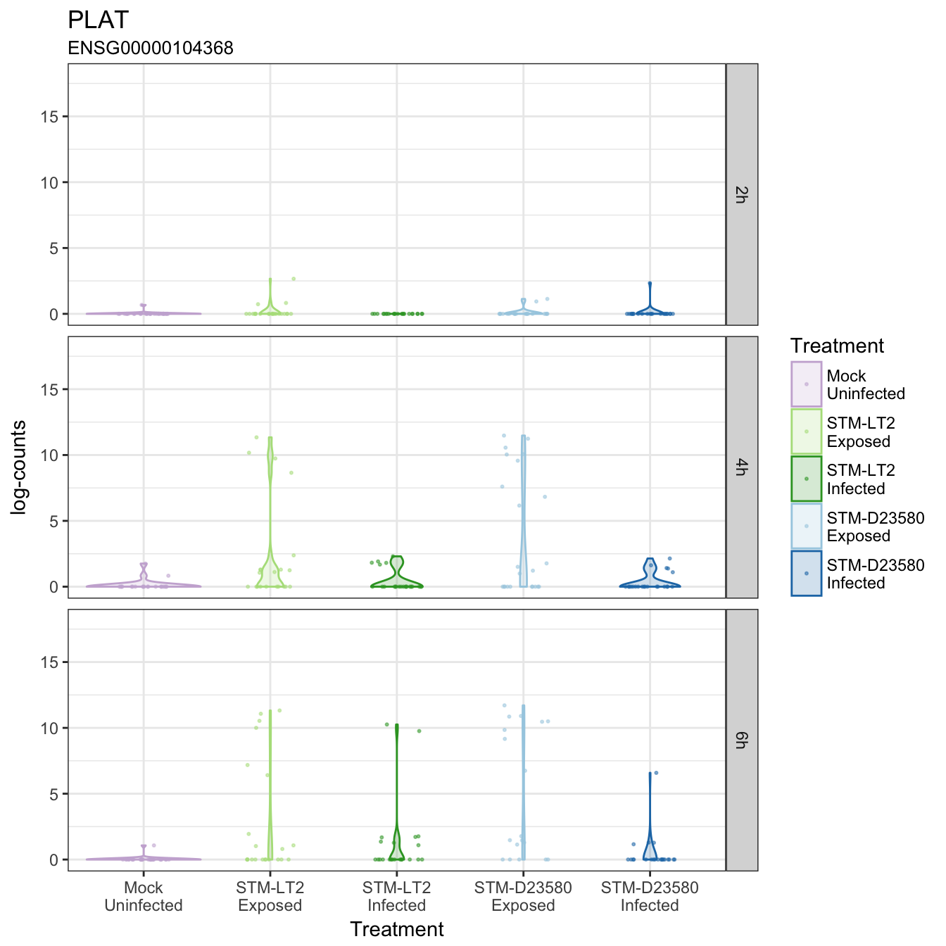
PLAT
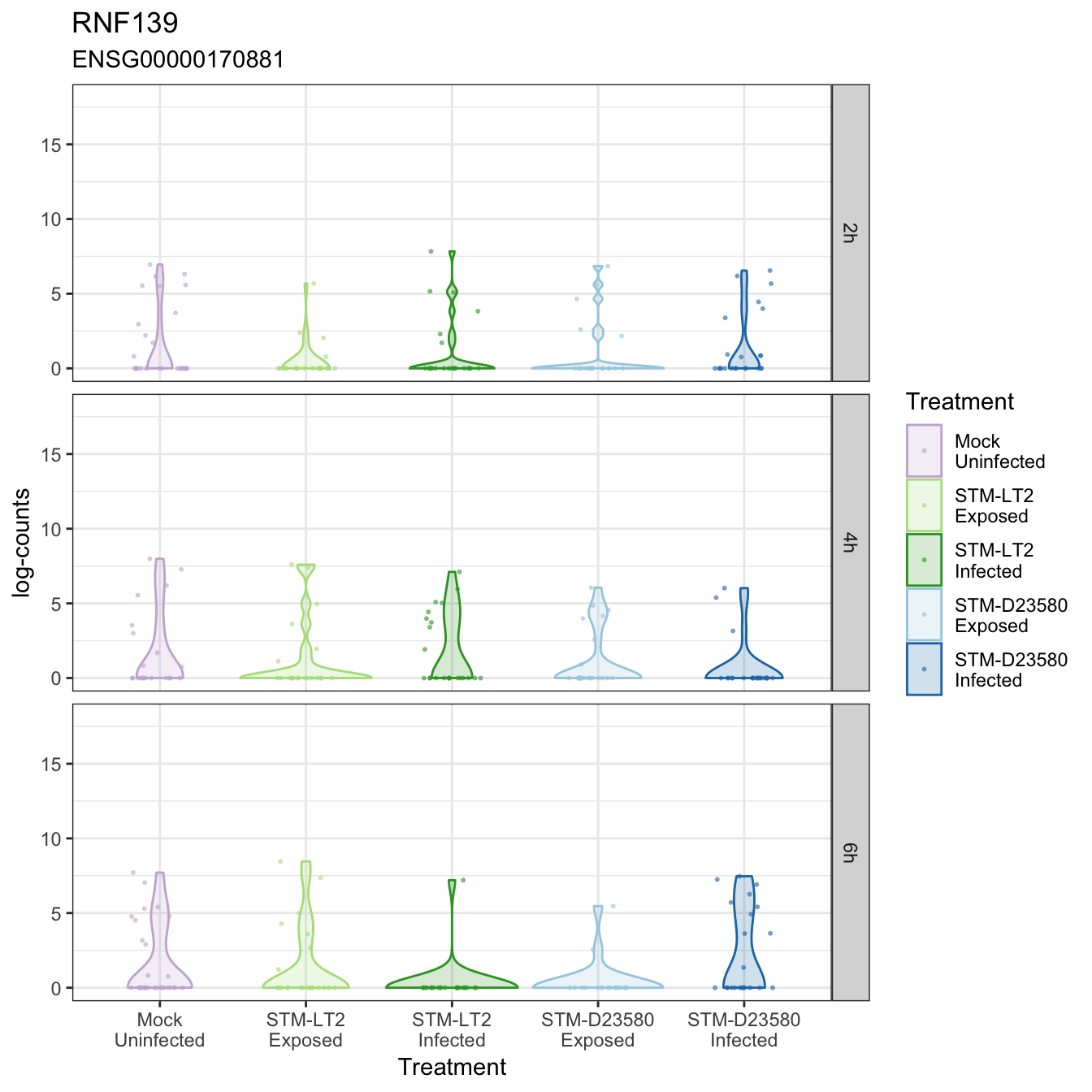
RNF139
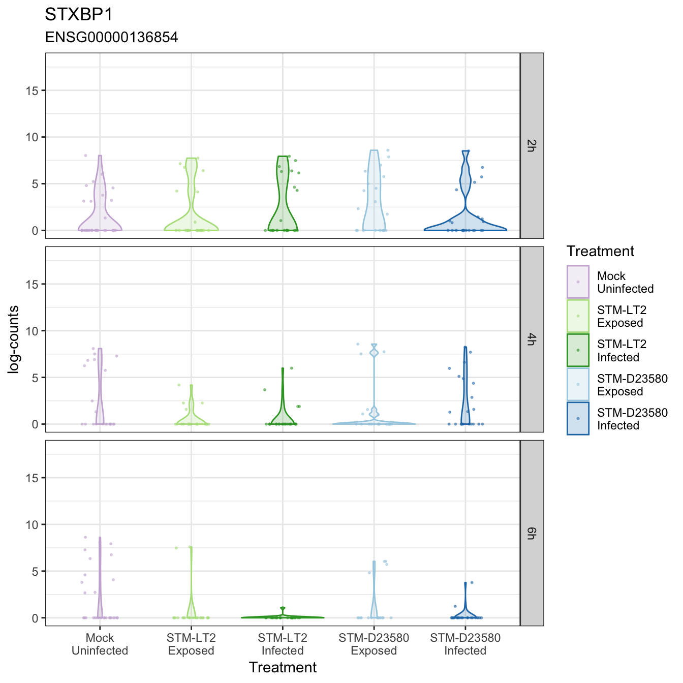
STXBP1
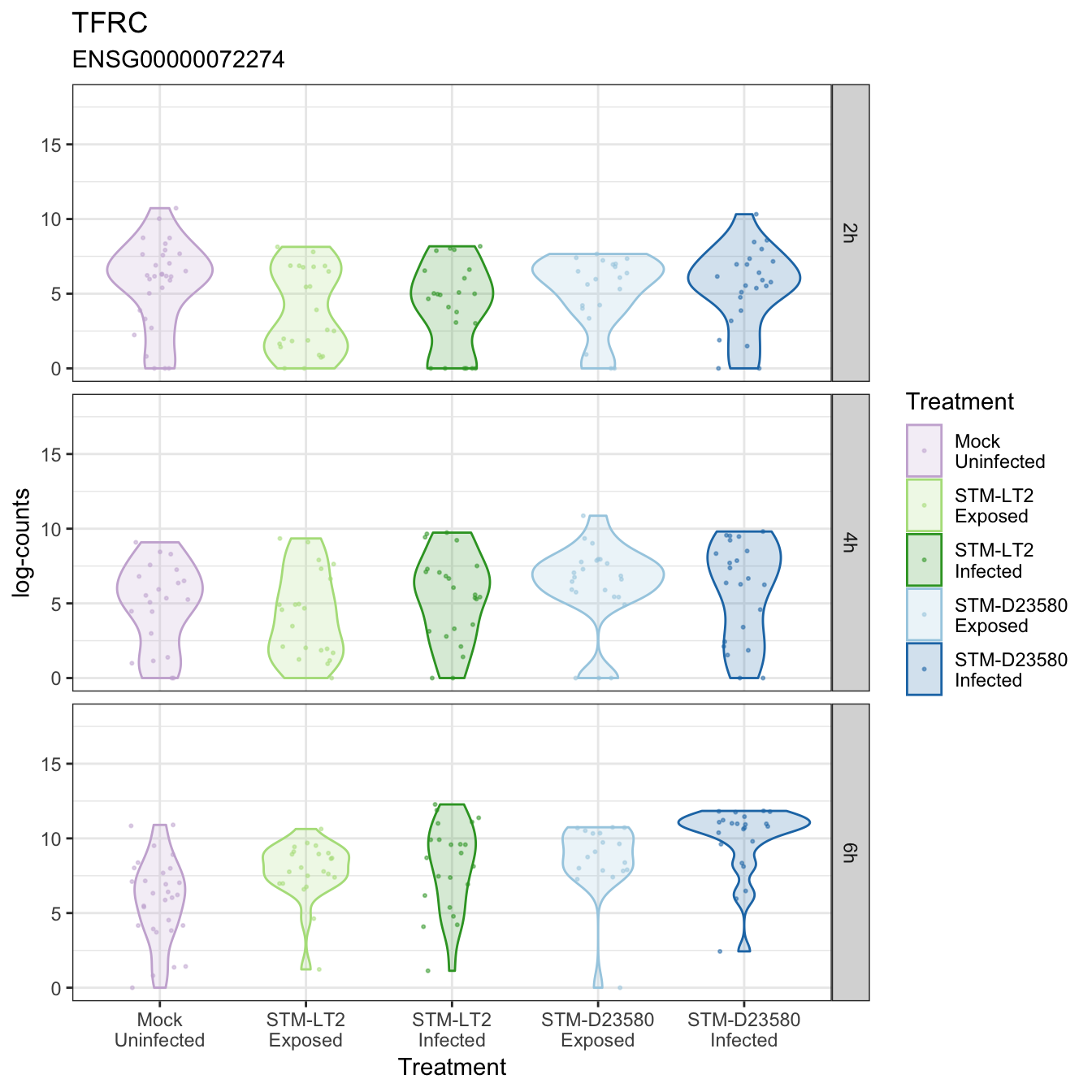
TFRC
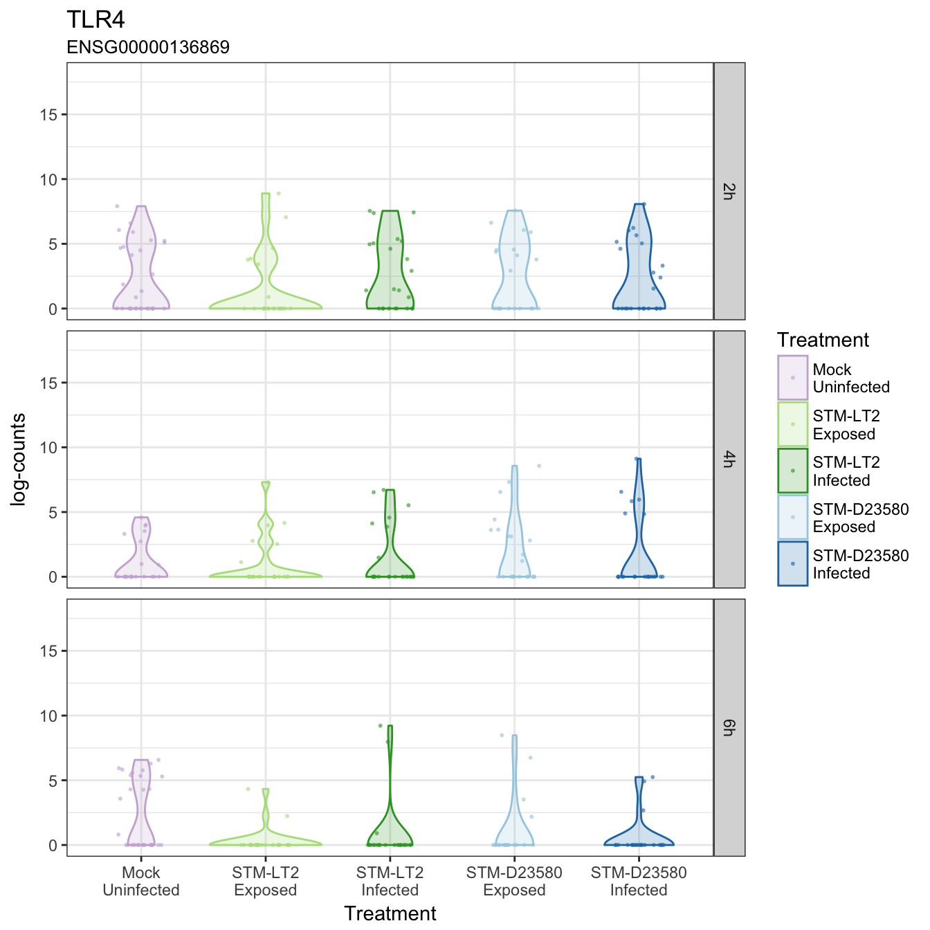
TLR4
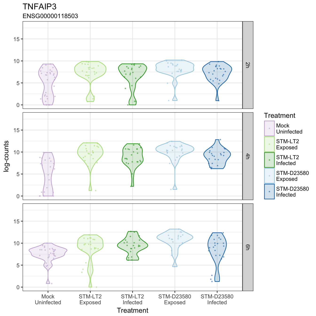
TNFAIP3
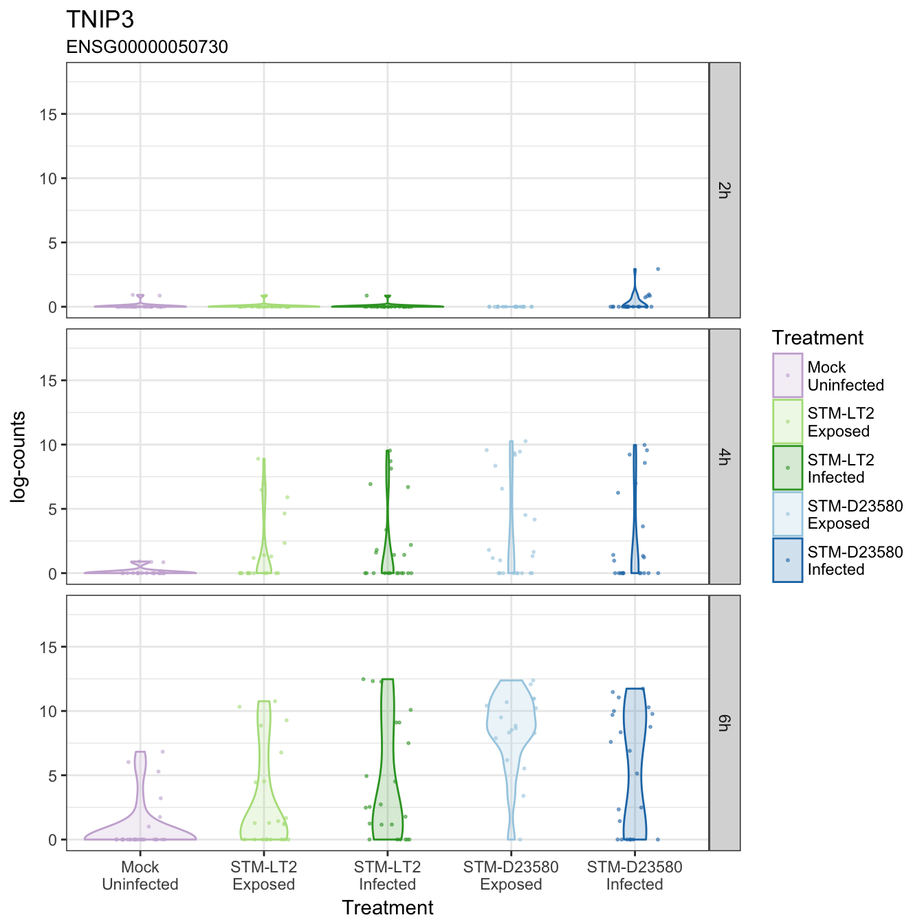
TNIP3
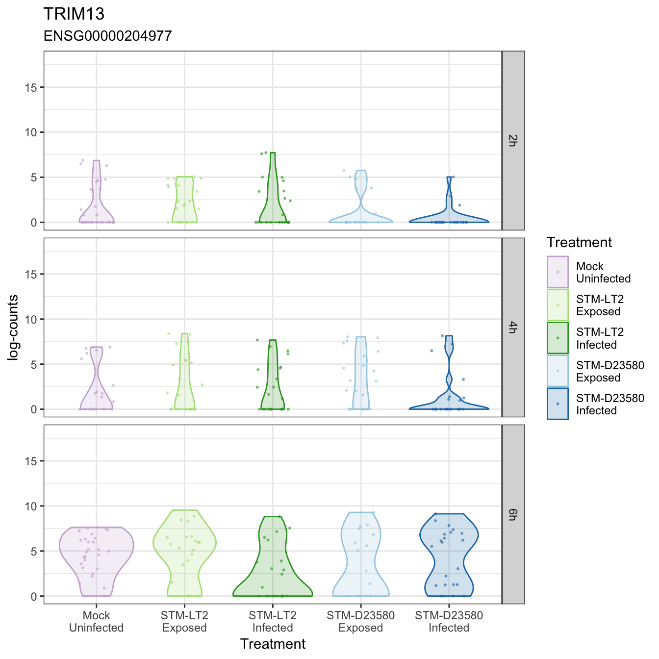
TRIM13
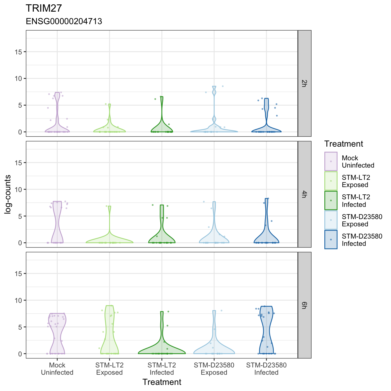
TRIM27
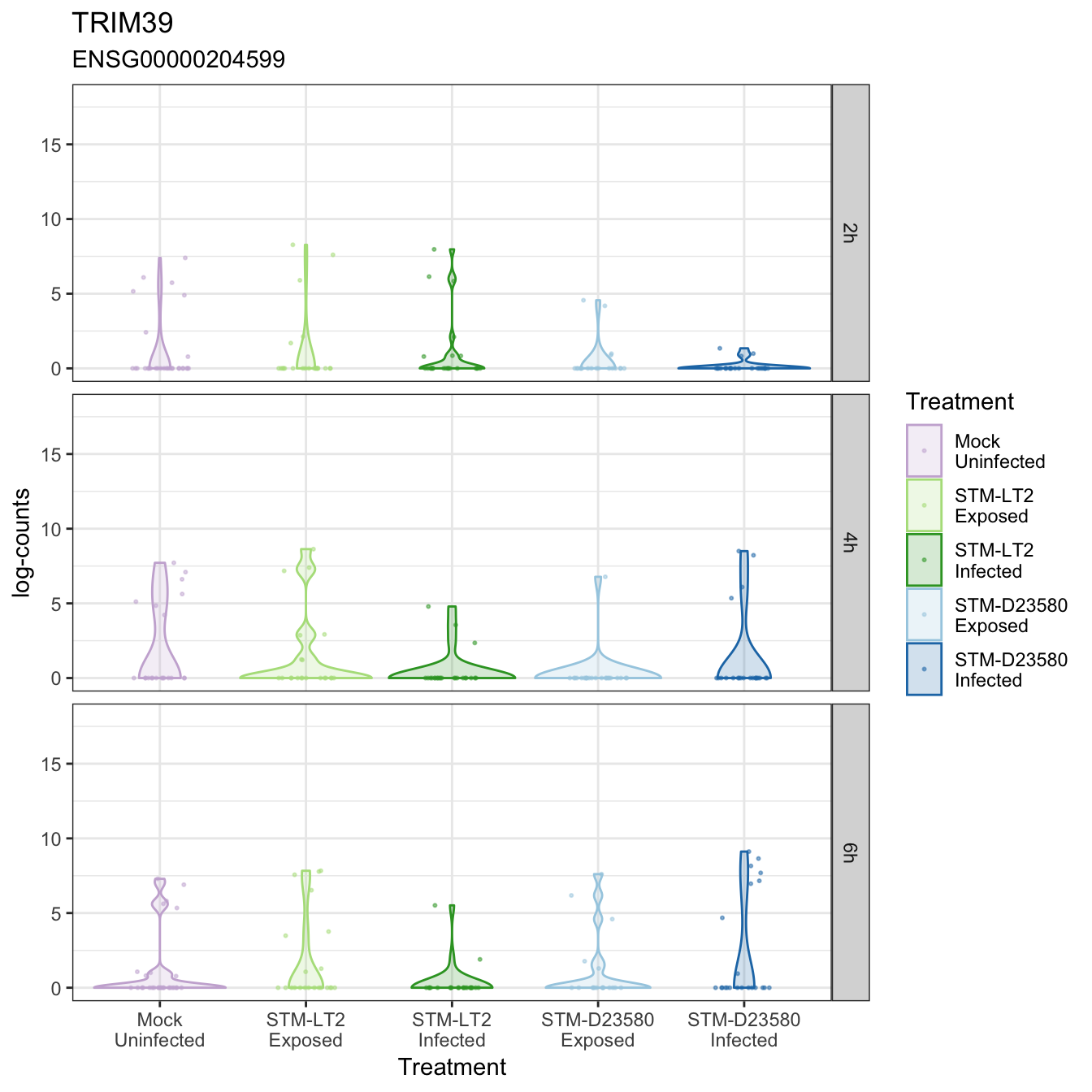
TRIM39
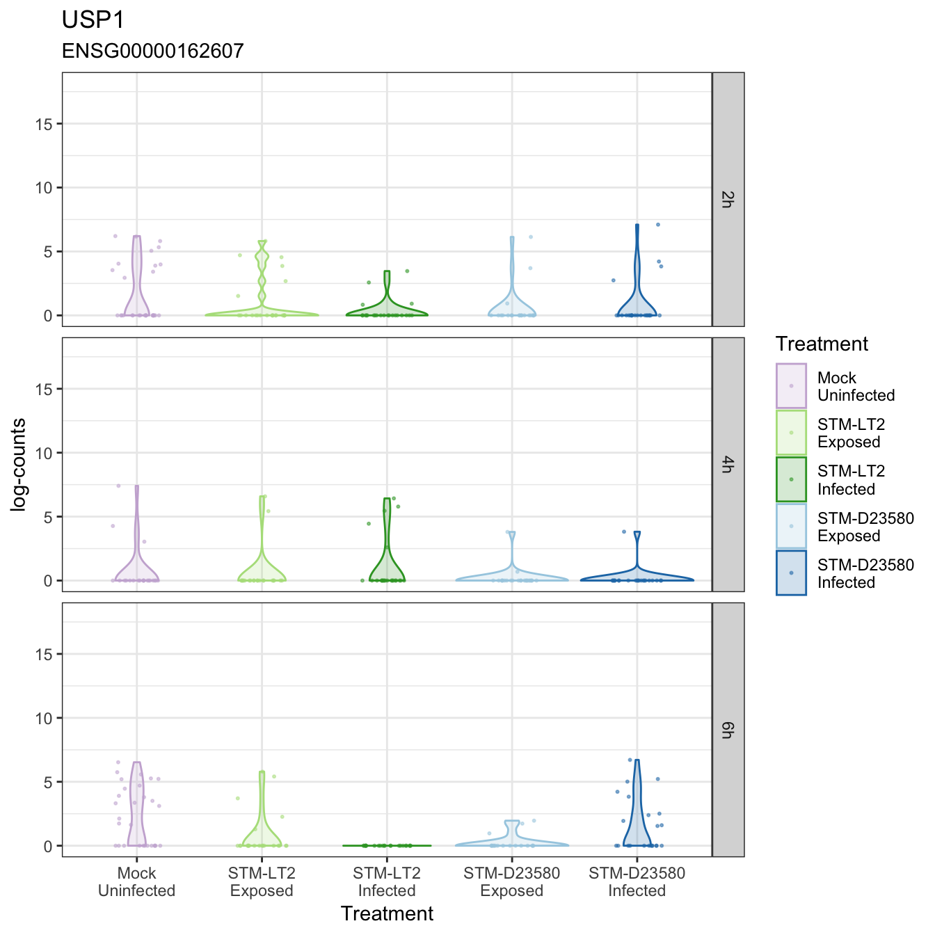
USP1
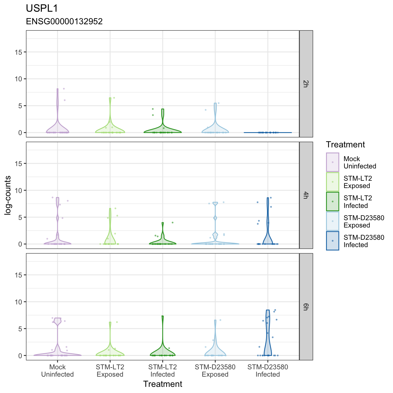
USPL1
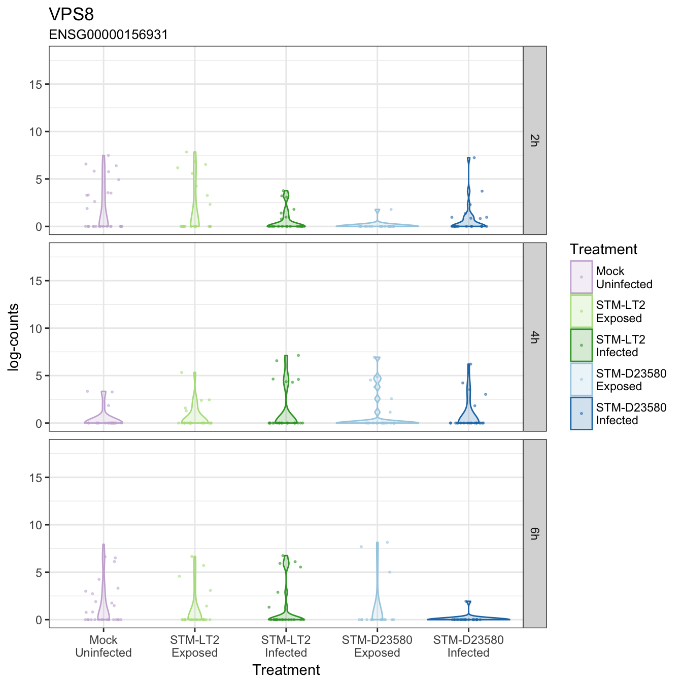
VPS8
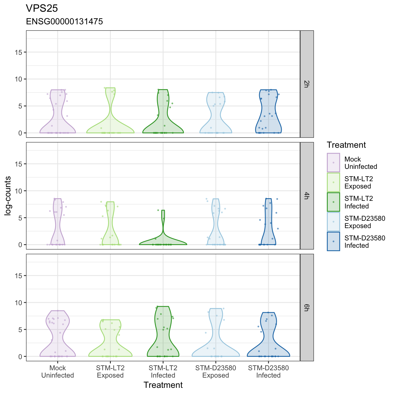
VPS25