Overview of normalised expression data
Plotting themes
Let us first define theme elements used throughout various figures in the following sections:
PCAtheme <- theme_bw() + theme(
    legend.position = "bottom", legend.box = "vertical"
  )
Relative importance of experimental factors
Having normalised the expression data for detected features in cells that passed quality control, the relative importance of experimental factors—both technical and biological—provides insight into uninteresting technical factors that may need to be accounted for when explaining variance in the expression data.
Explanatory variables
Let us examine the proportion of variance explained by known experimental factors, as well as the total spike-in count in each cell:
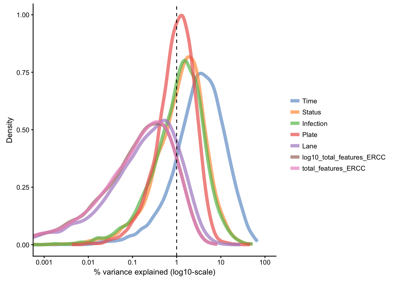
The above figure reinforces the effect of Time as the primary source of variance in gene expression, with substantial proportion of variance explained for a subset of features. Next are Status and Infection factors, while other technical factors share explanation of lower amount of the residual variance in the data set.
Note: Due to technical constraints, the the representation of time points is uneven across the four plates used for library preparation. In summary, while 75% of each plate is balanced, the remaining 25% are:
- a block of single cells collected at 2h
- a block of single cells collected at 4h
- a block of single cells collected at 6h
- an even mixture of cells from 2h, 4h, and 6h
As a result, some variance is expected to associate with the Plate factor, as it is partially confounded with the powerful Time factor.
For reference, the plate design is shown in the second tab.
Plate design (full)
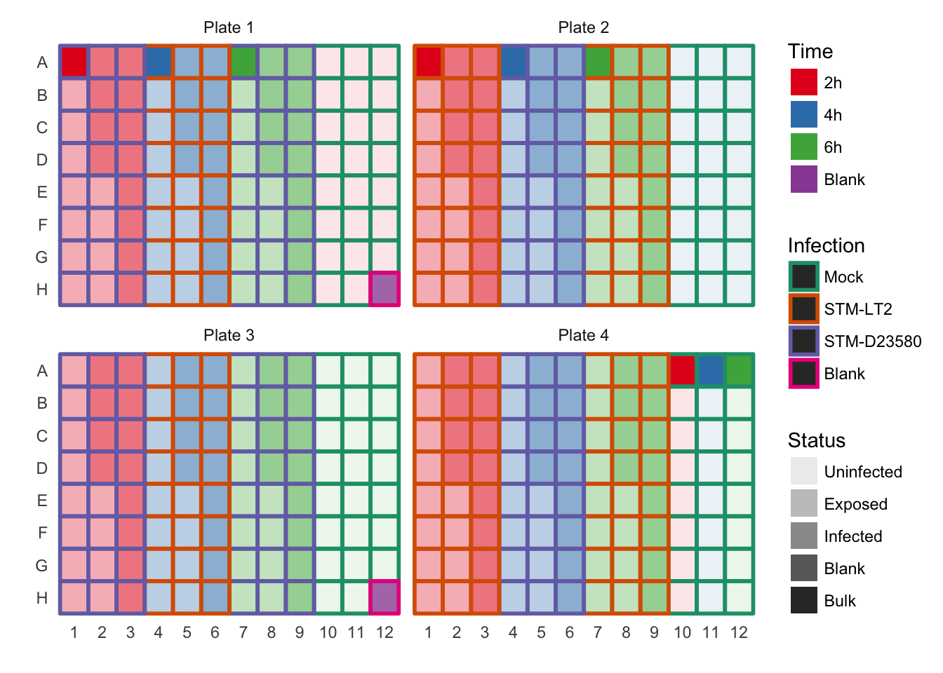
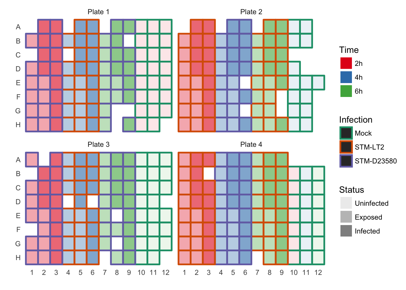
Plate design (Cells passed QC)
Dimensionality reduction methods
Let us examine the qualitatite distribution of cells using different dimensionality reduction approaches.
Principal component analysis (PCA)
All cells
Let us initially focus our attention on the two principal components that explain the largest amount of variance in the endogenous features.
Note 1: Some important default values are:
ntop=500: only the500most variable features are usedscale_features=TRUE: standardises expression values so that each feature has unit variance; this procedure normalises the relative importance of features expressed at high and low levels in the calculation of principal components.
Note 2: Some important non-default values are:
exprs_values="norm_exprs": the normalised log2-transformed CPM are used.feature_set=!isSpike(sce.norm): ERCC spike-in features are not considered (see this earlier section where the set of spike-in features is defined).
sce.norm <- runPCA(sce.norm, ncomponents = 3, exprs_values = "logcounts",
  feature_set = NULL, scale_features = TRUE)
Principal components 1 and 2
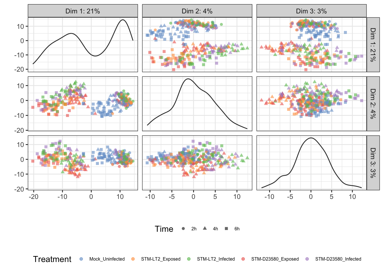
Treatment
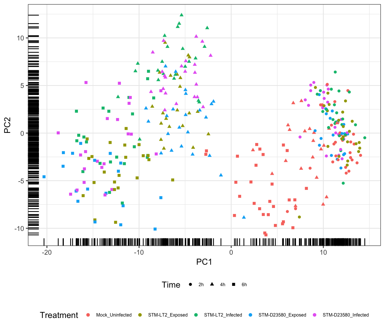
The above figure emphasises the importance of the Time factor, significantly associated with PC1; in the figure, cells progress from the earliest time points at the lowest coordinates on PC1 to the latest time points at the highest coordinates of PC1.
In addition, PC2 contributes to the increasingly marked separation of stimulated cells (i.e., infected and stimulated, in orange, green, red, and blue) from uninfected cells (in blue); uninfected cells generally appear at lower coordinates than their infected and exposed counterparts on both PC2 and PC1, with this trend becoming increasingly apparent over time.
Overall, the observations above suggest different transcriptional trajectories taken by cells in response to experimental stimuli.
Time
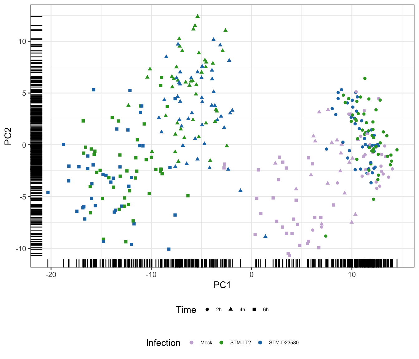
Infection
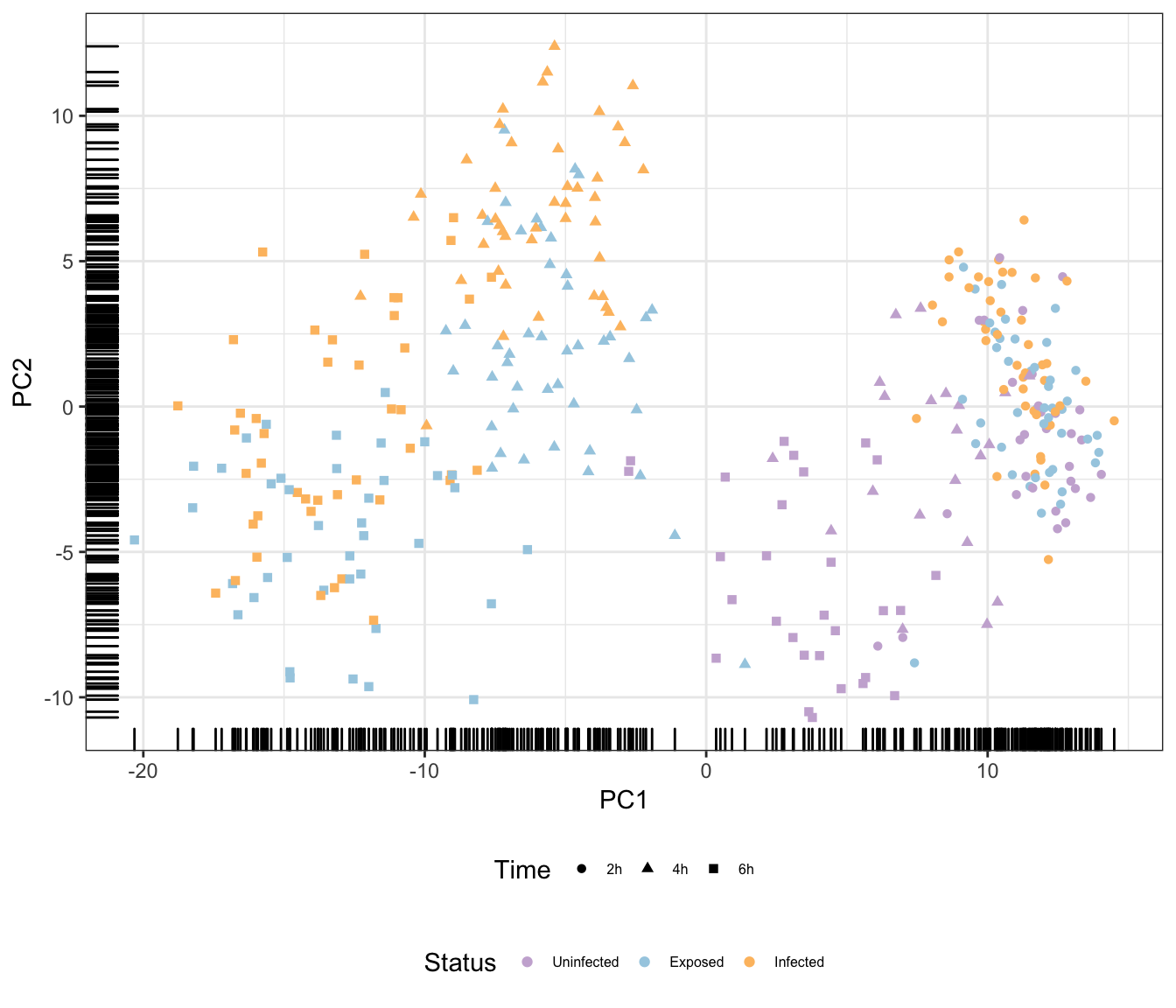
Status
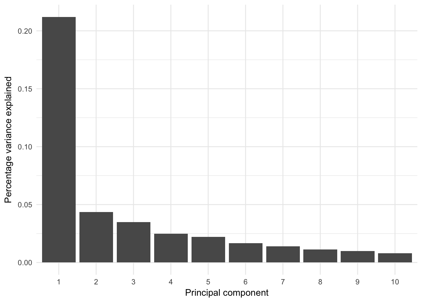
Additional principal components
The analysis may be extended to more principal components; however, by definition those principal components will report decreasing amount of variance in the data set:
Percentage variance explained
Percentage of variance explained by prinicipal components:
Treatment
Time
## Scale for 'colour' is already present. Adding another scale for
## 'colour', which will replace the existing scale.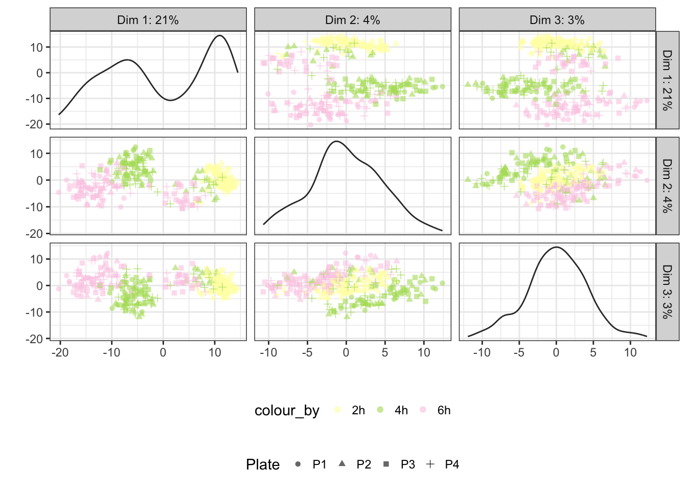
Status
## Scale for 'colour' is already present. Adding another scale for
## 'colour', which will replace the existing scale.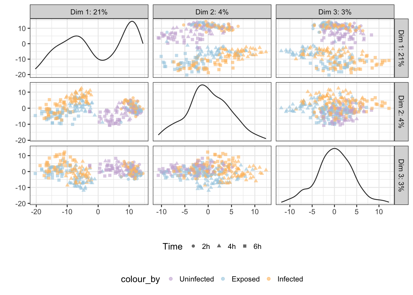
Infection
## Scale for 'colour' is already present. Adding another scale for
## 'colour', which will replace the existing scale.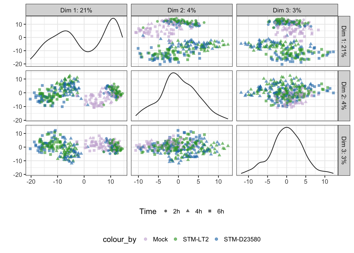
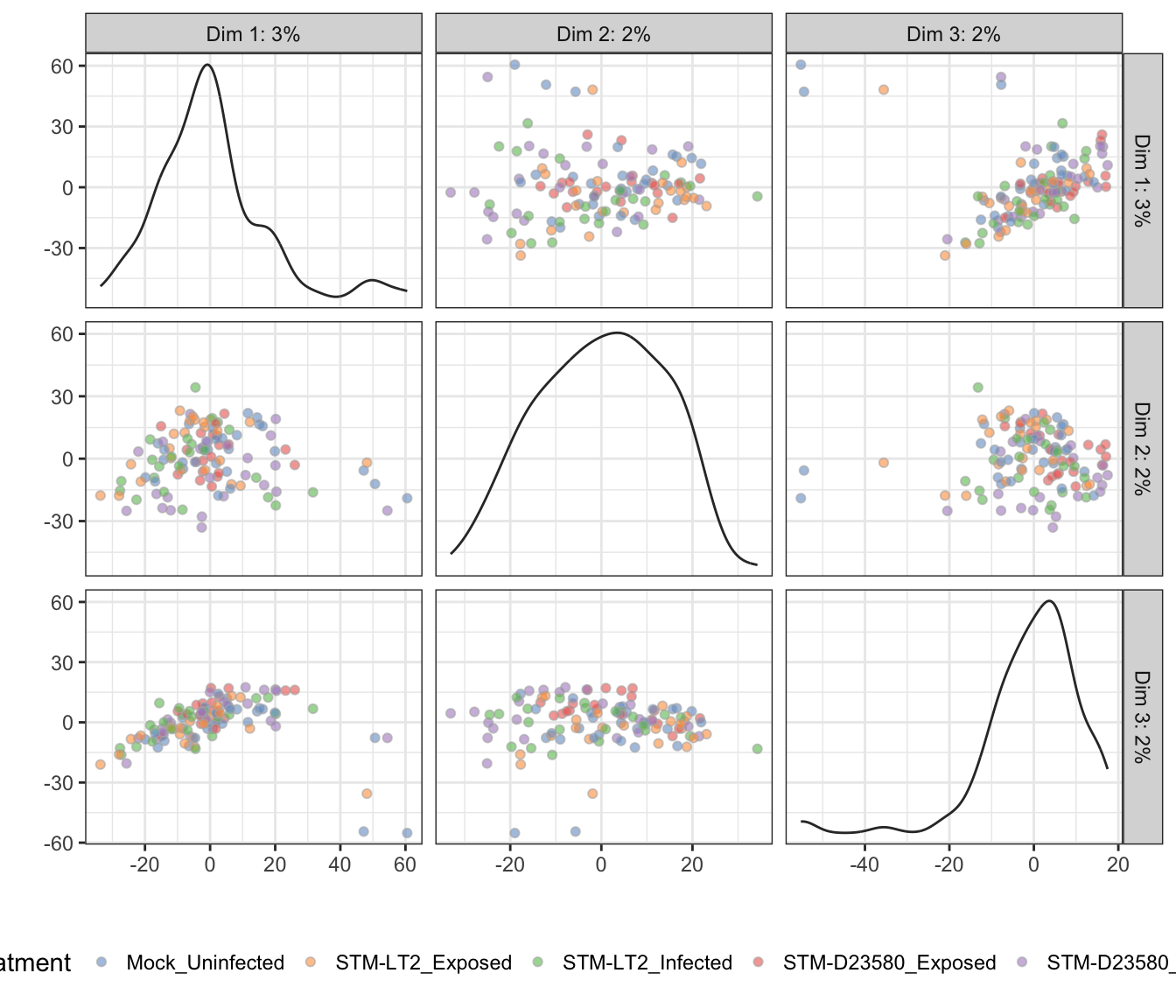
PCA analyses within time points
In the above section, the overwhelming influence of the Time factor likely shadows the relatively weaker effect of other biologically relevant factors Infection and Status.
Let us perform PCA at each time point:
time.sce <- list()
for (time in levels(sce.norm$Time)){
  tmp.sce <- sce.norm[,sce.norm$Time == time]
  keep_feature <- (rowMeans(counts(tmp.sce)) >= 1)
  tmp.sce <- tmp.sce[keep_feature,]
  tmp.sce <- runPCA(
    tmp.sce, ncomponents = 3, exprs_values = "logcounts",
    feature_set = !isSpike(tmp.sce, "ERCC")
  )
  time.sce[[time]] <- tmp.sce
  rm(tmp.sce)
}
rm(time)
Note: Below, the tab name indicates the experimental factor used to colour single cells (i.e., Infection or Status); the other factor is then used to shape each data point.
2h
Infection
## Scale for 'colour' is already present. Adding another scale for
## 'colour', which will replace the existing scale.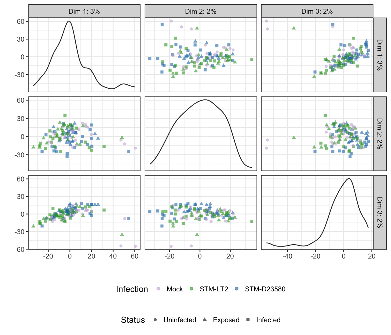
Status
## Scale for 'colour' is already present. Adding another scale for
## 'colour', which will replace the existing scale.
Treatment
4h
Infection
## Scale for 'colour' is already present. Adding another scale for
## 'colour', which will replace the existing scale.
Status
## Scale for 'colour' is already present. Adding another scale for
## 'colour', which will replace the existing scale.
Treatment

6h
Infection
## Scale for 'colour' is already present. Adding another scale for
## 'colour', which will replace the existing scale.
Status
## Scale for 'colour' is already present. Adding another scale for
## 'colour', which will replace the existing scale.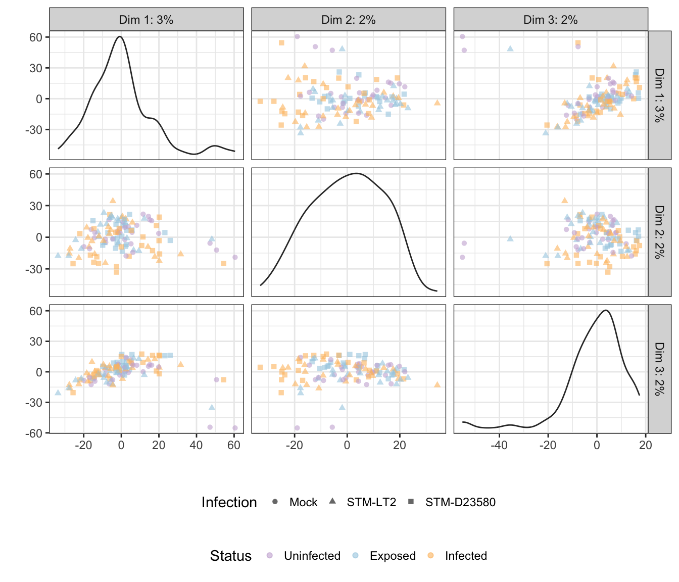
Treatment

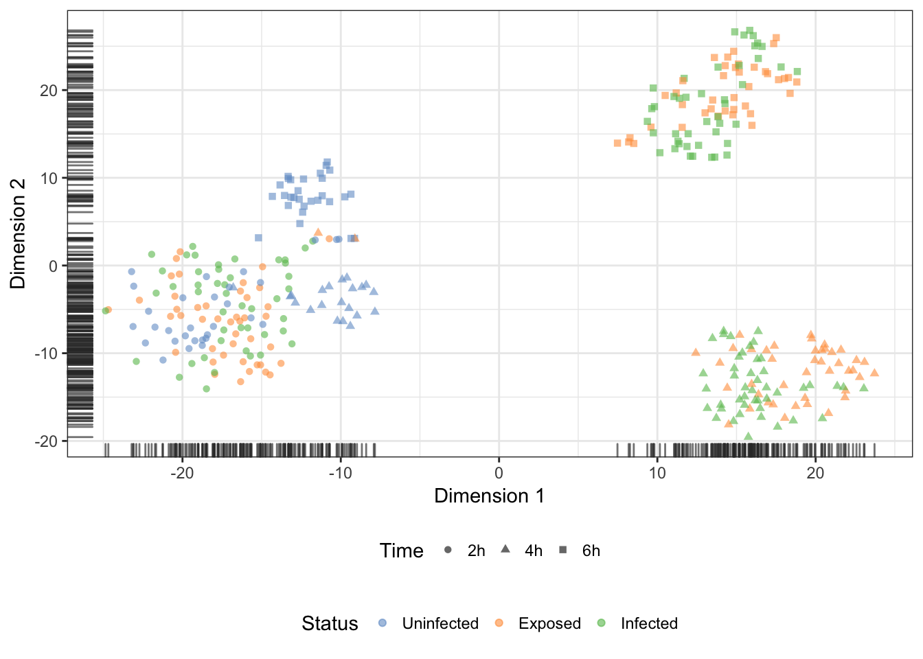
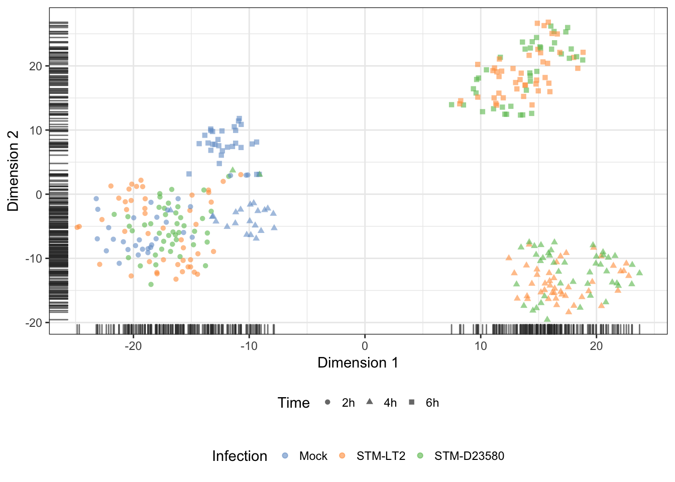
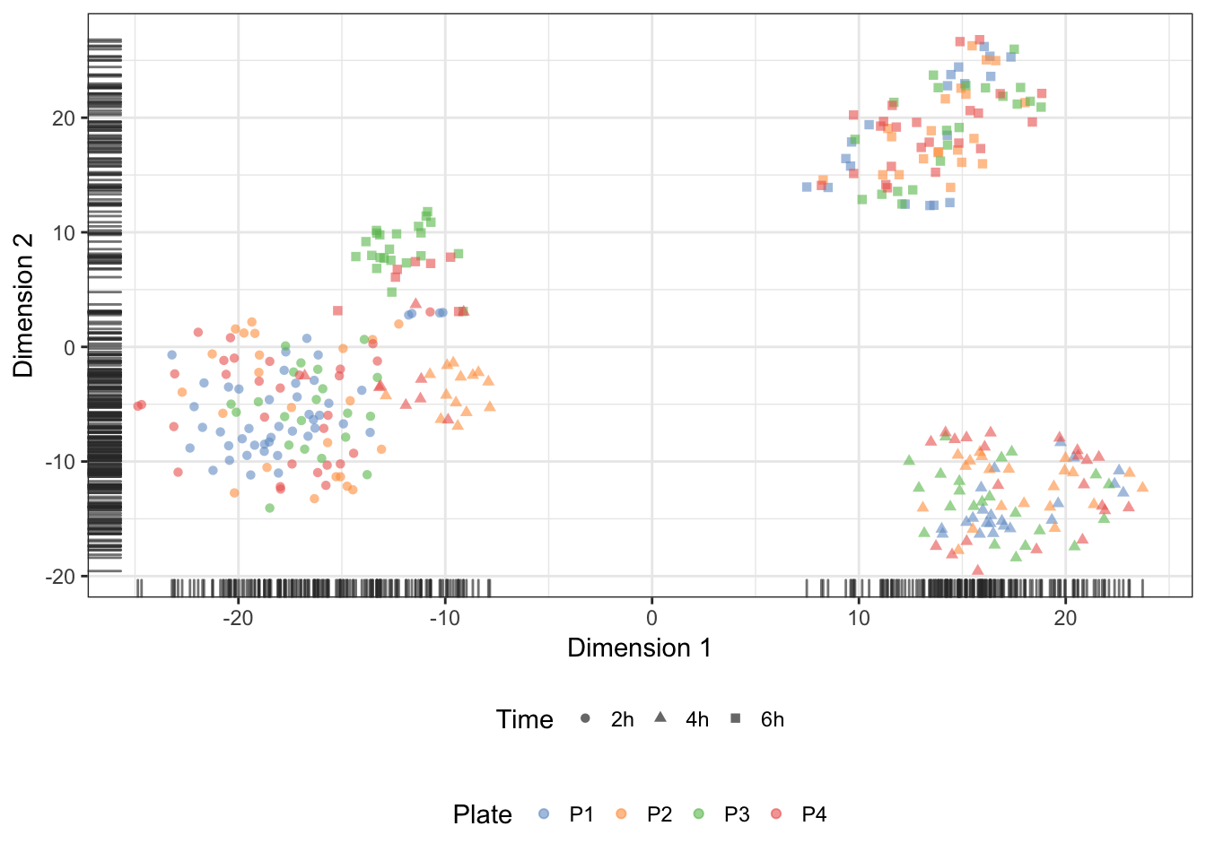
t-distributed stochastic neighbour embedding (t-SNE)
Experimental factors
Let us apply the t-distributed stochastic neighbour embedding (t-SNE) dimensionality reduction technique on the normalised expression of the 500 most variable endogenous features to check for substructure in the data set. Importantly, let us set the perplexity parameter of the Rtsne function to half the average size of an experimental group of single cells (i.e., 11; see this earlier section for the count of cells per group).
Note: “In t-SNE, the perplexity may be viewed as a knob that sets the number of effective nearest neighbors. It is comparable with the number of nearest neighbors \(k\) that is employed in many manifold learners (see the GitHub website of Laurens van der Maaten). As a consequence, an appropriate value of perplexity is necessary to allow data points (here, single cells) to form clusters with a reasonable number of nearest neighbours; instead, excessively large values of perplexity usually result in large ‘balls’ of uniformly distributed points, as all data points attempt to be equidistant from each other:
sce.norm <- runTSNE(
  sce.norm, ncomponents = 2, exprs_values = "logcounts",
  colour_by = "Status", shape_by = "Time",
  feature_set = !isSpike(sce.norm),
  perplexity = round(mean(table(sce.norm$Group)) / 2),
  rand_seed = 1794,
  return_SCE = TRUE, draw_plot = TRUE
)
Status
Infection
Treatment
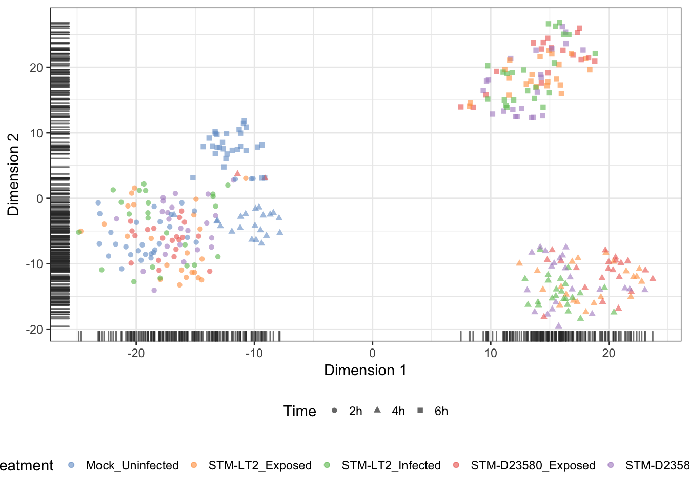
Plate (batch)
We may overlay the plate identifier onto the tSNE coordinates, to demonstrate the absence of batch effect associated with the preparation of sequencing libraries:
quickCluster (normalisation)
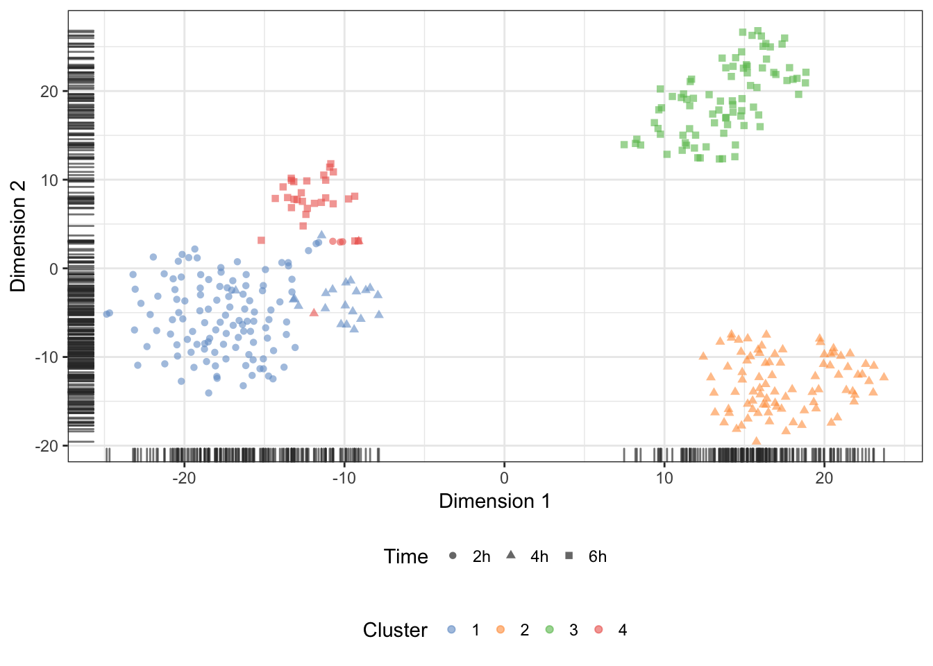
We may also overlay the clusters identify during normalisation onto the t-SNE:
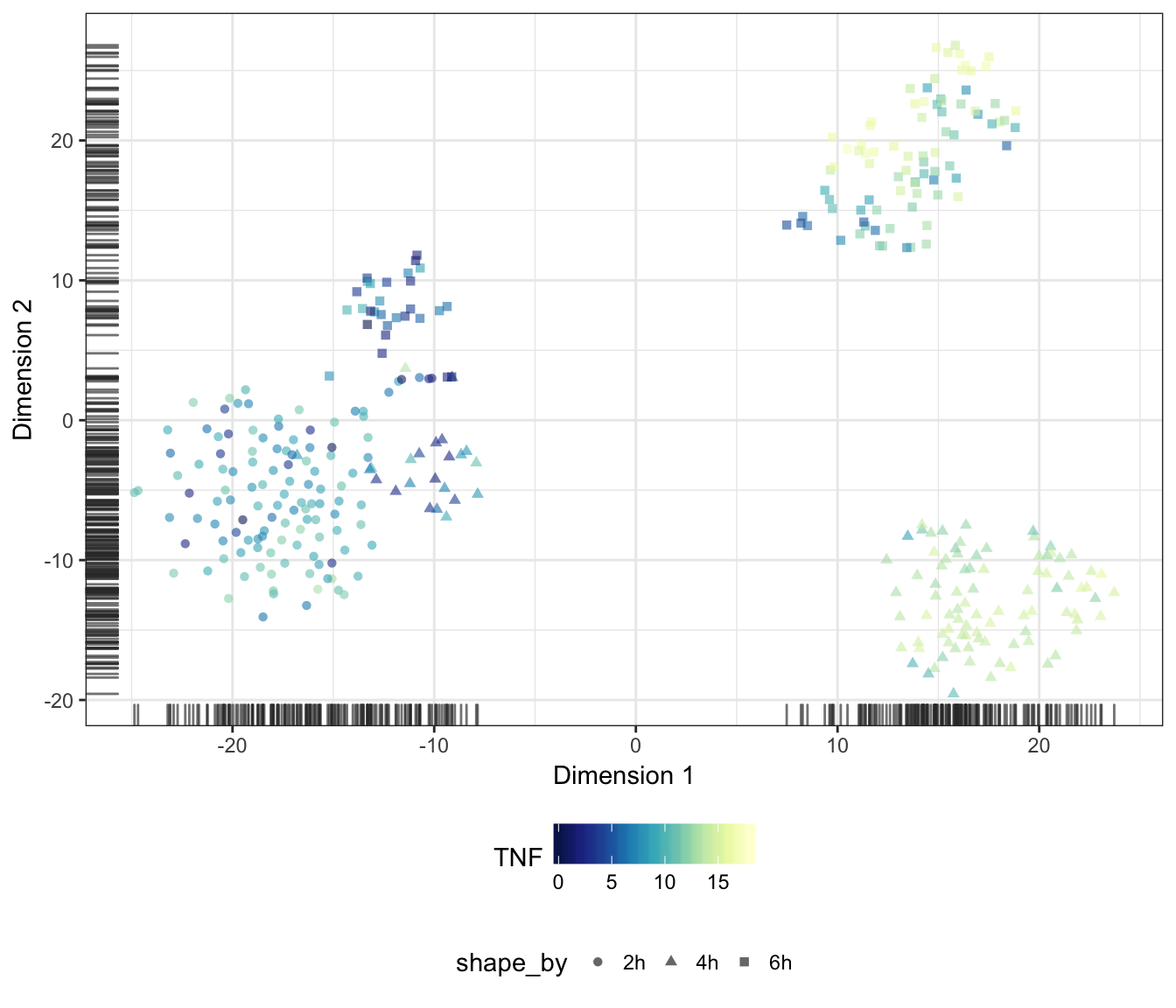
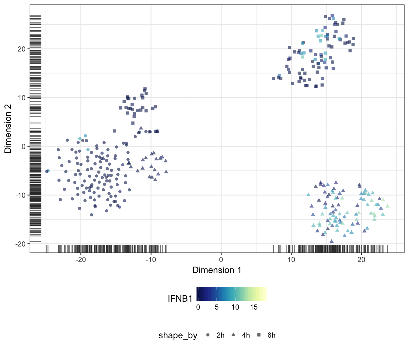
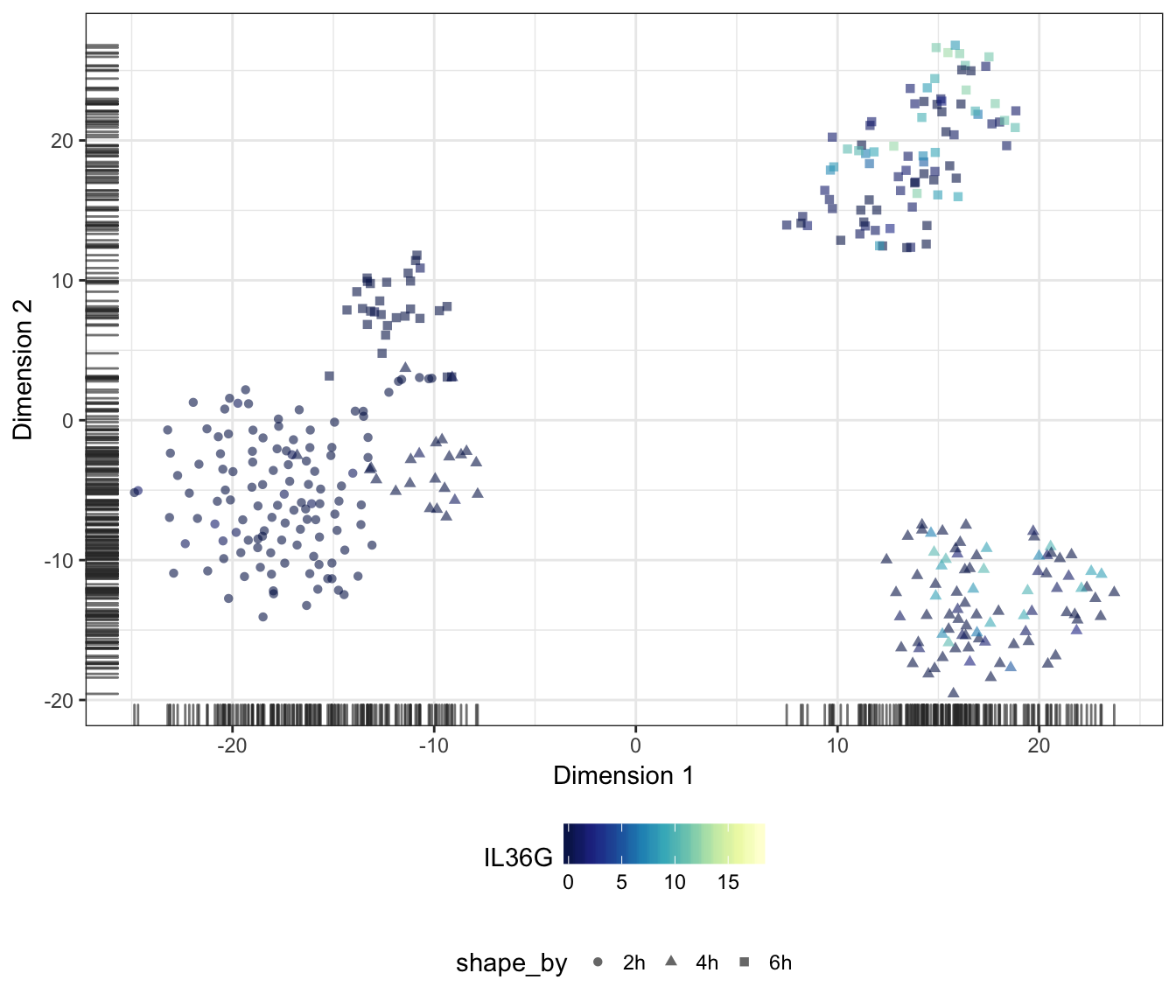
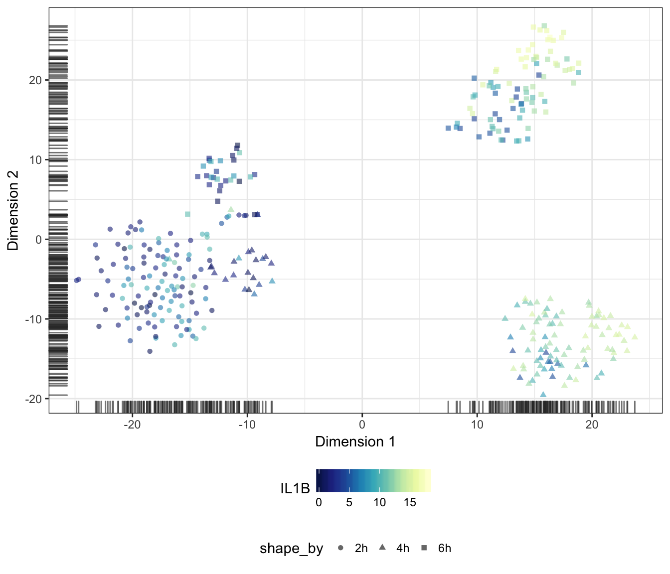
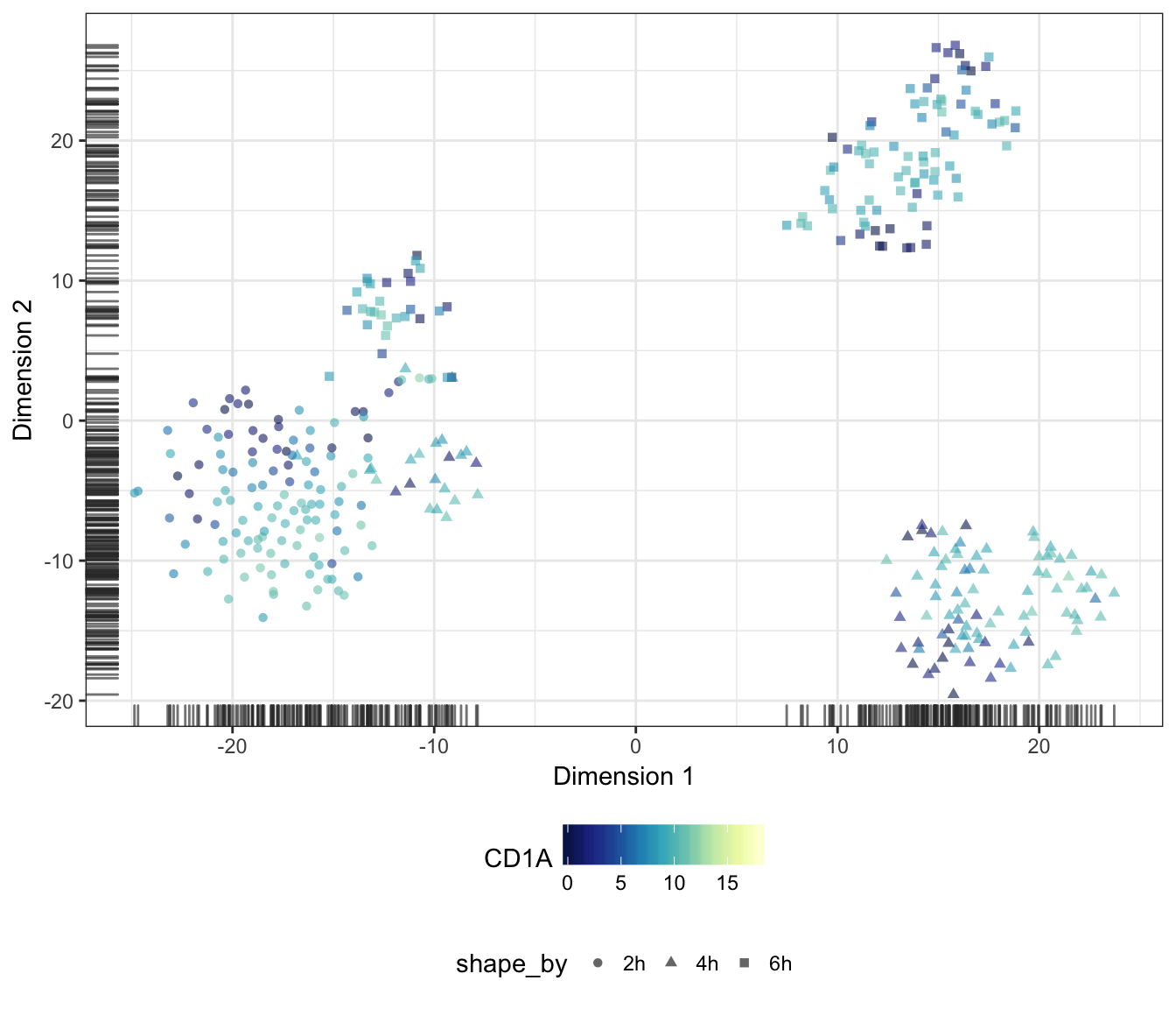
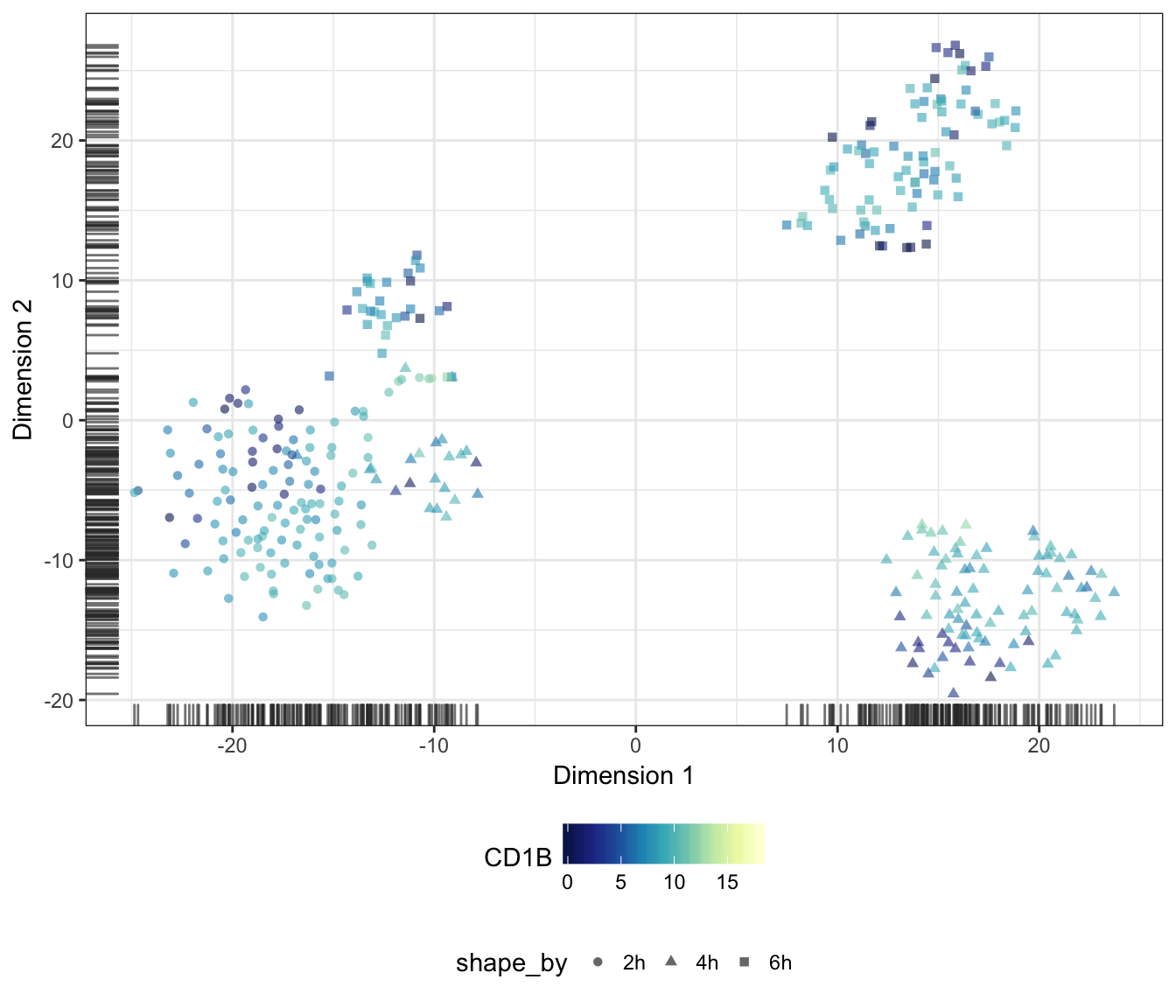
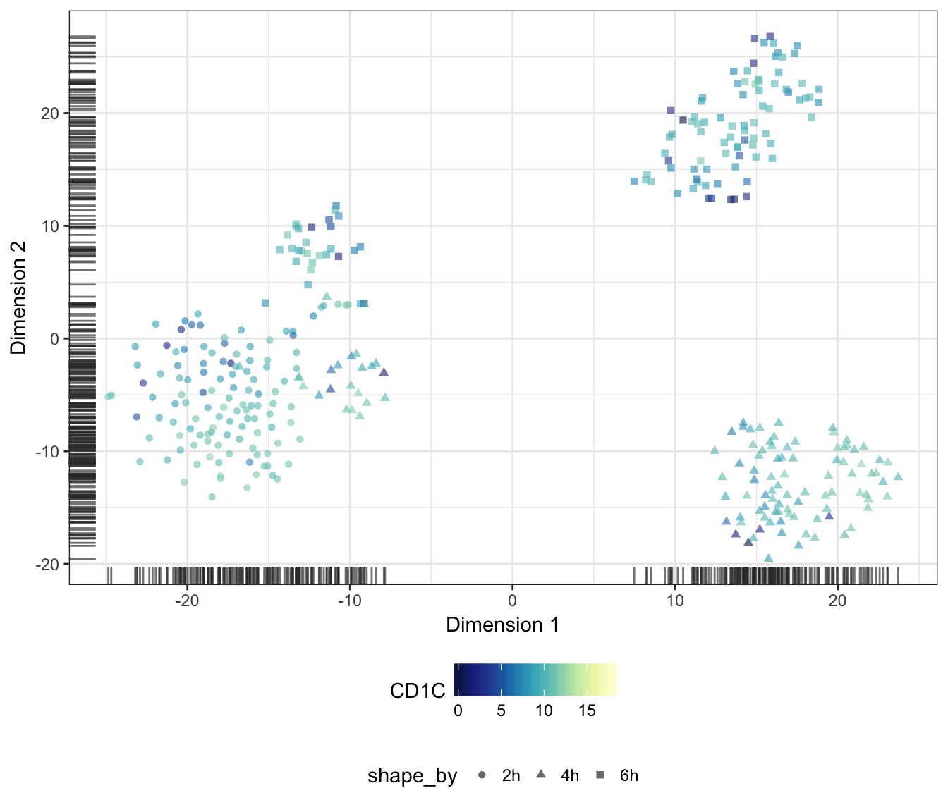
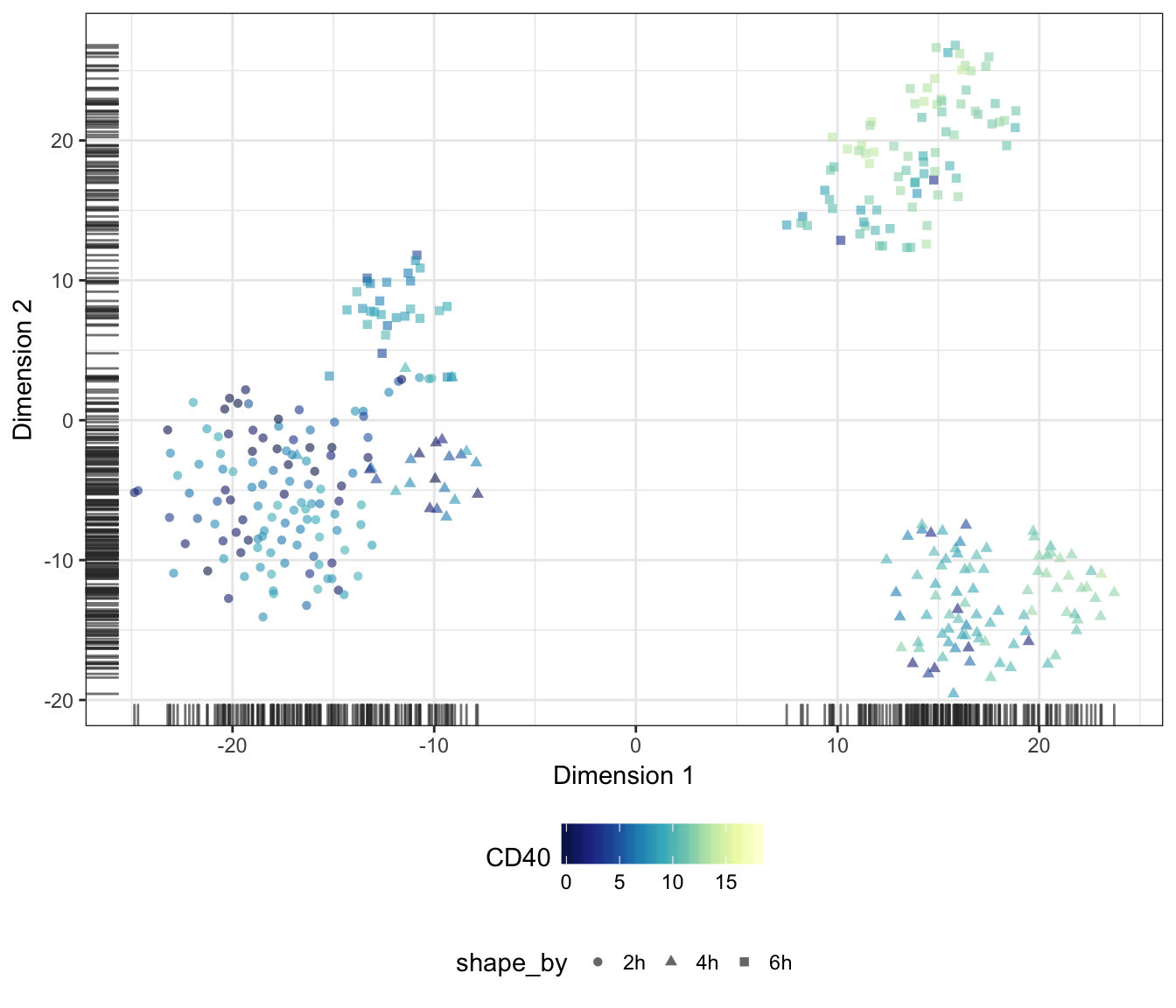
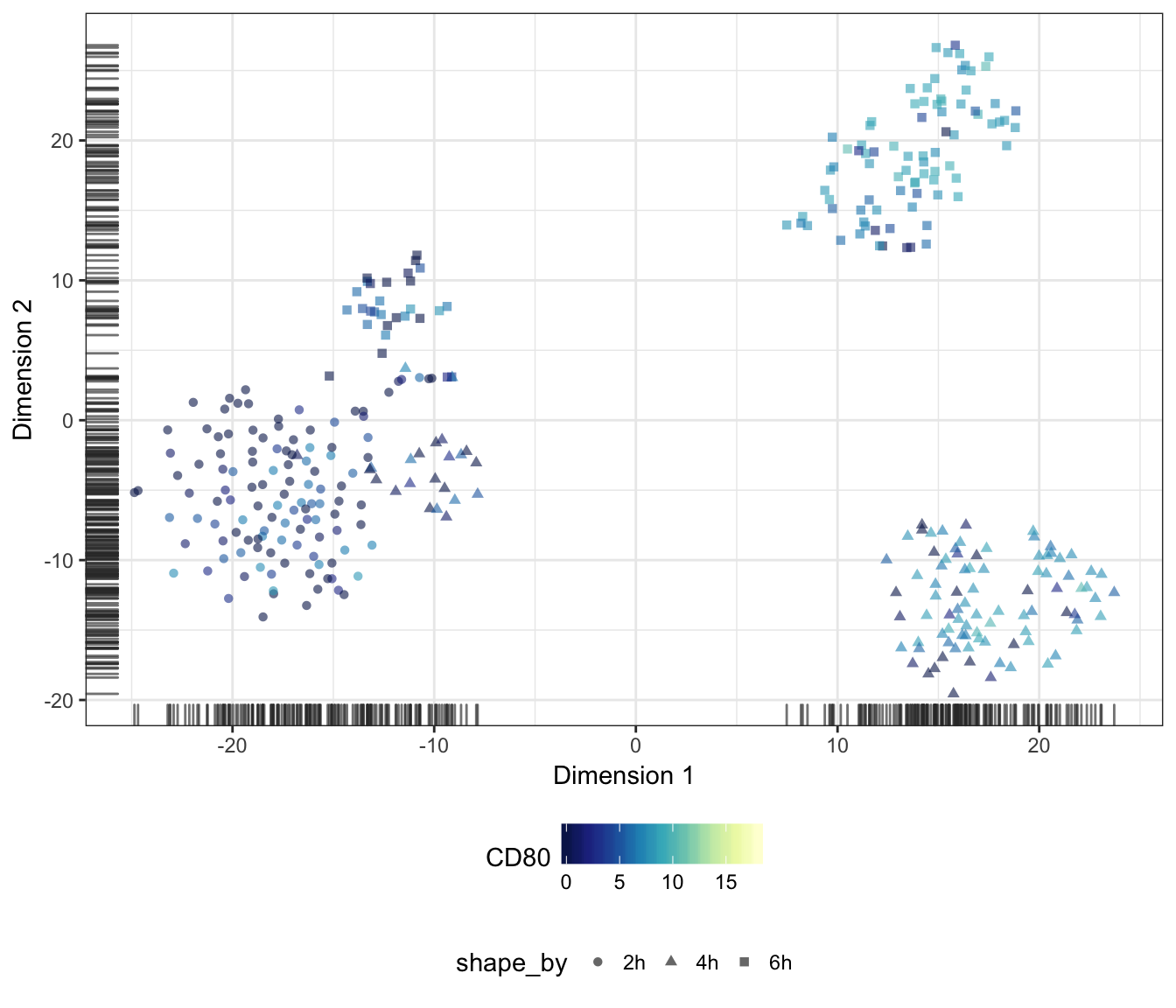
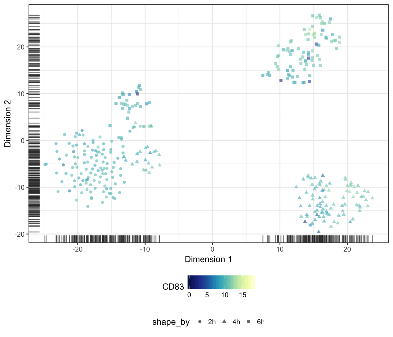
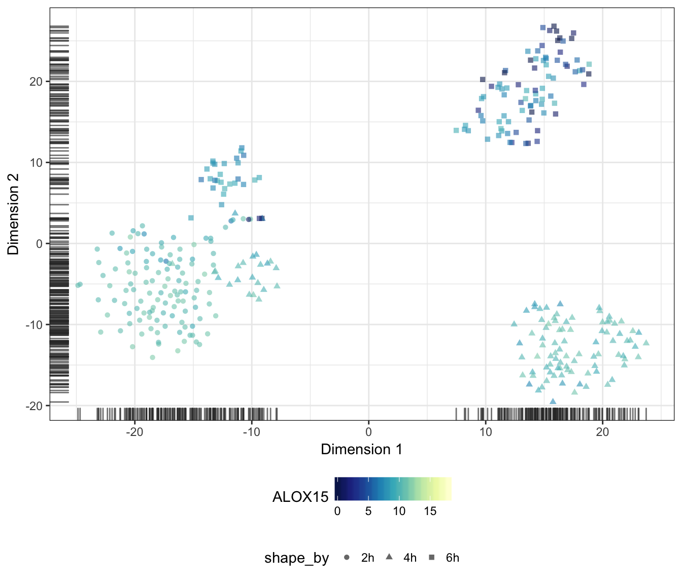
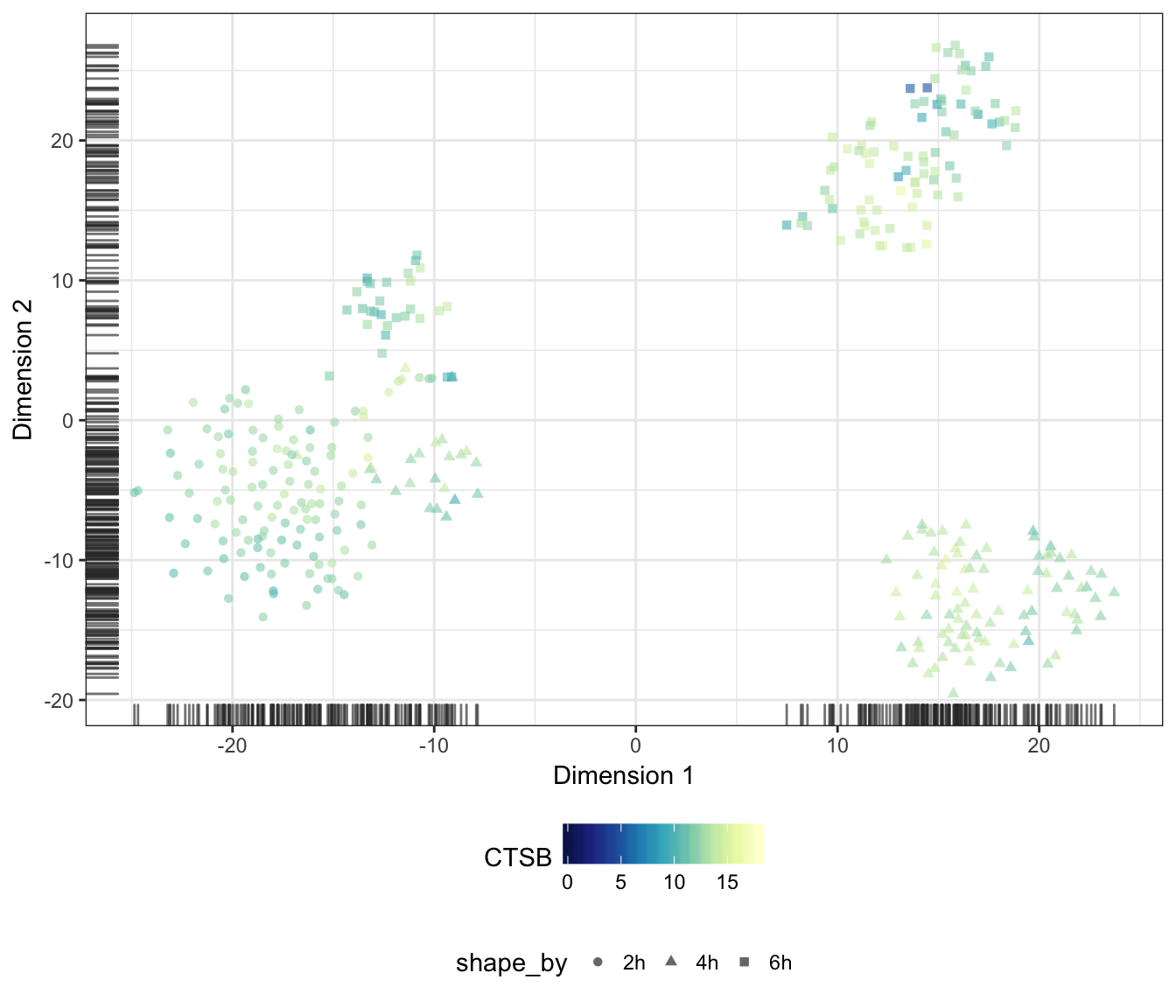
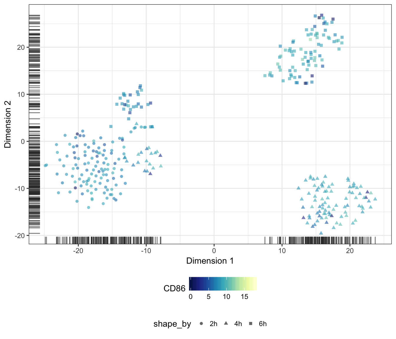
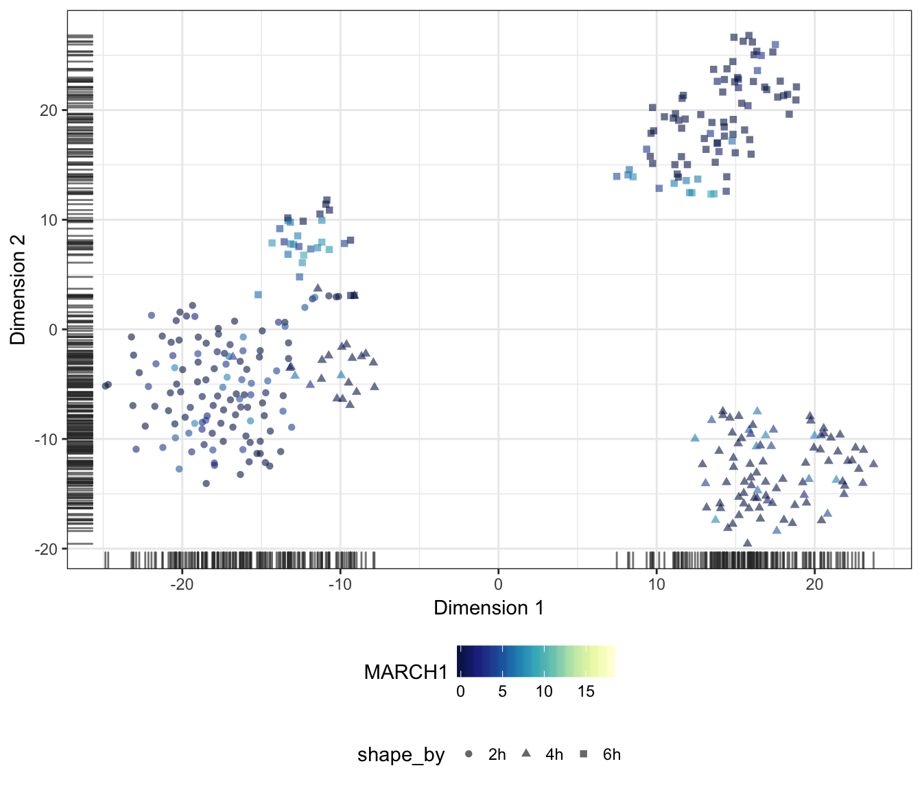
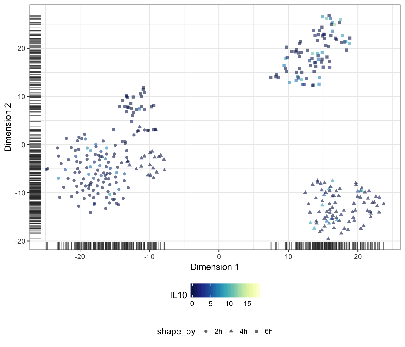
Genes
Alternatively, we may also overlay the expression level of a particular gene onto the data points as a colour gradient.
For this purpose, let us first set a common colour scale that ranges from the lowest to the highest expression values observed in the data set:
exprScale <- range(assay(sce.norm, "logcounts"))
colourScale <- rev(brewer.pal(9, "YlGnBu"))
TNF
IFNB1
IL12B

IL36G
IL1B
CD1A
CD1B
CD1C
RAMP1

CD40
CD80
CD83
ALOX15
CD209

CTSB
CD86
MARCH1
IL10
Diffusion map
Finally, let us also produce a diffusion map plot of two components as a dimensionality reduction of the endogenous features:
plotDiffusionMap(
  sce.norm,
  colour_by = "Status", shape_by = "Time",
  feature_set = !isSpike(sce.norm, "ERCC"),
  rand_seed = 1794) + PCAtheme
## Warning in .disambiguate_args(...): non-plotting arguments like
## 'feature_set' should go in 'run_args'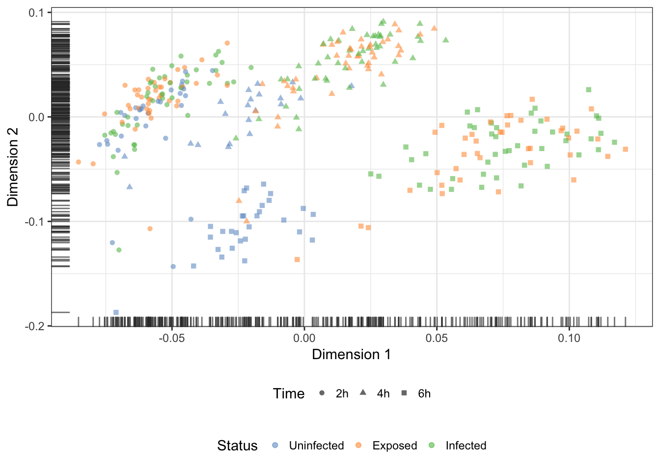
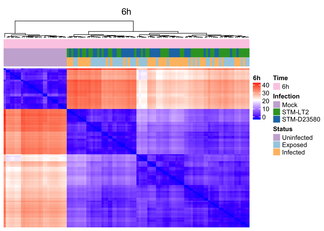
Pairwise distance beween samples in tSNE
The high-dimensional nature of gene expression data sets presents significant challenges for many analytical and visualisation methods. In particular, the set of low-dimensional coordinates produced by the tSNE technique can greatly facilitate the calculation of distance matrices, and the identification of robust clusters of cells in the data set.
Subset time points
Considering the overwhelming effect of the Time factor, let us examine pairwise distance and hierarchical clustering of cells within each time-point:
2h
sce.2h <- sce.norm[,sce.norm$Time == '2h']
dim(sce.2h)
## [1] 8270 1194h
sce.4h <- sce.norm[,sce.norm$Time == '4h']
dim(sce.4h)
## [1] 8270 1106h
sce.6h <- sce.norm[,sce.norm$Time == '6h']
dim(sce.6h)
## [1] 8270 113Estimate pairwise Euclidian distance in tSNE
2h
d.e.2h <- dist(reducedDim(sce.2h, "TSNE"), diag = TRUE, upper = TRUE)
mat.e.2h <- as.matrix(d.e.2h)
h.e.2h <- hclust(d.e.2h)
ord.mat.2h <- mat.e.2h[h.e.2h$order, h.e.2h$order]
rm(d.e.2h)
4h
d.e.4h <- dist(reducedDim(sce.4h, "TSNE"), diag = TRUE, upper = TRUE)
mat.e.4h <- as.matrix(d.e.4h)
h.e.4h <- hclust(d.e.4h)
ord.mat.4h <- mat.e.4h[h.e.4h$order, h.e.4h$order]
rm(d.e.4h)
6h
d.e.6h <- dist(reducedDim(sce.6h, "TSNE"), diag = TRUE, upper = TRUE)
mat.e.6h <- as.matrix(d.e.6h)
h.e.6h <- hclust(d.e.6h)
ord.mat.6h <- mat.e.6h[h.e.6h$order, h.e.6h$order]
rm(d.e.6h)
Prepare heatmaps
Let us first define a colour gradient common to all three time-points:
distRange <- range(c(mat.e.2h, mat.e.4h, mat.e.6h))
colorMap.eucl <- colorRamp2(
  c(min(distRange), median(distRange), max(distRange)),
  c("blue","white","red"))
2h
ht_column <- HeatmapAnnotation(
  df = data.frame(colData(sce.2h)[,c("Time", "Infection", "Status")]),
  col = list(Time = col.time, Status = col.status, Infection = col.infection)
)
ht.2h <- Heatmap(
  mat.e.2h, colorMap.eucl, name = "2h", column_title = "2h",
  top_annotation = ht_column,
  row_dend_reorder=rev(nrow(mat.e.2h):1),
  column_dend_reorder=rev(ncol(mat.e.2h):1),
  show_row_dend = FALSE, show_row_names = FALSE, show_column_names = FALSE
)
4h
ht_column <- HeatmapAnnotation(
  df = data.frame(colData(sce.2h)[,c("Time", "Infection", "Status")]),
  col = list(Time = col.time, Status = col.status, Infection = col.infection)
)
ht.4h <- Heatmap(
  mat.e.4h, colorMap.eucl, name = "4h", column_title = "4h",
  top_annotation = ht_column,
  row_dend_reorder=rev(nrow(mat.e.4h):1),
  column_dend_reorder=rev(ncol(mat.e.4h):1),
  show_row_dend = FALSE, show_row_names = FALSE, show_column_names = FALSE
)
6h
ht_column <- HeatmapAnnotation(
  df = data.frame(colData(sce.6h)[,c("Time", "Infection", "Status")]),
  col = list(Time = col.time, Status = col.status, Infection = col.infection)
)
ht.6h <- Heatmap(
  mat.e.6h, colorMap.eucl, name = "6h", column_title = "6h",
  top_annotation = ht_column,
  row_dend_reorder=rev(nrow(mat.e.6h):1),
  column_dend_reorder=rev(ncol(mat.e.6h):1),
  show_row_dend = FALSE, show_row_names = FALSE, show_column_names = FALSE
)
Heat maps
2h
4h
6h
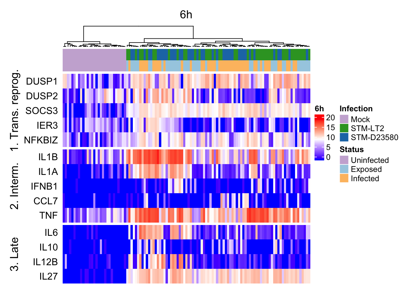
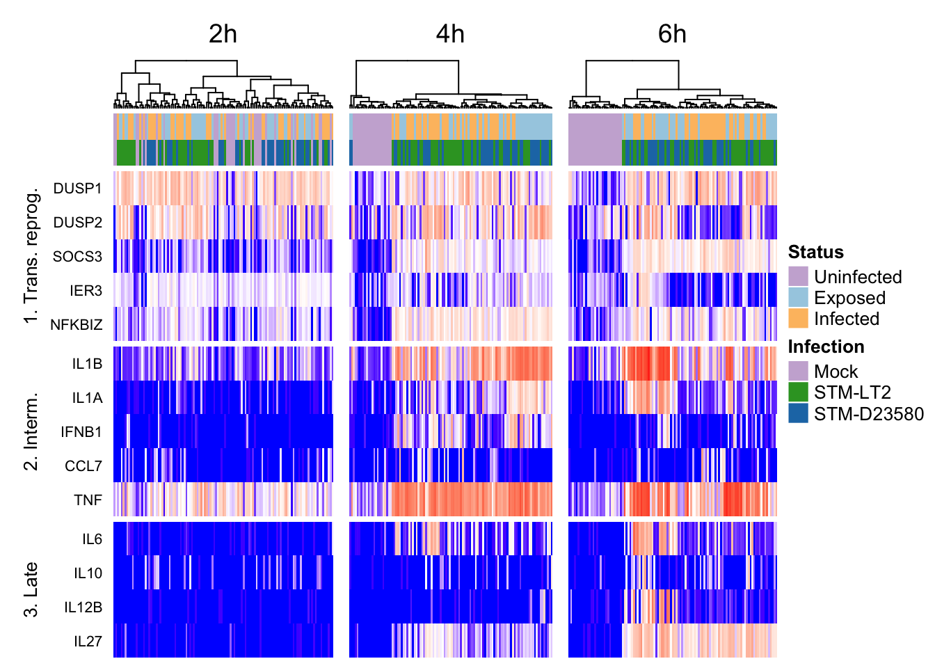
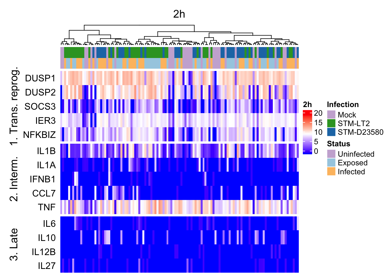
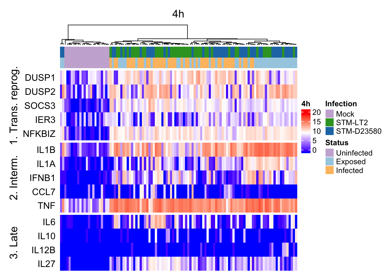
Heat maps of selected marker genes
It is also possible to use the above hierarchical clustering of cells (based on tSNE coordinates) to preserve the order of cells in heat maps used to display the expression levels of selected genes, thereby emphasising particular gene expression differences between clusters of cells defined by their broader transcriptome.
Let us first define:
- relevant gene identifiers:
geneNames.ht <- list(
  "1. Trans. reprog." = c("DUSP1","DUSP2","SOCS3","IER3","NFKBIZ"),
  "2. Interm." = c("IL1B","IL1A","IFNB1","CCL7","TNF"),
  "3. Late" = c("IL6","IL10","IL12B","IL27")
)
geneIds.ht <- with(
  rowData(sce.norm),
  gene_id[match(unlist(geneNames.ht), gene_name)]
)- a colour scale of expression levels common to the individual heat maps:
exprsRange <- range(assay(sce.norm, "logcounts"))
colorMap.exprs <- colorRamp2(
  c(min(exprsRange), median(exprsRange), max(exprsRange)),
  c("blue","white","red"))
Prepare heat maps
2h
ht_column <- HeatmapAnnotation(
  df = data.frame(colData(sce.2h)[,c("Infection", "Status")]),
  col = list(Status = col.status, Infection = col.infection)
)
exprs.2h <- assay(sce.2h, "logcounts")[geneIds.ht,]
rownames(exprs.2h) <- unlist(geneNames.ht)
ht_gene_2h <- Heatmap(
  exprs.2h, colorMap.exprs, name = "2h", column_title = "2h",
  top_annotation = ht_column, row_names_side = "left",
  cluster_rows = FALSE, cluster_columns = h.e.2h,
  show_row_dend = FALSE, show_column_names = FALSE,
  split = rep(names(geneNames.ht), times = lengths(geneNames.ht))
)
4h
ht_column <- HeatmapAnnotation(
  df = data.frame(colData(sce.4h)[,c("Infection", "Status")]),
  col = list(Status = col.status, Infection = col.infection)
)
exprs.4h <- assay(sce.4h, "logcounts")[geneIds.ht,]
rownames(exprs.4h) <- unlist(geneNames.ht)
ht_gene_4h <- Heatmap(
  exprs.4h, colorMap.exprs, name = "4h", column_title = "4h",
  top_annotation = ht_column, row_names_side = "left",
  cluster_rows = FALSE, cluster_columns = h.e.4h,
  show_row_dend = FALSE, show_column_names = FALSE,
  split = rep(names(geneNames.ht), times = lengths(geneNames.ht))
)
6h
ht_column <- HeatmapAnnotation(
  df = data.frame(colData(sce.6h)[,c("Infection", "Status")]),
  col = list(Status = col.status, Infection = col.infection)
)
exprs.6h <- assay(sce.6h, "logcounts")[geneIds.ht,]
rownames(exprs.6h) <- unlist(geneNames.ht)
ht_gene_6h <- Heatmap(
  exprs.6h, colorMap.exprs, name = "6h", column_title = "6h",
  top_annotation = ht_column, row_names_side = "left",
  cluster_rows = FALSE, cluster_columns = h.e.6h,
  show_row_dend = FALSE, show_column_names = FALSE,
  split = rep(names(geneNames.ht), times = lengths(geneNames.ht))
)
Heat maps
all
2h
4h
6h