Feature selection
Preliminary notes
This section uses objects defined in previous sections of the website, namely:
mixC: concentrations of ERCC spike-in molecules in mix (ERCC content),ERCCs: names of the ERCC spike-in features in the count matrix (Sample QC#blanks),MTs: names of the mitochondrial gene features in the count matrix (Sample QC#calculateQCMetrics).
Correlation of bulks and single cell average
Preprocessing
Let us first calculate the log2-transformed count per million (CPM) after adding a default \(0.25\) count to all genes, to avoid computing the logarithm of \(0\):
logCPM.cells <- edgeR::cpm(counts(sce.pass), log=TRUE, prior.count=0.25)
logCPM.bulk <- edgeR::cpm(counts(sce.bulk), log=TRUE, prior.count=0.25)
Let us progressively collect data for each experimental group:
bulkSCdata <- data.frame()
for (x_group in levels(sce.pass$Group)){
  message(x_group)
  time <- gsub("^(.*h)_.*", "\\1", x_group)
  infection <- gsub(".*_(.*)_.*", "\\1", x_group)
  status <- gsub(".*_.*_(.*)", "\\1", x_group)
  treatment <- gsub(".*_(.*_.*)", "\\1", x_group)
  cellIndex <- (sce.pass$Group == x_group)
  featureIndex <- (
    rowSums(counts(sce.pass)) > 0 |
      rowSums(counts(sce.bulk)) > 0)
  cellAvg <- rowMeans(logCPM.cells[featureIndex, cellIndex])
  bulkExpr <- logCPM.bulk[
    featureIndex,
    which(sce.bulk$Time == time & sce.bulk$Infection == infection)
  ]
  geneNames <- names(cellAvg)
  bulkSCdata <- rbind(
    bulkSCdata,
    data.frame(
      Cells = cellAvg,
      Bulk = bulkExpr[geneNames], # ensure order identical to single cells
      Gene = geneNames,
      Group = x_group, Treatment = treatment,
      Time = time, Infection = infection, Status = status
    )
  )
}
Stimulated bulk samples are expected to be a mixture of infected (minority; < 5%) and exposed cells (vast majority; > 95%). We may therefore compare the average expression in each subset of cells against the bulk average, both in log2(CPM), to identify potential differences. For reference, let us also indicate the identity line (\(y=x\)) in grey:
bulkSCdata$ERCC <- grepl("^ERCC-", bulkSCdata$Gene)
ggplot(bulkSCdata) +
  geom_hex(aes(Bulk, Cells), subset(bulkSCdata, !ERCC)) +
  geom_point(aes(Bulk, Cells), subset(bulkSCdata, ERCC),size=0.1,colour="red")+
  geom_abline(slope = 1, intercept = 0, colour = "grey") +
  coord_fixed(ratio = 1) + labs(y="Cell average") + guides(fill = FALSE) +
  facet_grid(Infection + Status ~ Time) +
  theme_minimal() + theme(
    axis.text.x = element_text(size = rel(0.5)),
    axis.text.y = element_text(size = rel(0.5))
  ) + guides(fill = "none")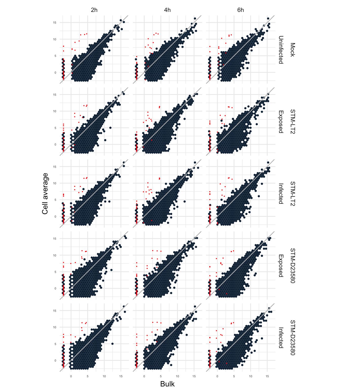
The figure above displays generally higher detection levels in bulk samples for a large proportion of genes; this demonstrates the higher frequency of dropout events in single cell samples, and the average measurement of bulk that rescues detection of rarer transcripts expressed stochastically at low levels or in few cells.
Overview of feature detection levels
Having selected single cells that pass all quality control criteria in the previous sections, let us identify features that are robustly detected across single cells in the data set. Indeed, features detected in a small count of cells, or expressed at very low levels carry limited information for differential expression analyses; moreover, those features negatively affect the performance of normalisation algorithms, due to the large number of dropout (i.e., zero count) events (Lun, McCarthy, and Marioni 2016; Brennecke et al. 2013).
Counts per million (CPM)
First, let us initalise the matrix of CPM:
SingleCellExperiment::cpm(sce.pass) <- edgeR::cpm(counts(sce.pass))
range(colSums(cpm(sce.pass)))
## [1] 1e+06 1e+06Note: The SingleCellExperiment::cpm method is an accessor to the corresponding slot of SingleCellExperiment objects, while the edgeR::cpm method calculates normalised counts per million (CPM) for given a matrix of read counts. Furthermore, in the absence of size factors, CPM are computed using the total count of read (i.e., library size) for each sample, without further normalisation of library sizes between samples.
Detection frequency and mean expression level
For this purpose, let us first calculate updated QC metrics–in the subset of cells that passed quality control in the previous section–using once more the scater calculateQCMetrics method:
sce.pass <- calculateQCMetrics(
  sce.pass, feature_controls = list(ERCC = ERCCs, MT = MTs)
)
## Note that the names of some metrics have changed, see 'Renamed metrics' in ?calculateQCMetrics.
## Old names are currently maintained for back-compatibility, but may be removed in future releases.We may then examine for each feature the proportion of cells in which it is detected (non-zero expression level) against its average expression level across all cells:
plotExprsFreqVsMean(
  sce.pass,
  feature_controls = rowData(sce.pass)[,"is_feature_control_ERCC"]
)
## Warning in .get_all_sf_sets(object): spike-in set 'ERCC' should have its
## own size factors## `geom_smooth()` using method = 'loess'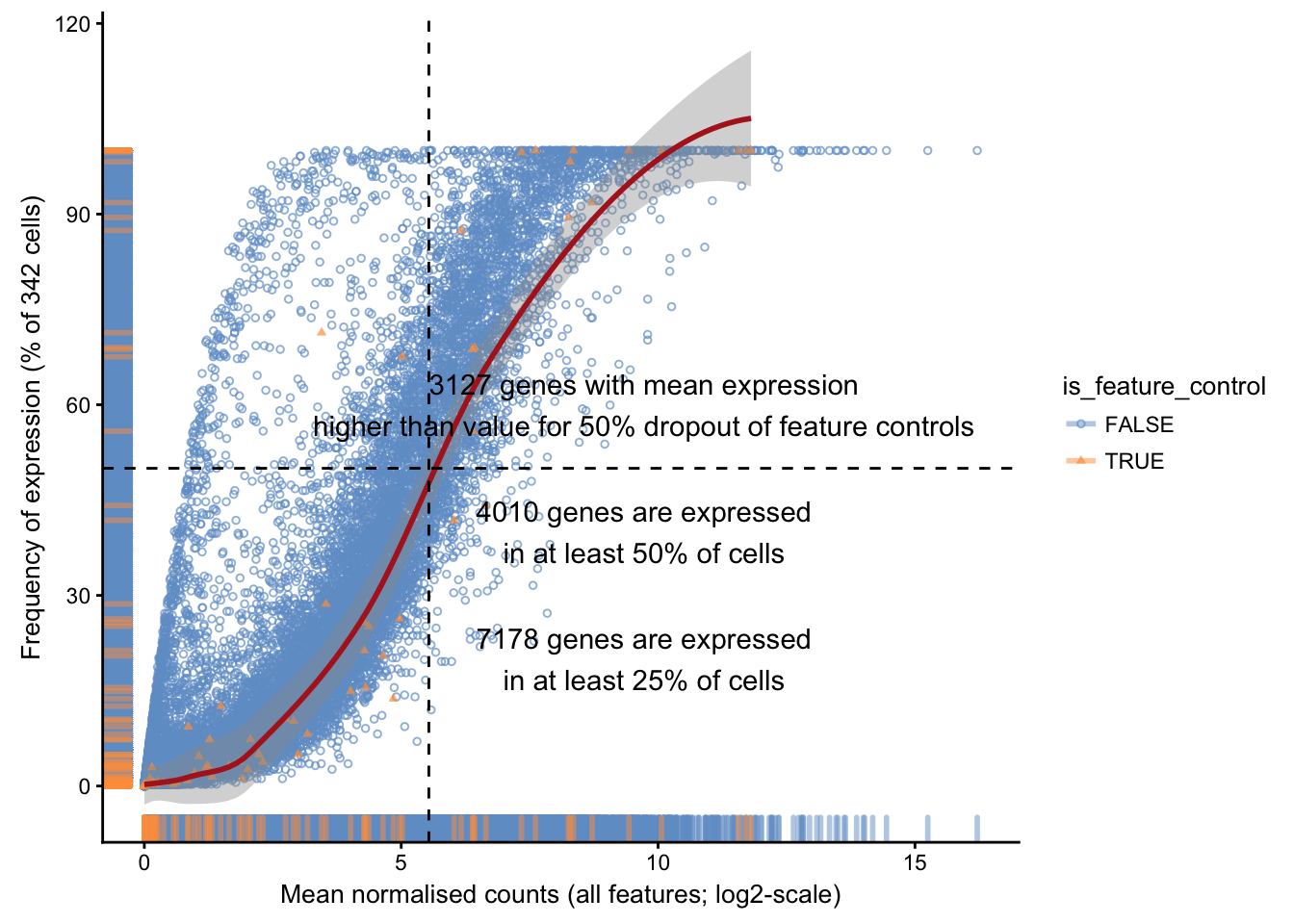
Spike-in expectations
Let us compare the expected number of spike-in molecules introduced in each sample (calculated in this earlier section) against the average count detected across all single cells, while indicating the identity relationship (\(y=x\)) as a solid black line:
mixC$avgCount <- rowMeans(counts(sce.pass)[mixC$ID,])
ggplot(mixC) +
  geom_point(aes(ERCCmolecules, avgCount)) +
  geom_abline(slope = 1, intercept = 0, linetype = "dashed", colour = "red") +
  labs(
    x = "Estimated ERCC molecules injected",
    y = "Average observed fragment count in cells passed QC") +
  scale_x_log10() + scale_y_log10() + coord_fixed(ratio = 1) + theme_minimal()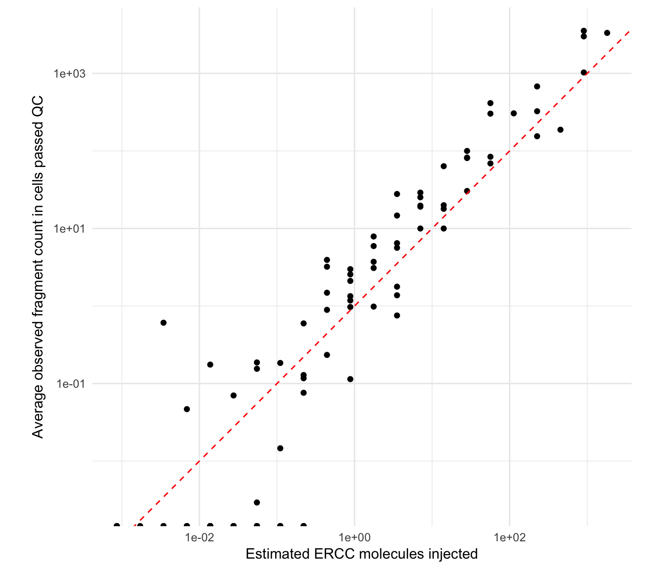
Definition of detected features
Count of genes by mean expression level
Let us examine the distribution of log-mean CPM across all genes, while indicating an average value of 1 CPM by a vertical blue dashed line:
ave.cpm <- rowMeans(cpm(sce.pass))
hist(
  log10(ave.cpm), breaks = 100,
  main = "", xlab = expression(Log[10]~"average CPM", col="grey80")
)
abline(v = log10(1), col = "blue", lwd = 2, lty = 2)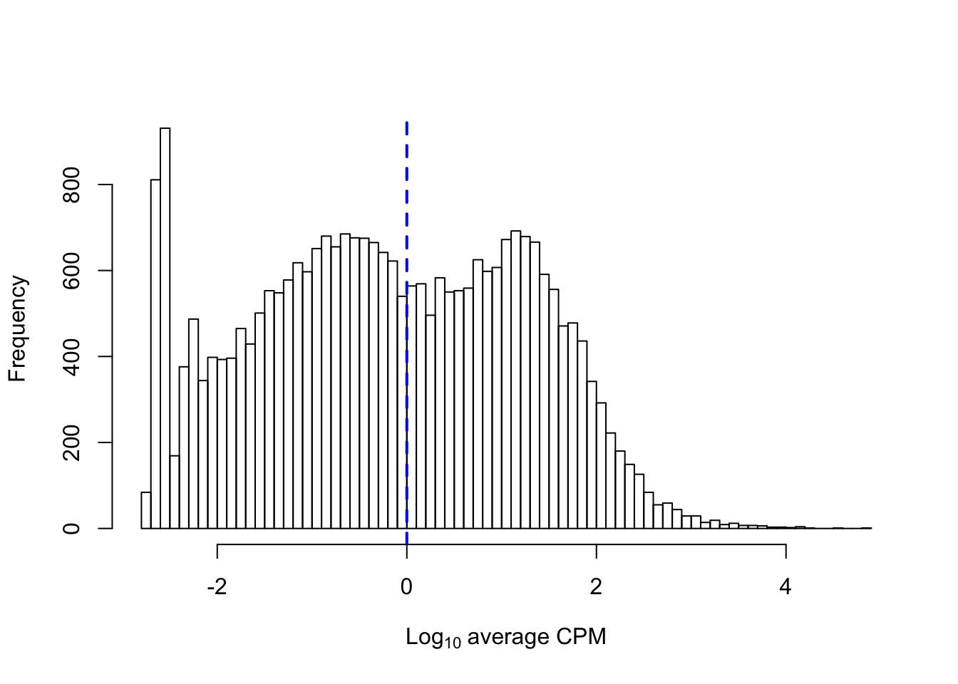
Count of cells with detectable expression
We may compare the above figure with the a smoother representation of the count of cells in which each feature is detected against the average log10-transformed count of reads assigned to that same feature, while marking the same cut-off threshold of an average 1 count across all cells:
numcells <- nexprs(sce.pass, byrow = TRUE)
is.ercc <- rowData(sce.pass)[,"is_feature_control_ERCC"]
smoothScatter(
  log10(ave.cpm), numcells, xlab=expression(Log[10]~"average CPM"),
  ylab="Number of expressing cells"
)
points(
  log10(ave.cpm[is.ercc]), numcells[is.ercc],
  col = "red", pch = 16, cex = 0.5
)
abline(v = log10(1), col = "blue", lwd = 2, lty = 2)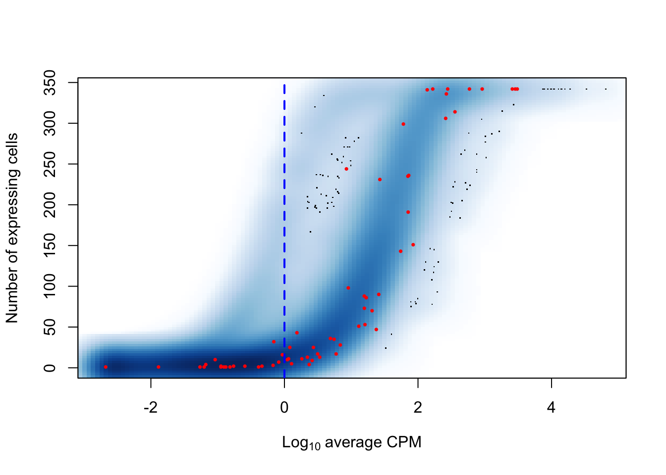
Distribution of expression levels within groups
Density
Let us first calculate the average CPM for each gene within each experimental group:
avgCPMbyGroup <- apply(
  cpm(sce.pass)[!isSpike(sce.pass, "ERCC"),],
  1,
  function(x){tapply(x, sce.pass$Group, mean)})
avgCPMbyGroup <- reshape2::melt(
  avgCPMbyGroup,
  varnames = c("Group", "Feature"),
  value.name = "AvgCPM"
)
avgCPMbyGroup[,c("Time","Infection","Status")] <-
  limma::strsplit2(avgCPMbyGroup$Group, "_")
The following figure displays the resulting distribution of average log10(CPM) within each experimental group of single cells (after removal of zero-count genes):
## Warning: Removed 644273 rows containing non-finite values (stat_bin).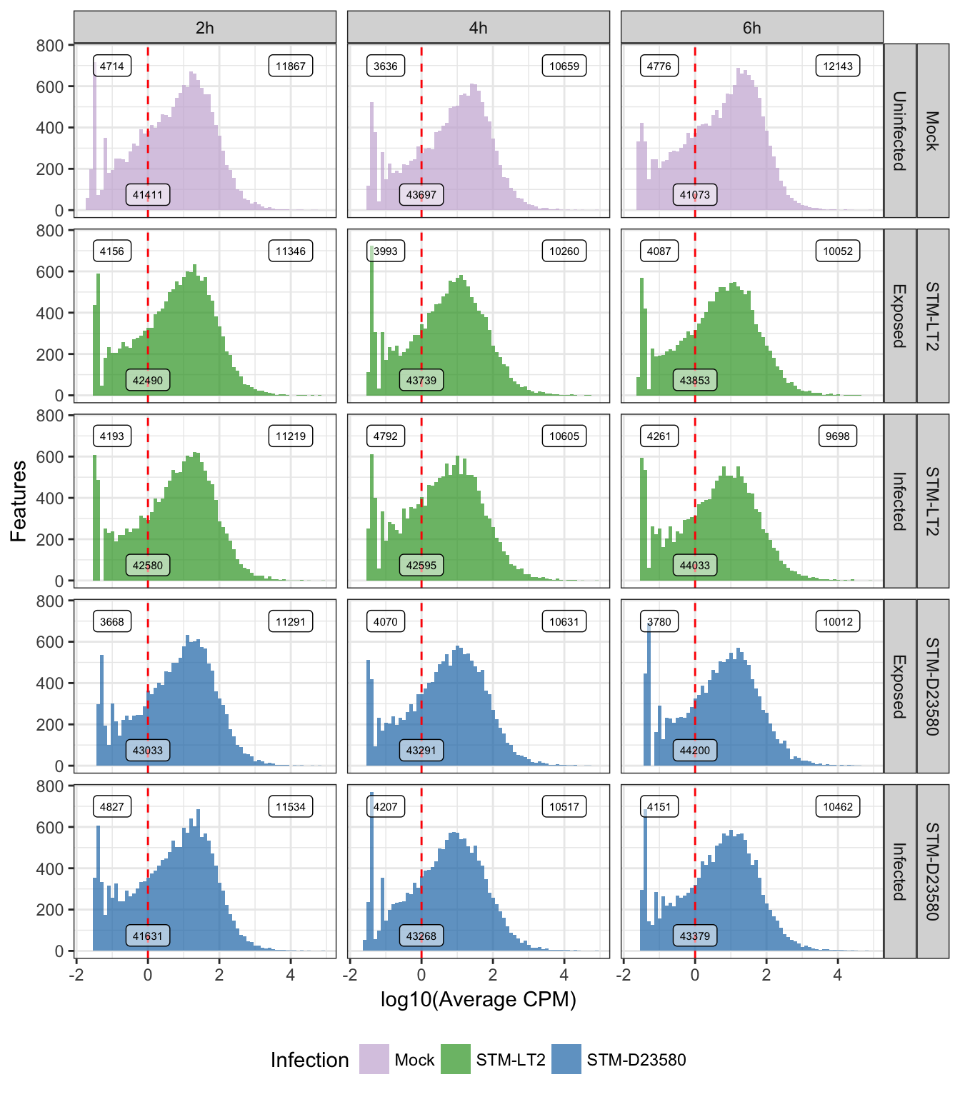
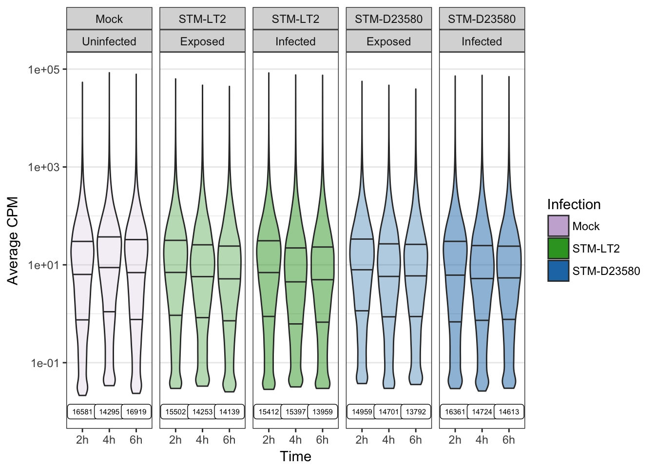
Violin
Alternatively, we may also display the distribution of average log10(CPM) within each experimental group of single cells as a violin plot.
Let us first identify the count of detected features in each experimental group of cells:
detectedCounts <- data.frame(
  Group = levels(avgCPMbyGroup$Group), y = 1E-2,
  Count = with(avgCPMbyGroup, tapply(AvgCPM, Group, function(x){sum(x>0)}))
)
detectedCounts$Time <- factor(
  gsub("(.*)_.*_.*", "\\1", detectedCounts$Group), levels(sce.pass$Time)
)
detectedCounts$Infection <- factor(
  gsub(".*_(.*)_.*", "\\1", detectedCounts$Group), levels(sce.pass$Infection)
)
detectedCounts$Status <- factor(
  gsub(".*_.*_(.*)", "\\1", detectedCounts$Group), levels(sce.pass$Status)
)
The following figure displays the distribution of average log10(CPM) within each experimental group of single cells, while indicating for each of them the count of non-zero values in each experimental groups:
Selection of detected features
In the context of the present multifactorial experimental design, it is expected that many genes display detectable expression levels in only a subset of experimental conditions (e.g., cells stimulated with bacteria after sufficient time to allow intracellular signalling).
Consequently, let us define informative endogenous features as those that display an average expression level above an expression threshold of 10 counts per million (CPM) in at least 25% of at least 1 experimental group of cells (18-30 cells per group, after the earlier exclusion of outliers).
In contrast, let us define informative spike-in features as those with an average count across all single cells greater or equal to a threhsold of 1 count. Note that the detailed count of cells per group was reported here.
First, let us obtain—for each feature—the proportion of cells within each experimental group of cells that display an expression level above \(20\) CPM:
propOver10byGroup <- apply(
  cpm(sce.pass)[!isSpike(sce.pass, "ERCC"),],
  1,
  function(x){
  tapply(x, sce.pass$Group, function(x){sum(x > 10) / length(x)})
})
propOver10byGroup <- reshape2::melt(
  propOver10byGroup, varnames = c("Group", "Feature"), value.name = "Proportion")
Let us now define whether each feature is detected in at least 25% of each group:
propOver10byGroup$PropOver25pct <- (propOver10byGroup$Proportion > 0.25)Let us then define the count of groups in which each gene is detected above 10 CPM in over 25% of the group:
groupsOver25pct <- as.data.frame(with(
    propOver10byGroup,
    tapply(PropOver25pct, Feature, function(x){sum(x)}))
)
colnames(groupsOver25pct) <- "Groups"
groupsOver25pct$Feature <- rownames(groupsOver25pct)
We may now merge this information with the features detected above 10 CPM in at least 1 group:
detectedCPMandProp <- merge(
  subset(propOver10byGroup, Proportion > 0.25), groupsOver25pct, by = "Feature"
)
detectedCPMandProp <- merge(
  detectedCPMandProp,
  as.data.frame(unique(colData(sce.pass)[,c("Group","Time","Treatment")])),
  by = "Group"
)
And visualise the count of feature detected above 10 CPM of at least 25% of cells in each group, while indicating the count of groups in which each feature passed the above detection cut-offs:
## Warning: Removed 1 rows containing missing values (geom_bar).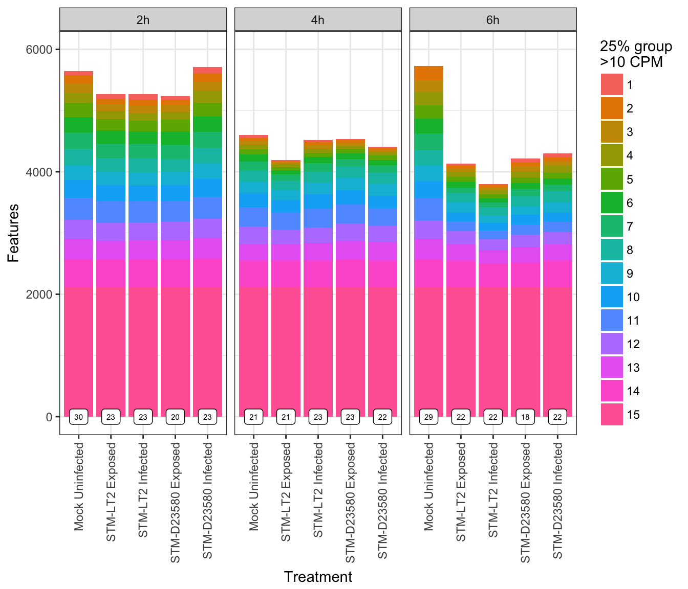
Let us now retain for further analysis:
- endogenous features detected above 10 CPM in at least 25% of at least 1 experimental group of cells
- ERCC spike-in features detected at an average level greater than 1 count across all cells:
detectedFeatures <- names(which(tapply(
  propOver10byGroup$Proportion, propOver10byGroup$Feature,
  function(x){sum(x > 0.25) > 0})))
keepEndogenous <- (rownames(sce.pass) %in% detectedFeatures) &
(!isSpike(sce.pass, "ERCC"))
keepSpike <- (rowMeans(counts(sce.pass)) > 1) & (isSpike(sce.pass))
table(keepEndogenous); table(keepSpike)## keepEndogenous
## FALSE TRUE
## 49858 8226## keepSpike
## FALSE TRUE
## 58040 44Finally, we may extract detected features (endogenous and ERCC spike-in molecules) into a new SCESet:
sce.filtered <- sce.pass[keepEndogenous | keepSpike,]
dim(sce.filtered)
## [1] 8270 342References
Brennecke, P., S. Anders, J. K. Kim, A. A. Kolodziejczyk, X. Zhang, V. Proserpio, B. Baying, et al. 2013. “Accounting for Technical Noise in Single-Cell Rna-Seq Experiments.” Journal Article. Nat Methods 10 (11): 1093–5. doi:10.1038/nmeth.2645.
Lun, A. T., D. J. McCarthy, and J. C. Marioni. 2016. “A Step-by-Step Workflow for Low-Level Analysis of Single-Cell Rna-Seq Data with Bioconductor.” Journal Article. F1000Res 5: 2122. doi:10.12688/f1000research.9501.2.