Highly variable genes (HVGs)
Plotting themes
First of all, let us define theme elements used throughout various figures in the following sections:
exprsViolinTheme <- theme(
    panel.grid.major.x = element_blank(),
    legend.position = "bottom", legend.box = "vertical")
Highly variable genes (HVGs)
We identify HVGs to focus on the genes that are driving heterogeneity across the population of cells. This requires estimation of the variance in expression for each gene, followed by decomposition of the variance into biological and technical components. HVGs are then identified as those genes with the biological component most significantly greater than the technical component. This avoids prioritizing genes that are highly variable due to technical factors such as sampling noise during RNA capture and library preparation.
Define technical component by mean-variance trend
Ideally, the technical component would be estimated by fitting a mean-variance trend to the ERCC spike-in features.
Alternatively, the expression level of endogenous features may be used for this purpose, under the assumption that most endogenous features exhibit mostly technical variation, in contrast to little biological variation.
In both cases, given the mean abundance of a gene, the fitted value of the trend can be used as an estimate of the technical component for that gene. The biological component of the variance may then be calculated by subtracting the technical component from the total variance of each gene with the scran decomposeVar function.
Both methods are shown below. However, for this data set, the use of endogenous features was preferred for the following reasons:
- the limited count of detected ERCC spike-in features adversely affected the quality of the fitted trend at intermediate expression levels (i.e., mean log-expression in the range 5-10)
- ERCC spike-in features show variability levels generally similar to endogenous features.
Using ERCC spike-in features
Let us recall that the same set of ERCC spike-in features was added in identical quantity to each sample. Consequently, ERCC spike-in features should exhibit no biological variability, i.e., any variance in their counts should be technical in origin.
Let us fit a trend to the variance of spike-in features using the scran trendVar function; while accounting for the minor effect of technical factors described earlier. We do not block on the key experimental factors Time, Infection, and Status, as doing so may regress out biological effects of interest.
dm <- model.matrix(~Plate, data = colData(sce.norm))
colnames(dm)
## [1] "(Intercept)" "PlateP2" "PlateP3" "PlateP4"Having defined the design matrix, we fit the mean-dependent trend to the gene-specific variances in the data set:
var.fit.ercc <- trendVar(
  sce.norm,  method = "loess", assay.type="logcounts", parametric = TRUE,
  design = dm, loess.args=list(span = 0.4), use.spikes=TRUE
)
names(var.fit.ercc)
## [1] "vars" "means" "resid.df" "design" "trend" "df2"We may then decompose the gene-specific variance into biological and technical components using the ERCC spike-in trend as an estimate of technical variance:
var.out.ercc <- decomposeVar(
  sce.norm, var.fit.ercc, assay.type="logcounts", get.spikes=FALSE)
names(var.out.ercc)
## [1] "mean" "total" "bio" "tech" "p.value" "FDR"Finally, we may plot the fitted trend, while highlighting ERCC spike-in features used to obtain it:
plot(var.out.ercc$mean, var.out.ercc$total, pch = 16, cex = 0.6,
  xlab = "Mean log-expression", ylab = "Variance of log-expression"
)
points(var.fit.ercc$mean, var.fit.ercc$var, col="red", pch=16)
o <- order(var.out.ercc$mean);
lines(var.out.ercc$mean[o], var.out.ercc$tech[o], col="red", lwd=2)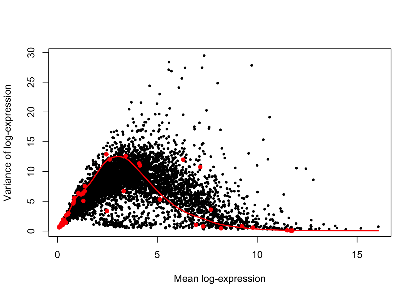
While the above figure suggests that the trend fits accurately spike-in features at extreme values the detection range, it also indicate substantial scatter around the trend for feature at intermediate levels of detection, and likely understimates technical variance in both ERCC spike-in and endogenous features at moderately high levels of detection (i.e., mean log-expression in the range 5-10).
Using endogenous features
Similarly to the use of ERCC spike-in features, let us use the scran trendVar method to estimate technical variation under the assumption stated above, accouting for the same technical factors of the experimental design:
var.fit.endo <- trendVar(
  sce.norm, method = "loess", parametric = TRUE,
  design = dm, loess.args=list(span = 0.1), assay.type="logcounts", use.spikes=FALSE
)
names(var.fit.endo)
## [1] "vars" "means" "resid.df" "design" "trend" "df2"Similarly, the estimated variance is decomposed into its technical and biological components (using only the endogenous features processed above):
var.out.endo <- decomposeVar(
  sce.norm, var.fit.endo, assay.type="logcounts", get.spikes=FALSE)
names(var.out.endo)
## [1] "mean" "total" "bio" "tech" "p.value" "FDR"In the figure below, we assess the suitability of the trend fitted to the endogenous variances by examining whether it is consistent with the spike-in variances.
plot(var.out.endo$mean, var.out.endo$total, pch=16, cex=0.6,
  xlab="Mean log-expression", ylab="Variance of log-expression"
)
o <- order(var.out.endo$mean)
lines(var.out.endo$mean[o], var.out.endo$tech[o], col="dodgerblue", lwd=2)
spike.fit <- trendVar(sce.norm, assay.type="logcounts", use.spikes=TRUE) # To compute spike-in variances.
points(spike.fit$mean, spike.fit$var, col="red", pch=16)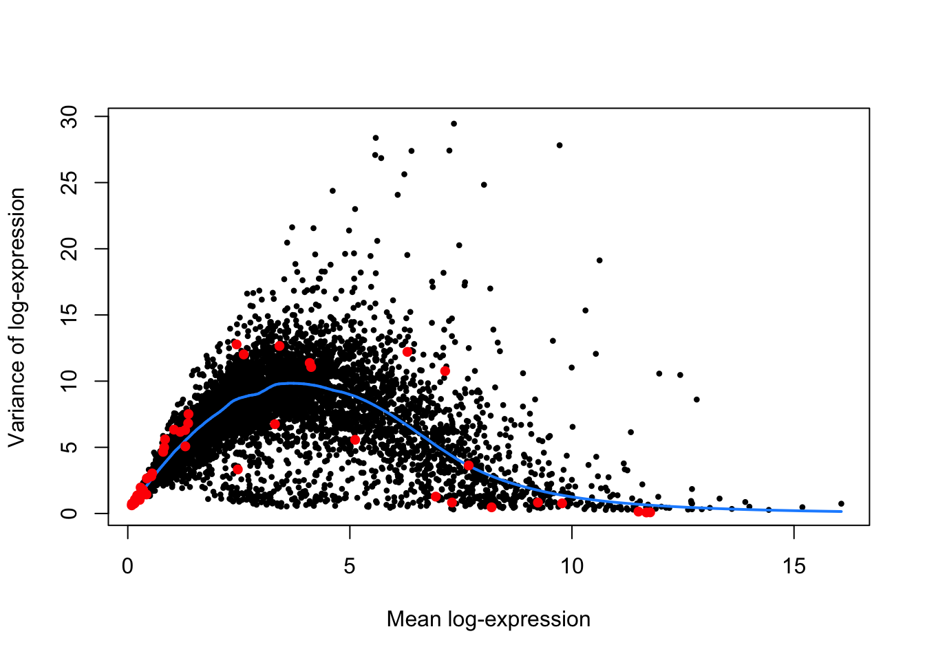
Notably, the trend passes through or close to most of the spike-in variances, suggesting that the assumption (that most genes have low levels of biological variability) is suitable for this data set. Notably, this strategy exploits the large number of endogenous genes to obtain a stable trend, with the ERCC spike-in features primarily used as diagnostic features rather than in the trend fitting itself.
Importantly, if the assumption (that most genes have low levels of biological variability) did not hold, one would rather use the trend fitted to the ERCC spike-in features using the default use.spikes=TRUE settings. Notably, this would sacrifice stability to reduce systematic errors in the estimate of the biological component for each gene (Lun, McCarthy, and Marioni 2016).
Model selection
The two methods presented above (i.e., ERCC spike-in and endogenous features) yield markedly distinct trends.
In particular, the limited count of spike-in features robustly detected across cells (i.e., 44 ERCC spike-in features were retained in the sce.norm object), scarcer at moderate levels of expression, may explain to some extent the substantial scatter around the trend at moderate levels of expression (i.e., mean log-expression in the range \(\approx [2.5 - 7.5]\)). Nevertheless, this trend matches closely observations at low detection levels dense in ERCC spike-in features, and high detection levels that show generally limited variability.
In contrast, the use of endogenous features—under the assumption that most genes exhibit technical variation and little biological variation—yields a trend that may understimate technical variation at low levels of detection and overestimate technical variation at high levels of detection, considering ERCC spike-in for reference. However, at moderate detection levels, the overall trend provides a more representative average estimate of variance matching both ERCC spike-in and endogenous features (always under the assumption that most spike-in and endogenous features only show technical variation).
Let us adopt a conservative approach and use the latter trend (i.e., estimated from the endogenous features) as it appears to be more consistent with the spike-in variances, and as such supports the assumption that most genes have low levels of biological variability does hold in this data set.
Identify variable genes
HVGs are defined as genes with biological components that are significantly greater than 0 at a false discovery rate (FDR) of 5%. These genes are interesting as they are most likely to drive differences in the expression profiles between cells that belong to different experimental groups, while more generally explaining a substantial proportion of the transcriptional variance across all cells in the data set.
In addition to the definition above, let us define HVGs as endogenous features with an estimated biological component of variance greater than or equal to 0.5. For transformed expression values on the log2 scale, this means that the average difference in true expression between any two cells will be at least 2-fold. This reasoning assumes that the true log-expression values are normally distributed with variance of 0.5 (Lun, McCarthy, and Marioni 2016).
Identification
hvg.out <- var.out.endo[with(var.out.endo, which(FDR <= 0.05 & bio >= 0.5)),]
hvg.out <- hvg.out[order(hvg.out$bio, decreasing=TRUE),]
The above criteria have identified 1270 endogenous genes as highly variable.
The 100 genes with highest biological component of variance may be examined in the second tab.
Expression levels
Let us examine the distribution of expression values for the top HVGs across cells to ensure that the variance estimate is not being dominated by a small count of extreme outliers.
We may highlight the relationship between those HVGs and experimental factors such as Time, Infection, and Status.
topHvgIds <- rownames(hvg.out)[1:10]Time
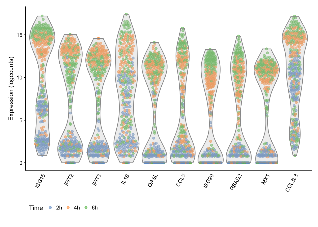
The figure above generally indicates a progressive up-regulation of gene expression over time.
Infection
## Scale for 'colour' is already present. Adding another scale for
## 'colour', which will replace the existing scale.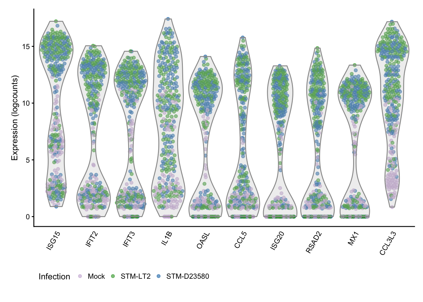
The figure above further links the high variance of those genes to the differences between bacteria-stimulated and mock-infected cells, particularly at the later time-points.
Status
## Scale for 'colour' is already present. Adding another scale for
## 'colour', which will replace the existing scale.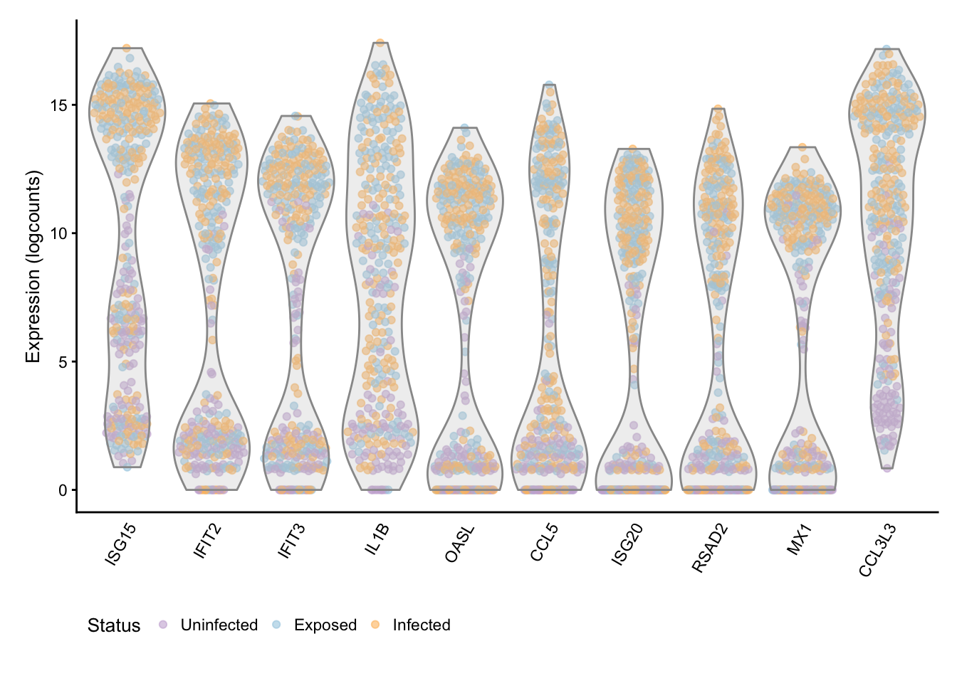
The figure above reinforces clear-cut differences between cells stimulated by bacterial infection or exposure and uninfected cells, particularly at the later time-points.
GO enrichment
Let us use the goseq package to identify the most enriched gene ontologies among the HVGs. Note that we restrict the results to GO categories associated with at least 10 genes, for robustness.
Computation
The initial step of the goseq procedure is to create a named vector that indicates whether each gene (i.e., names) is highly variable (1) or not (0):
endoFeatures <- rownames(sce.norm)[!isSpike(sce.norm, "ERCC")]
hvgs <- as.integer(endoFeatures %in% rownames(hvg.out))
names(hvgs) <- endoFeatures
table(hvgs)
## hvgs
## 0 1
## 6956 1270Next, goseq is capable of accounting for gene length bias during GO testing. In the current case, the gene length information reported by featureCounts is used:
geneLengths <- width(rowRanges(sce.norm[rownames(hvg.out),]))
names(geneLengths) <- rownames(hvg.out)
Using the above gene length data, the probability weighting function (PWF) is calculated for the full gene set in this analysis:
pwf <- goseq::nullp(
  hvgs, bias.data = width(rowRanges(sce.norm[names(hvgs),])), plot.fit=TRUE)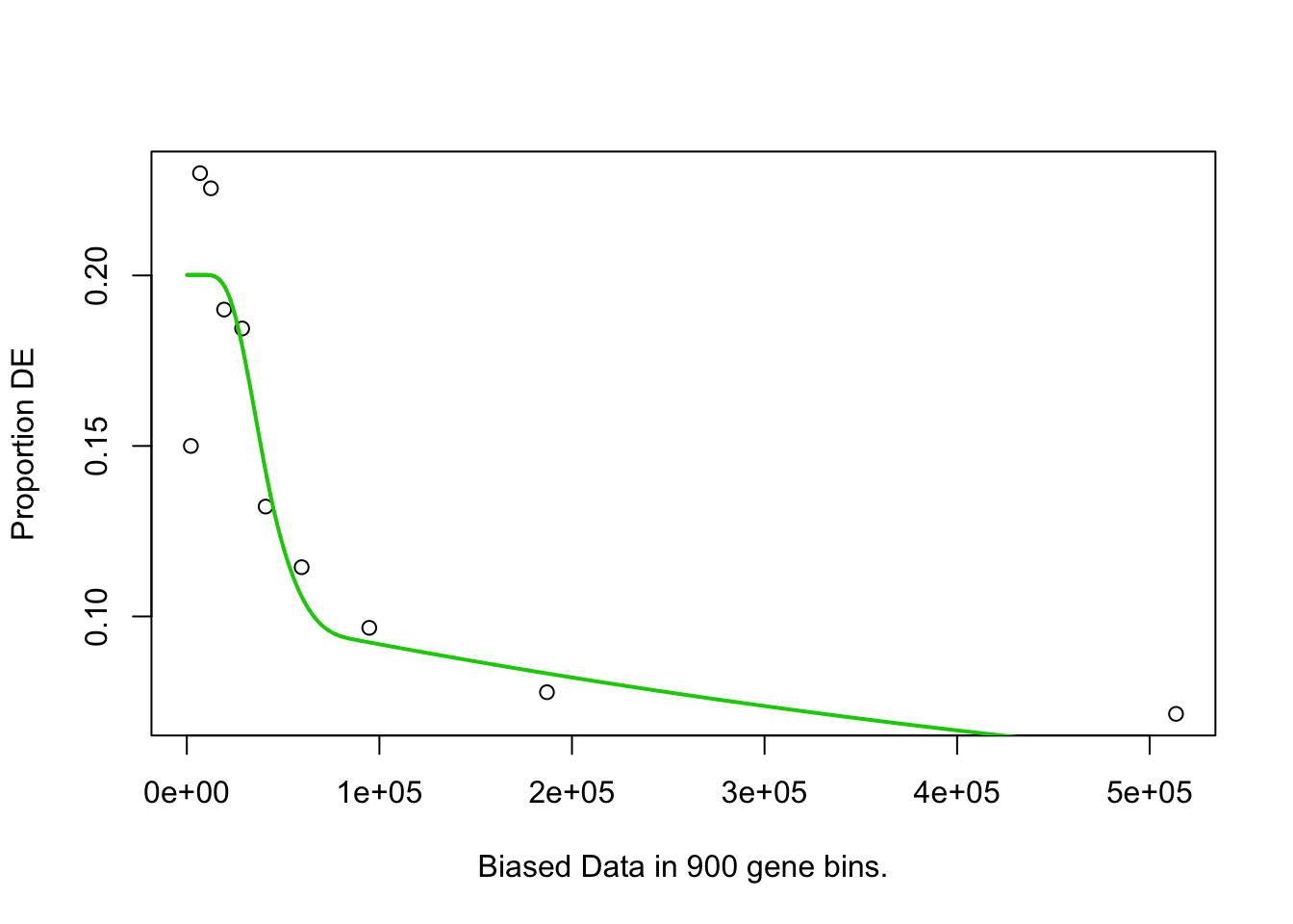
Finally, the goseq function is used to test for enrichment amongst the HVGs:
GO.out <- goseq::goseq(pwf, "hg38", "ensGene")## Fetching GO annotations...## Loading required package: AnnotationDbi## ## For 744 genes, we could not find any categories. These genes will be excluded.## To force their use, please run with use_genes_without_cat=TRUE (see documentation).## This was the default behavior for version 1.15.1 and earlier.## Calculating the p-values...## 'select()' returned 1:1 mapping between keys and columnsThe ontology field (i.e., "BP", "MF", or "CC") is reformatted as a factor:
GO.out$ontology <- as.factor(GO.out$ontology)Expression heatmap
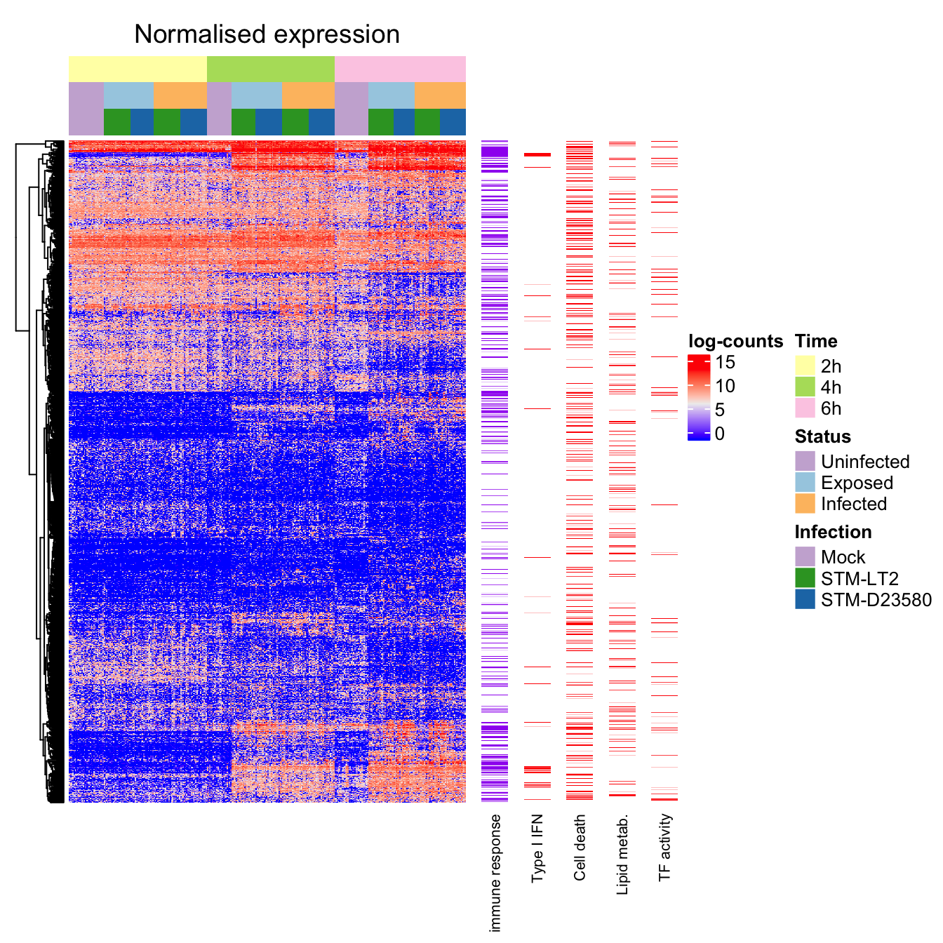
We may then visualise normalised and scaled expression values in a heat map manually organised by phenotype, while allowing genes with similar expression profiles to cluster. The procedure is split below in multiple panels for visual convenience:
Preprocessing
Let us first subset the normalised data set to retain only endogenous features, and also reorder samples by Time, Status, and Infection, to facilitate interpretation of the expression data in the context of the present experimental design:
sce.endo <- sce.norm[!isSpike(sce.norm, "ERCC"),]
sce.endo <- sce.endo[,with(colData(sce.endo), order(Time, Status, Infection))]
dim(sce.endo)
## [1] 8226 342We may now select the expression data of the endogenous HVGs identified above:
norm.endo.hvg <- assay(sce.endo, "logcounts")[rownames(hvg.out),]
dim(norm.endo.hvg)
## [1] 1270 342In preparation for the heat map, let us define an annotation panel that indicates key phenotype levels for each cell:
h_column <- HeatmapAnnotation(
  df = colData(sce.endo)[,c("Time", "Status", "Infection")],
  col = list(
    Time = col.time,
    Status = col.status,
    Infection = col.infection
  )
)
Let us first cluster HVGs according to their expression profile across all single cells:
hvg.endo.d <- dist(norm.endo.hvg)
hvg.endo.clust <- hclust(hvg.endo.d)
rm(hvg.endo.d)
We may then cluster single cells according to their expression profile, within each of the experimental groups (i.e., Time:Infection:Status):
sample.order <- c()
expGroups <- data.frame(unique(colData(sce.endo)[,c("Time","Infection","Status")]))
expGroups <- dplyr::arrange(expGroups, Time, Status, Infection)
for (groupIndex in seq_len(nrow(expGroups))){
time <- expGroups[groupIndex, "Time"]
infection <- expGroups[groupIndex, "Infection"]
status <- expGroups[groupIndex, "Status"]
sample.index <- with(colData(sce.endo), which(
Time == time & Infection == infection & Status == status
))
hvg.sample.d <- dist(t(norm.endo.hvg[,sample.index]))
local.order <- sample.index[hclust(hvg.sample.d)$order]
sample.order <- c(sample.order, local.order)
rm(sample.index, local.order, time, infection, status)
}
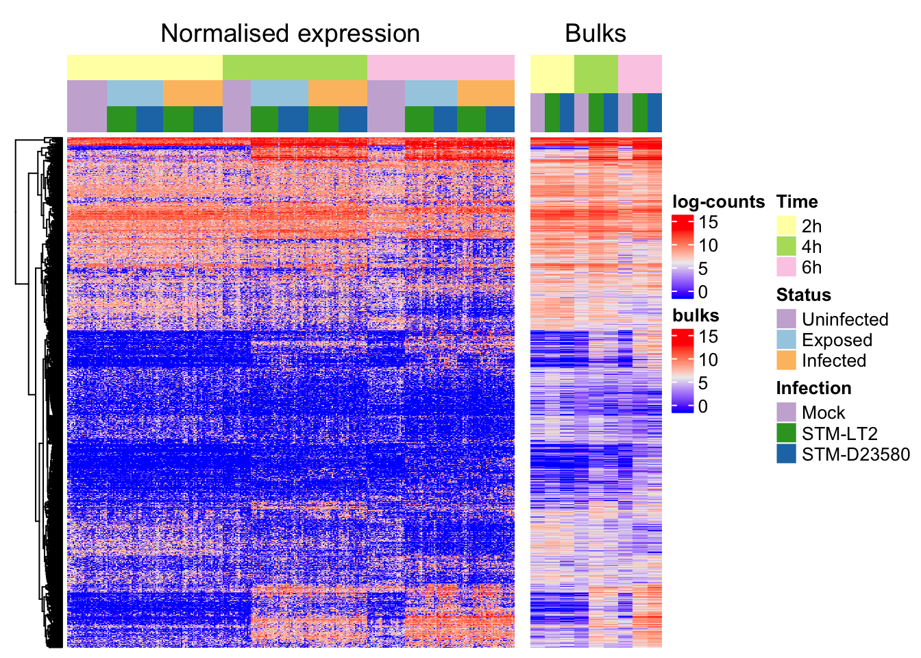
rm(expGroups, groupIndex)We may then produce a heat map that uses the above semi-supervised sample clustering in combination with the earlier gene clustering, to reveal potential sub-structure within the otherwise homogeneous experimental groups:
ht_semisupervised <- Heatmap(
norm.endo.hvg,
name = "log-counts", column_title = "Normalised expression",
top_annotation = h_column,
row_order = hvg.endo.clust$order, column_order = sample.order,
cluster_rows = hvg.endo.clust, cluster_columns = FALSE,
show_row_names = FALSE, show_column_names = FALSE
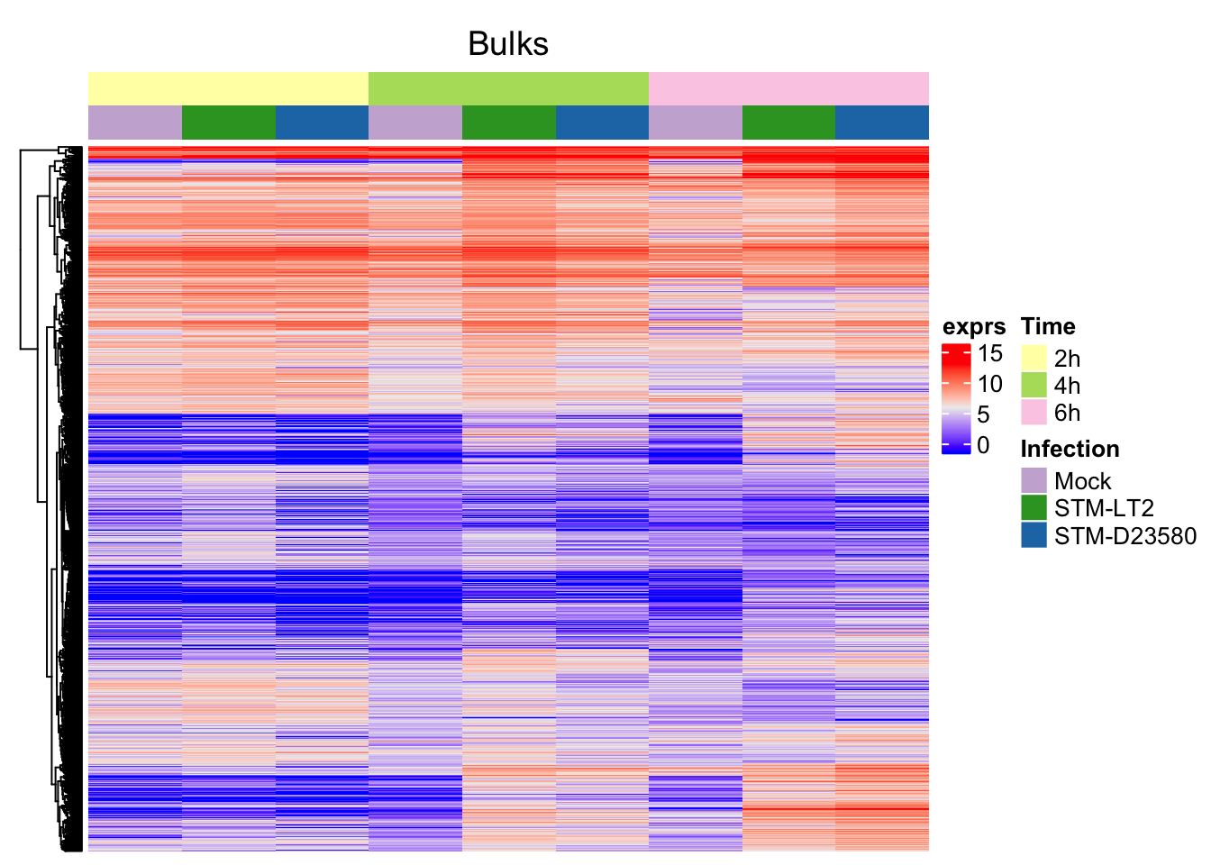
)We may display the expression level of bulk samples for reference. (\(log_2(count+1)\) values).
Order bulks identically to single cells:
sce.bulk <- sce.bulk[,with(colData(sce.bulk), order(Time, Status, Infection))]Annotate bulks with the same colour code:
bulk_column <- HeatmapAnnotation(
  df = colData(sce.bulk)[,c("Time", "Infection")],
  col = list(
    Time = col.time,
    Infection = col.infection
  )
)
ht_bulks <- Heatmap(
log2(assay(sce.bulk, "counts")[rownames(norm.endo.hvg),] + 1),
top_annotation = bulk_column,
name = "exprs", column_title = "Bulks",
cluster_rows = hvg.endo.clust, cluster_columns = FALSE,
show_row_names = FALSE, show_column_names = FALSE
)Bulks
Alone:
Alongside single cells (semi-supervised clustering):
Gene ontology
Let us retrieve the identifier of genes associated with the most enriched category immune response::
genes.topCategory <- unique(AnnotationDbi::select(
  org.Hs.eg.db, GO.out$category[1], "ENSEMBL", "GOALL")$ENSEMBL
)
table(rownames(norm.endo.hvg) %in% genes.topCategory)
##
## FALSE TRUE
## 909 361In the same manner, let us also annotated genes relating to 4 more GO categories relevant to the experimental design:
- type I interferon signaling pathway (GO:0060337)
- cell death (GO:0008219)
- lipid metabolic process (GO:0006629)
- regulation of sequence-specific DNA binding transcription factor activity (GO:0051090)
genes.ifn <- unique(AnnotationDbi::select(
  org.Hs.eg.db, "GO:0060337", "ENSEMBL", "GOALL")$ENSEMBL)
table(rownames(norm.endo.hvg) %in% genes.ifn)
##
## FALSE TRUE
## 1235 35genes.death <- unique(AnnotationDbi::select(
org.Hs.eg.db, "GO:0008219", "ENSEMBL", "GOALL")$ENSEMBL)
table(rownames(norm.endo.hvg) %in% genes.death)##
## FALSE TRUE
## 999 271genes.lipid <- unique(AnnotationDbi::select(
org.Hs.eg.db, "GO:0006629", "ENSEMBL", "GOALL")$ENSEMBL)
table(rownames(norm.endo.hvg) %in% genes.lipid)##
## FALSE TRUE
## 1119 151genes.tf <- unique(AnnotationDbi::select(
org.Hs.eg.db, "GO:0051090", "ENSEMBL", "GOALL")$ENSEMBL)
table(rownames(norm.endo.hvg) %in% genes.tf)##
## FALSE TRUE
## 1209 61Let us annotate genes associated with the above GO categories on the heat map:
top_l <- rownames(norm.endo.hvg) %in% genes.topCategory
h_top <- Heatmap(
  top_l + 0, name = GO.out$term[1], col = c("0" = "white", "1" = "purple"),
  column_names_gp = gpar(fontsize = 8),
  show_heatmap_legend = FALSE, width = unit(5, "mm"))
ifn_l <- rownames(norm.endo.hvg) %in% genes.ifn
h_ifn <- Heatmap(
  ifn_l + 0, name = "Type I IFN", col = c("0" = "white", "1" = "red"),
  column_names_gp = gpar(fontsize = 8),
  show_heatmap_legend = FALSE, width = unit(5, "mm"))
death_l <- rownames(norm.endo.hvg) %in% genes.death
h_death <- Heatmap(
  death_l + 0, name = "Cell death", col = c("0" = "white", "1" = "red"),
  column_names_gp = gpar(fontsize = 8),
  show_heatmap_legend = FALSE, width = unit(5, "mm"))
lipid_l <- rownames(norm.endo.hvg) %in% genes.lipid
h_lipid <- Heatmap(
  lipid_l + 0, name = "Lipid metab.", col = c("0" = "white", "1" = "red"),
  column_names_gp = gpar(fontsize = 8),
  show_heatmap_legend = FALSE, width = unit(5, "mm"))
tf_l <- rownames(norm.endo.hvg) %in% genes.tf
h_tf <- Heatmap(
  tf_l + 0, name = "TF activity", col = c("0" = "white", "1" = "red"),
  column_names_gp = gpar(fontsize = 8),
  show_heatmap_legend = FALSE, width = unit(5, "mm"))
Semi-supervised
Pairwise distances between samples
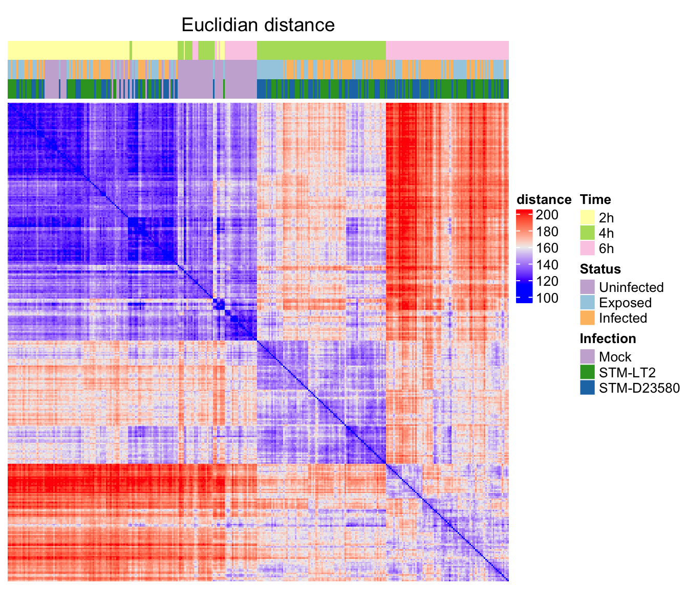
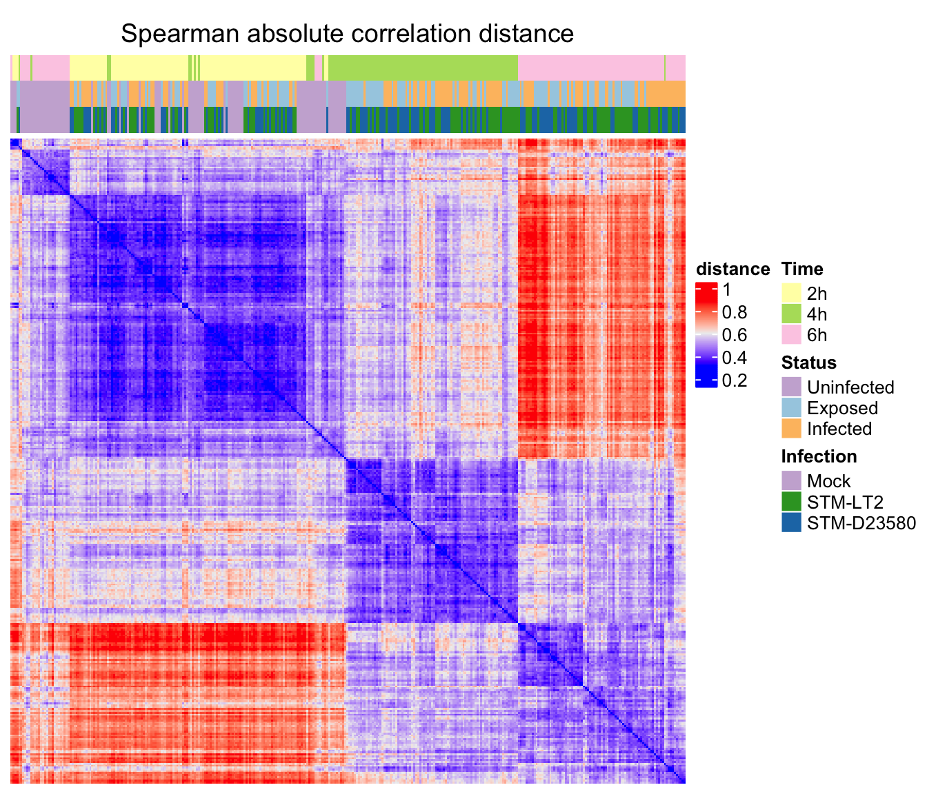
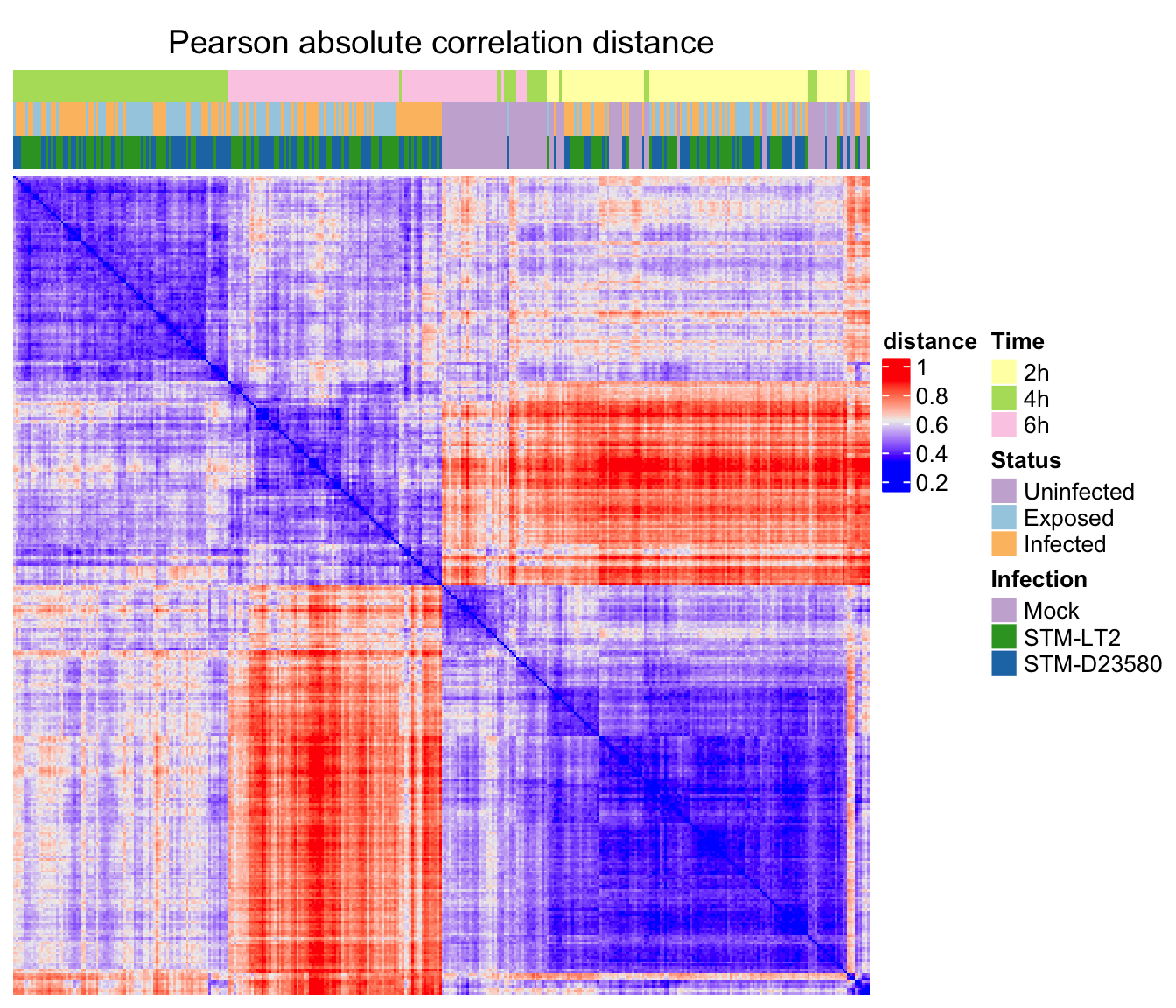
In this section, let us explore three approaches to estimate pairwise distance between single cell samples using the normalised expression data calculated in a previous section for the 1270 HVGs identified above.
Estimate distance
Euclidian distance
Estimate distance between cells using Euclidian distance:
d.e <- dist(t(norm.endo.hvg), diag = TRUE, upper = TRUE)
mat.e <- as.matrix(d.e)
We may then cluster samples according to their Euclidian distance, using Ward’s criterion to minimize the total variance within each cluster (Lun, McCarthy, and Marioni 2016):
h.e <- hclust(d.e, method = "ward.D2")
ord.e <- mat.e[h.e$order, h.e$order]
rm(mat.e)
Assemble the heat map:
ht_column <- HeatmapAnnotation(
  df = colData(sce.endo)[h.e$order,c("Time", "Status", "Infection")],
  col = list(
    Time = col.time,
    Status = col.status,
    Infection = col.infection
  )
)
ht_e <- Heatmap(
  ord.e, name = "distance", column_title = "Euclidian distance",
  top_annotation = ht_column,
  cluster_rows = FALSE, cluster_columns = FALSE,
  show_row_names = FALSE, show_column_names = FALSE
)
Spearman correlation
Estimate distance between cells using Spearman’s \(\rho\) correlation.
c.s <- MKmisc::corDist(t(norm.endo.hvg), "spearman", diag = TRUE, upper = TRUE)
mat.c.s <- as.matrix(c.s)
Cluster samples:
h.c.s <- hclust(c.s)
ord.c.s <- mat.c.s[h.c.s$order, h.c.s$order]
rm(c.s)
Assemble the heat map:
ht_column <- HeatmapAnnotation(
  df = colData(sce.endo)[h.c.s$order,c("Time", "Status", "Infection")],
  col = list(
    Time = col.time,
    Status = col.status,
    Infection = col.infection
  )
)
ht_s <- Heatmap(
  ord.c.s, name = "distance", column_title = "Spearman absolute correlation distance",
  top_annotation = ht_column,
  cluster_rows = FALSE, cluster_columns = FALSE,
  show_row_names = FALSE, show_column_names = FALSE
)
Pearson correlation
Estimate distance between cells using Pearson’s \(r\) correlation:
c.p <- MKmisc::corDist(t(norm.endo.hvg), diag = TRUE, upper = TRUE)
mat.c.p <- as.matrix(c.p)
Cluster samples using Pearson’s correlation:
h.c.p <- hclust(c.p)
ord.c.p <- mat.c.p[h.c.p$order, h.c.p$order]
rm(c.p)
Assemble the heat map:
hn_column <- HeatmapAnnotation(
  df = colData(sce.endo)[h.c.p$order,c("Time", "Status", "Infection")],
  col = list(
    Time = col.time,
    Status = col.status,
    Infection = col.infection
  )
)
ht_p <- Heatmap(
  ord.c.p, name = "distance", column_title = "Pearson absolute correlation distance",
  top_annotation = hn_column,
  cluster_rows = FALSE, cluster_columns = FALSE,
  show_row_names = FALSE, show_column_names = FALSE
)
Heat maps
Euclidian
Spearman
Pearson
HVGs within experimental groups
Identification
Similarly to the above identification of HVGs across cells (driven primarily by a strong effect of the Time factor), let us identify HVGs within each experimental group of cells:
par(mfrow=c(5,3))
dVar.groups <- list()
HVGs.group <- list()
for (group in levels(sce.norm$Group)){
  idx.group <- which(sce.norm$Group == group)
  message(group); message(sprintf("# samples: %i", length(idx.group)))
  dm <- model.matrix(~Plate, data = droplevels(colData(sce.norm)[idx.group,]))
  var.fit.endo <- trendVar(
    sce.norm[,idx.group], assay.type="logcounts",
    design = dm, use.spikes = FALSE, span = 0.1
  )
  var.out.endo <- decomposeVar(
    sce.norm[,idx.group], var.fit.endo, assay.type="logcounts", get.spikes=FALSE)
  ## Optional check: to compare spike-in variances.
  plot(var.out.endo$mean, var.out.endo$total, pch=16, cex=0.2,
      xlab="Mean log-expression", ylab="Variance of log-expression",
      main = group)
  o <- order(var.out.endo$mean)
  lines(var.out.endo$mean[o], var.out.endo$tech[o], col="dodgerblue", lwd=2)
  spike.fit <- trendVar(
    sce.norm[,idx.group], assay.type="logcounts", use.spikes=TRUE)
  points(spike.fit$mean, spike.fit$var, col="red", pch=16, cex=0.4)
  var.out.endo <- cbind(
    Symbol = with(
      rowData(sce.endo), gene_name[match(rownames(var.out.endo), gene_id)]),
    var.out.endo
  )
  write.csv(var.out.endo, file.path(outdir, sprintf("HVGs_%s_full.csv", group)))
  dVar.groups[[group]] <- var.out.endo
  hvg.out <- var.out.endo[which(
    var.out.endo$FDR <= 0.05 & var.out.endo$bio >= 0.5
    ),]
  write.csv(
    hvg.out, file.path(outdir, sprintf("HVGs_%s_significant.csv", group)))
  HVGs.group[[group]] <- hvg.out
}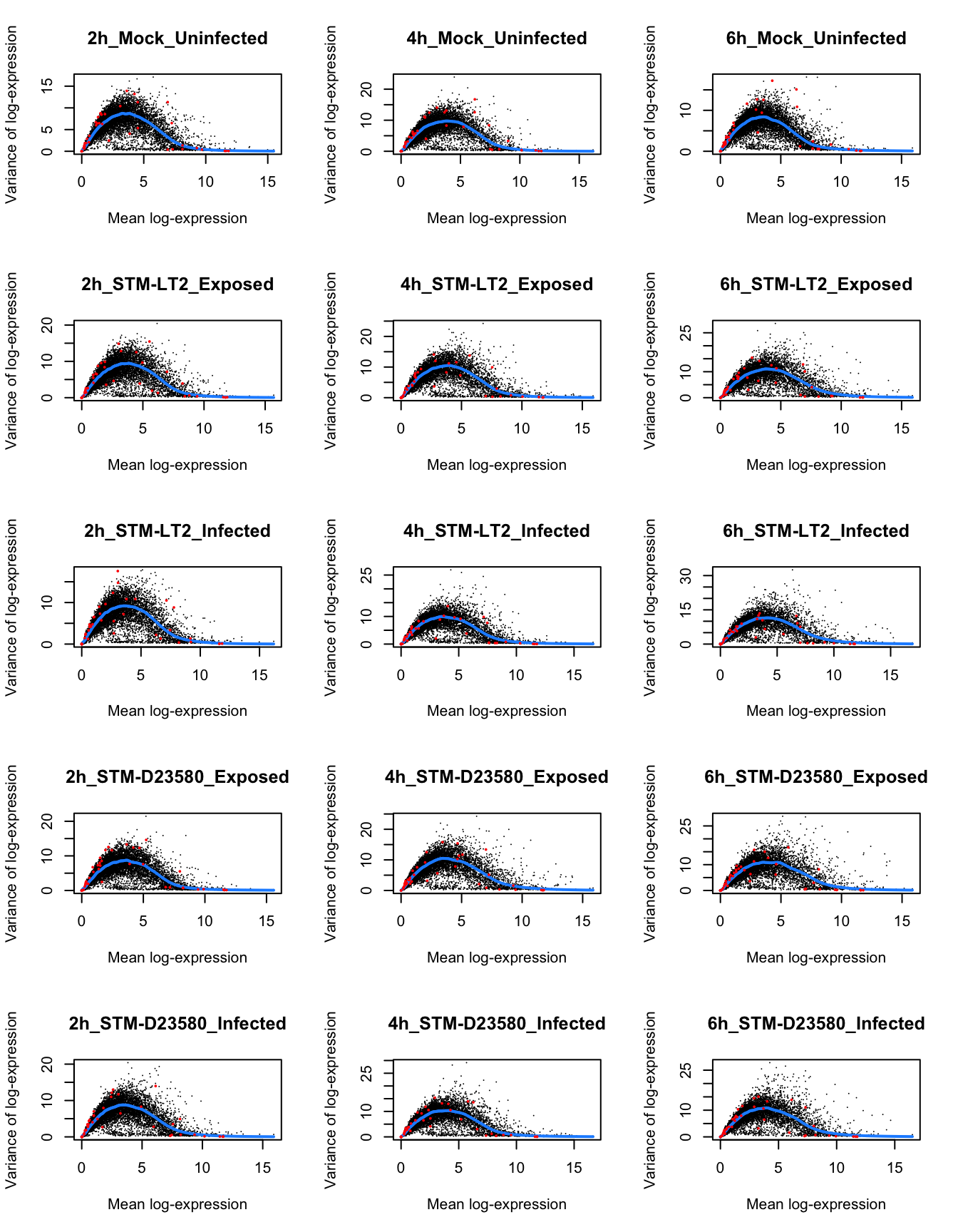
par(mfrow=c(1,1))In the figure above, note how—in the stimulated cells—the mean-variance trend shifts to the right over time; variability increases among moderately to highly expressed genes at later time points.
Interestingly, at the 6h time point, all groups of stimulated cells present a small set of genes that appear to be both highly expressed (mean log-expression > 10) and highly variable (markedly above the trend of estimated technical variance for most genes; blue line). Those subsets of genes are further investigated below, as they may represent key markers of polarisation toward distinct phenotypes (e.g., states of cellular activation).
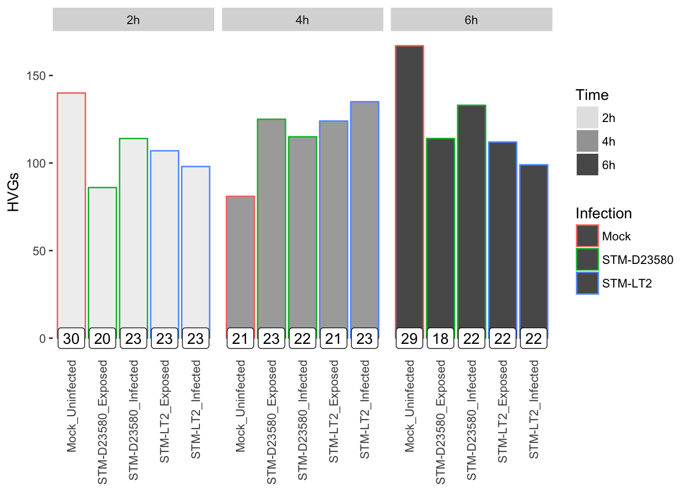
Let us visualise the count of HVGs identified in each experimental group, while indicating the count of cells per group in a text label for reference:
References
Lun, A. T., D. J. McCarthy, and J. C. Marioni. 2016. “A Step-by-Step Workflow for Low-Level Analysis of Single-Cell Rna-Seq Data with Bioconductor.” Journal Article. F1000Res 5: 2122. doi:10.12688/f1000research.9501.2.