Learning Gene Signatures from the Seurat PBMC 3k Tutorial
Kevin Rue-Albrecht
19/12/2018
Example data set
First, load the SingleCellExperiment object of 10X Genomics 2,700 peripheral blood mononuclear cells (PBMC) preprocessed in a previous vignette.
library(SingleCellExperiment)
sce <- readRDS("pbmc3k_tutorial.sce.rds")
sce
## class: SingleCellExperiment
## dim: 32738 2638
## metadata(0):
## assays(1): counts
## rownames(32738): ENSG00000243485 ENSG00000237613 ...
## ENSG00000215616 ENSG00000215611
## rowData names(3): ENSEMBL_ID Symbol_TENx Symbol
## colnames: NULL
## colData names(12): Sample Barcode ... Date_published seurat.ident
## reducedDimNames(2): PCA TSNE
## spikeNames(0):Learning signatures from a data set
Here, we use the data set as a reference to learn markers associated with known cell types.
To do so, we store manually curated cell type annotations (obtained from the Guided Clustering Tutorial of the Seurat package) in the "seurat.celltype" cell metadata.
sce$seurat.celltype <- factor(sce$seurat.ident, labels = c(
    "CD4 T cells", "CD14+ Monocytes", "B cells", "CD8 T cells",
    "FCGR3A+ Monocytes", "NK cells", "Dendritic Cells", "Megakaryocytes"
))
table(sce$seurat.celltype)
##
## CD4 T cells CD14+ Monocytes B cells CD8 T cells
## 1151 479 342 308
## FCGR3A+ Monocytes NK cells Dendritic Cells Megakaryocytes
## 157 155 32 14Now, let us programmatically identify the top 2 markers for each cluster by asking the question: “Which genes are detected (count strictly greater than 0) in each cell type at a frequency at least 20% higher than any other cell type in the data set”?
In addition, we require that the genes comprising each signature are co-detected in at least 10% of the target cluster (min.prop=0.1).
library(hancock)
library(knitr)
signatures <- learnSignatures(
    sce, assay.type = "counts",
    method = "PositiveProportionDifference", cluster.col="seurat.ident",
    threshold = 0, n = 2, min.diff = 0.2, diff.method = "min", min.prop = 0.1)
x <- as.data.frame(signatures)
x <- cbind(x, Symbol_TENx=rowData(sce)[x$element, "Symbol_TENx"])
kable(x)| element | set | ProportionPositive | minDifferenceProportion | Symbol_TENx |
|---|---|---|---|---|
| ENSG00000142546 | 0 | 0.6481321 | 0.2418821 | NOSIP |
| ENSG00000100100 | 0 | 0.4178975 | 0.2230923 | PIK3IP1 |
| ENSG00000143546 | 1 | 0.9728601 | 0.4696754 | S100A8 |
| ENSG00000170458 | 1 | 0.6617954 | 0.4117954 | CD14 |
| ENSG00000156738 | 2 | 0.8596491 | 0.7768466 | MS4A1 |
| ENSG00000105369 | 2 | 0.9356725 | 0.7481725 | CD79A |
| ENSG00000113088 | 3 | 0.5876623 | 0.4779849 | GZMK |
| ENSG00000153563 | 3 | 0.5032468 | 0.3989896 | CD8A |
| ENSG00000166927 | 4 | 0.8025478 | 0.5415874 | MS4A7 |
| ENSG00000224397 | 4 | 0.8216561 | 0.5252051 | RP11-290F20.3 |
| ENSG00000100453 | 5 | 0.9548387 | 0.6658777 | GZMB |
| ENSG00000115523 | 5 | 0.9612903 | 0.6528488 | GNLY |
| ENSG00000179639 | 6 | 0.8437500 | 0.8291362 | FCER1A |
| ENSG00000108561 | 6 | 0.8437500 | 0.4388847 | C1QBP |
| ENSG00000163736 | 7 | 1.0000000 | 0.9426752 | PPBP |
| ENSG00000163737 | 7 | 1.0000000 | 0.9375000 | PF4 |
Note that the table above does include some of the markers suggested in the Seurat Guided Clustering Tutorial (listed below). Namely, CD14 (CD14+ Monocytes), MS4A1 (B cells), CD8A (CD8 T cells), FCER1A (Dendritic Cells), PPBP (Megakaryocytes).
library(unisets)
seuratTutorialMarkers <- list(
    "CD4 T cells"=c("IL7R"),
    "CD14+ Monocytes"=c("CD14", "LYZ"),
    "B cells"=c("MS4A1"),
    "CD8 T cells"=c("CD8A"),
    "FCGR3A+ Monocytes"=c("FCGR3A", "MS4A7"),
    "NK cells"=c("GNLY", "NKG7"),
    "Dendritic Cells"=c("FCER1A", "CST3"),
    "Megakaryocytes"=c("PPBP")
)
seuratTutorialMarkers <- as(seuratTutorialMarkers, "Sets")
seuratTutorialMarkers
## Sets with 12 relations between 12 elements and 8 sets
## element set
## <character> <character>
## [1] IL7R CD4 T cells
## [2] CD14 CD14+ Monocytes
## [3] LYZ CD14+ Monocytes
## [4] MS4A1 B cells
## [5] CD8A CD8 T cells
## ... ... ...
## [8] GNLY NK cells
## [9] NKG7 NK cells
## [10] FCER1A Dendritic Cells
## [11] CST3 Dendritic Cells
## [12] PPBP Megakaryocytes
## -----------
## elementInfo: IdVector with 0 metadata
## setInfo: IdVector with 0 metadataVisualizing signatures
Reduced dimension
Let us visualize the top 2 markers identified in this way for each cluster.
For reference, the cell type identity associated with markers mentioned in the Guided Clustering Tutorial is indicated in each panel subtitle, where applicable.
library(ggplot2)
library(cowplot)
library(scales)
ggList <- list()
for (markerId in unique(ids(elements(signatures)))) {
    ggDataFrame <- data.frame(
        reducedDim(sce, "TSNE"),
        logcounts=log2(assay(sce, "counts")[markerId, ] + 1)
    )
    markerName <- rowData(sce)[markerId, "Symbol_TENx"]
    seuratIdentity <- subset(as(seuratTutorialMarkers, "data.frame"), element == markerName, "set", drop=TRUE)
    if (length(seuratIdentity) == 0) { seuratIdentity <- " "} # trick to make equal plot dimensions
    gg <- ggplot(ggDataFrame, aes(tSNE_1, tSNE_2, color=logcounts)) +
        geom_point(size=0.1) +
        scale_color_viridis_c() +
        labs(
            title=sprintf("%s (%s)", markerId, markerName),
            subtitle=seuratIdentity,
            x=NULL, y=NULL) +
        theme(
            axis.text = element_blank(), axis.ticks = element_blank(),
            title = element_text(size=rel(0.7)),
            legend.text = element_text(size=rel(0.8)), legend.title = element_text(size=rel(0.8)),
            legend.position = "bottom")
    ggList[[markerId]] <- gg
}
cowplot::plot_grid(plotlist = ggList)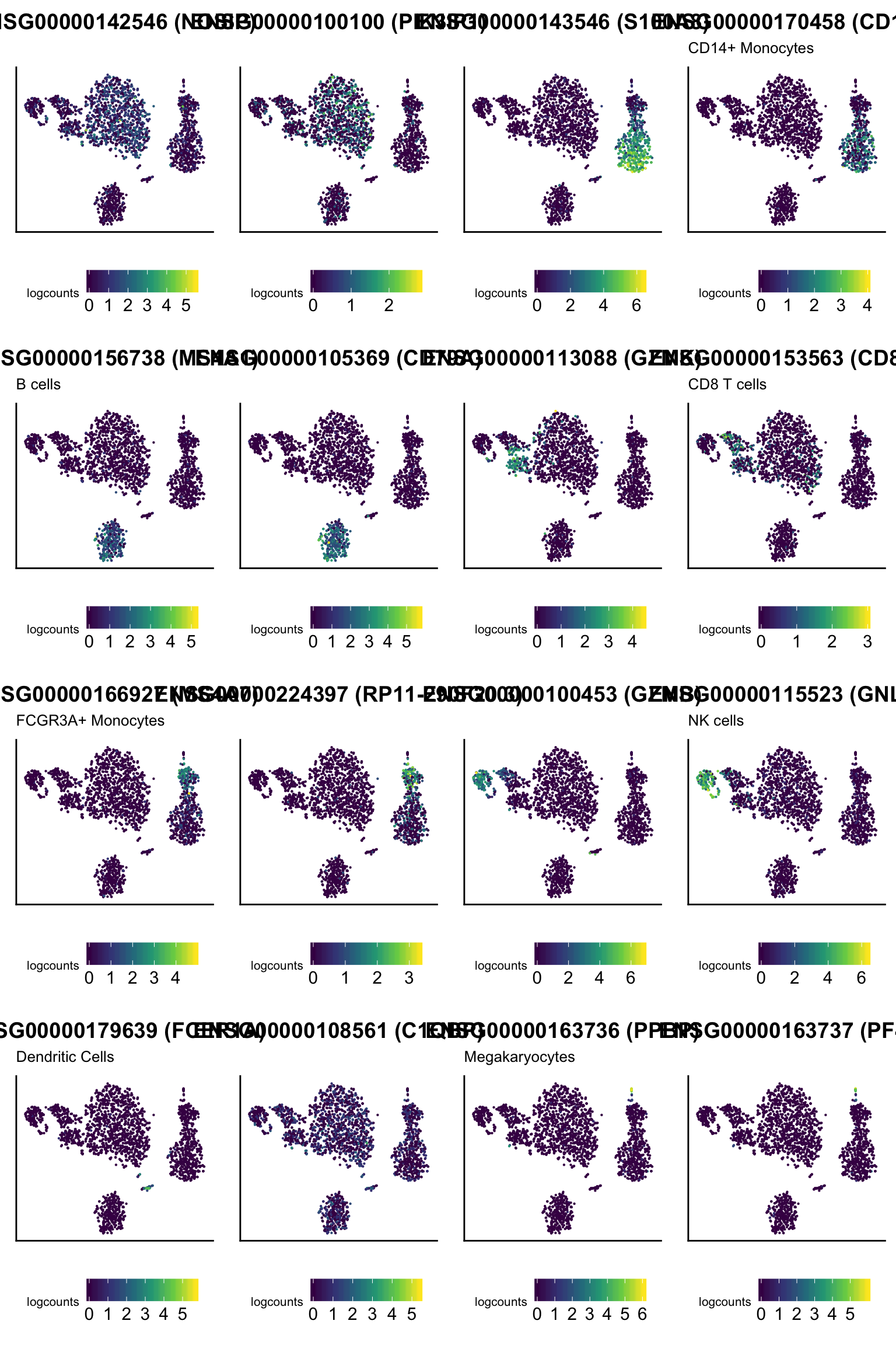
Interactively
It is possible to interactively set the names of each gene signature learned using an interactive Shiny app. For this purpose, we learn as many markers as possible for each cluster, and we pass both the signatures (as a Sets object) and the annotated SingleCellExperiment to the interactive app.
signatures <- learnSignatures(
    sce, assay.type = "counts",
    method = "PositiveProportionDifference", cluster.col="seurat.celltype",
    threshold = 0, n = Inf, min.diff = 0.2)
scePred <- predict(signatures, sce, method="ProportionPositive", cluster.col="seurat.ident")
if (interactive()){
    library(shiny)
    signatures <- runApp(shinyLabels(signatures, scePred))
}
Note how the returned signatures object contains any update you may have done to the names of the gene sets interactively within the app.
Proportion of cells predicted for each signature
One may also visualize the proportion of cells positive for each signature in each cluster. If you renamed any signature in the previous chunk, the predict method should be run again to apply the new labels to the SingleCellExperiment object.
scePred <- predict(signatures, sce, method="ProportionPositive", cluster.col="seurat.ident")
plotProportionPositive(scePred, cluster_columns=FALSE, cluster_rows=FALSE)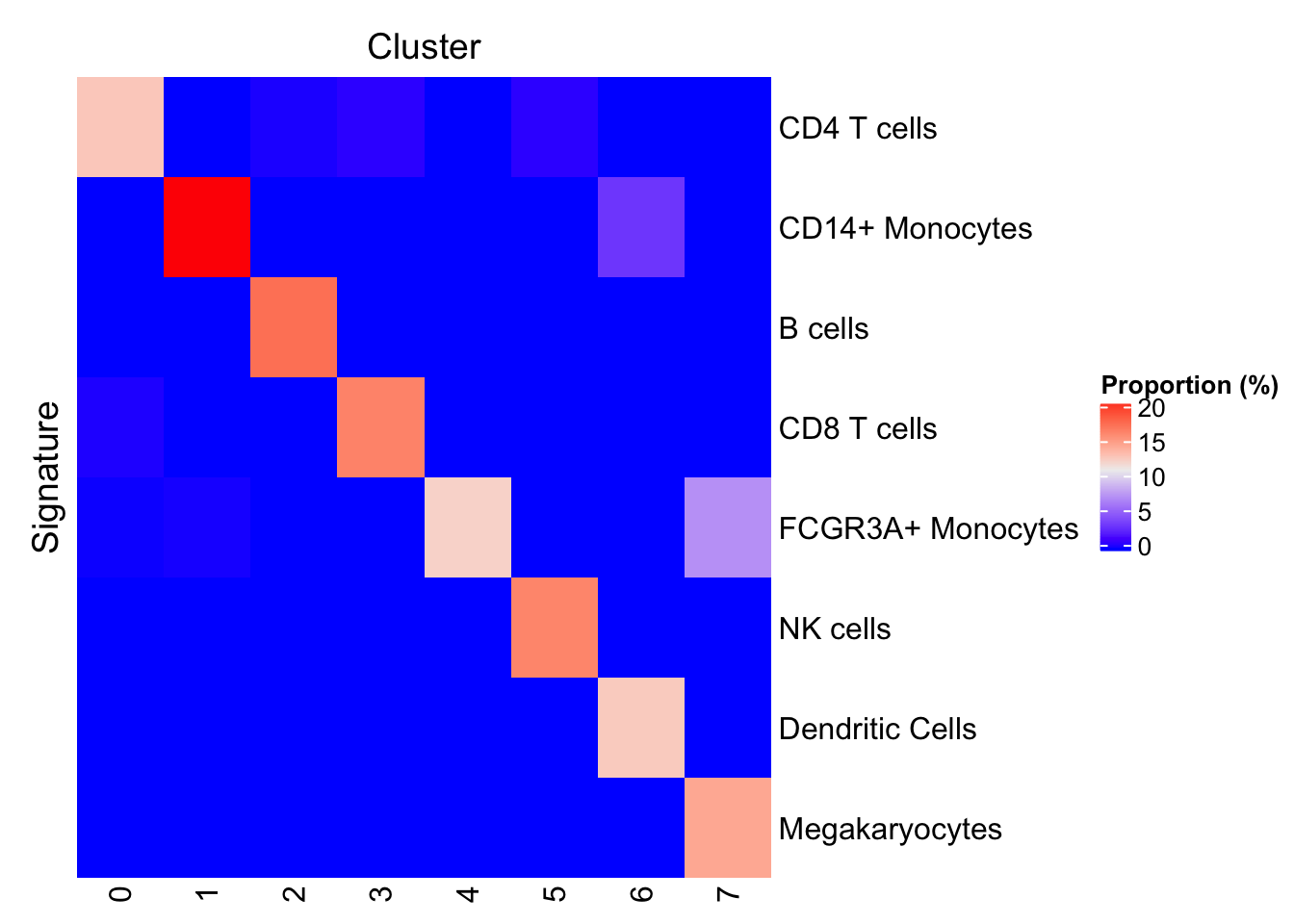
Concepts
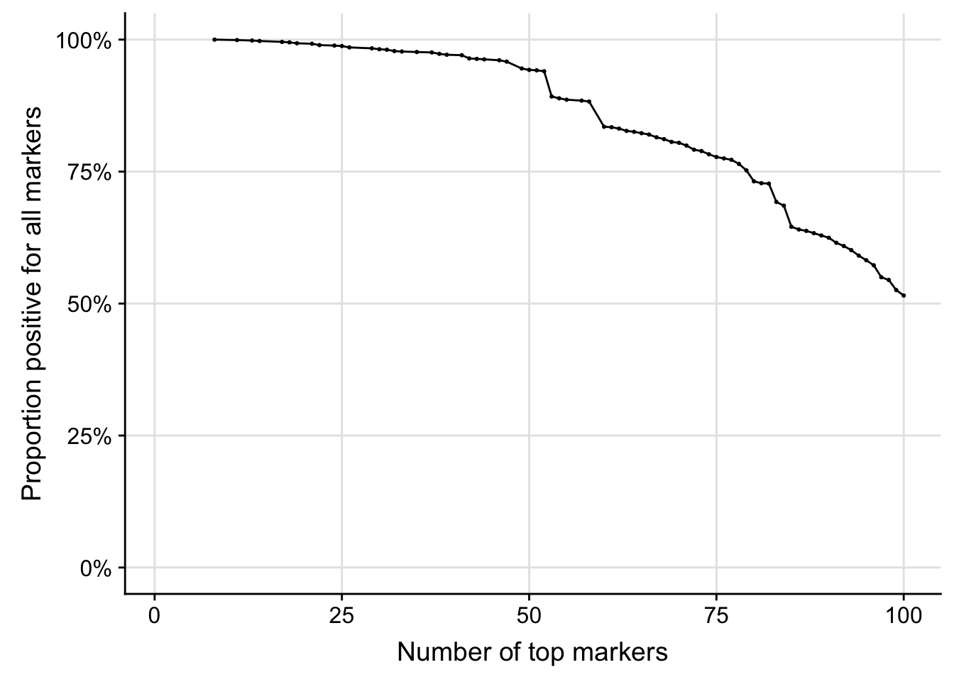
Scree detection plot
The learning method "PositiveProportionDifference" allows the trimming of candidate markers to those that are co-detected in a minimal proportion of samples in the target cluster. The trimming process starts from the most frequently detected marker and stop when the frequency of co-detection drops below the required minimal proportion; all candidate markers beyond this point are dropped. The motivation here is that for the purpose of defining qualitative gene signatures, it is useful to ensure that all of the combined gene set that makes up a signature is fully detected in a minimal proportion of samples.
To illustrate this process, the code chunk below computes and displays the proportion of cells in cluster "0" in which the N most frequently detected markers are co-detected. Specifically, the figure displays the proportion of samples with detectable expression of the most frequently detected gene, the two most frequently detected genes (simultaneously), etc.
library(DelayedMatrixStats)
# Choose a cluster for this example
cluster0 <- "0"
topMarkers <- 100
# Fetch only the cells of that cluster
sce0 <- sce[, sce$seurat.ident == cluster0]
# Extract a subset of the most frequently detected genes in those cells
freq0 <- rowSums2(assay(sce0, "counts"))
order0 <- order(freq0, decreasing=TRUE)
# Test whether each marker is detected in each cell
detection0 <- makeMarkerDetectionMatrix(sce0, head(rownames(sce0)[order0], topMarkers))
# Compute the simultaneous detection rate for increasing numbers of markers
scree0 <- makeMarkerProportionScree(detection0)
# Plot
ggplot(scree0, aes(markers, proportion)) +
    geom_line() + geom_point(size=0.4) +
    scale_y_continuous(limits=c(0, 1), labels = scales::percent) +
    scale_x_continuous(limits=c(1, topMarkers)) +
    theme(panel.grid.major=element_line(color="grey90", size=0.5)) +
    labs(x="Number of top markers", y="Proportion positive for all markers")