Chapter 2 Plotting gene expression
2.1 Foreword
If “CSI: Miami” has taught me anything, it’s that Miami is made of palm trees. On the sidewalks, in the parks, on people’s lawns: they’re basically weeds over there. I mention this because I get a strange sense of déjà vu when I read single-cell papers: just replace the palm trees with violin plots and boom! - you’re in a bioinformatics version of South Beach. Admittedly, violin plots do provide a compact yet informative visualization of the distribution of expression values, serving as a satisfactory, possibly even decent compromise between boxplots and histograms. (Yes, I do know about ridgeline plots. No, don’t try to sell them to me.) This chapter will show you how to contribute to the violin plot overdose in the single-cell field.
This chapter’s rated R… for excessive violins.
(•_•) / ( •_•)>⌐■-■ / (⌐■_■)
YEAAAAAHH!
2.2 Setting up the dataset
At one point, it was highly fashionable to perform scRNA-seq on the pancreas. After all, it’s a highly heterogeneous tissue with clear differences between cell types, which makes it easy to use to generate some impressive-looking plots. Following this example, we’ll be using a pancreas dataset from Segerstolpe et al. (2016) for our demonstrations here.
We need to generate normalized log-expression values for high-quality cells. As it happens, the authors provided some indications of which cells were low-quality, which we combine with our own filtering (see the other book for details).
low.qual <- sce$`single cell well quality` == "low quality cell"

library(scater)
stats <- perCellQCMetrics(sce)
qc <- quickPerCellQC(stats, percent_subsets="altexps_ERCC_percent",
    batch=sce$individual,
    subset=!sce$individual %in% c("HP1504901", "HP1509101"))

sce <- sce[,!(qc$discard | low.qual)]
sce <- logNormCounts(sce)
Happily enough, the authors also provided cell type labels (cell type) and disease status (disease) for each individual.
We’ll be using these to spice up some of the visualizations below.
2.3 Visualizing with scater
When one thinks of the pancreas, one thinks of insulin, and so Figure 2.1 shows the distribution of INS expression in each cell type.
We call scater’s plotExpression() function (McCarthy et al. 2017) with features="INS", which extracts the log-expression values of INS from sce; along with x="cell type", to specify that we want the cell type identities on the x-axis.
Again, the output of this function is a ggplot object so we can add more layers to customize the plot’s appearance - in this case, we’ve flipped the coordinates to improve the label visibility.
library(ggplot2)
plotExpression(sce, features="INS", x="cell type",
    colour_by="cell type") + coord_flip()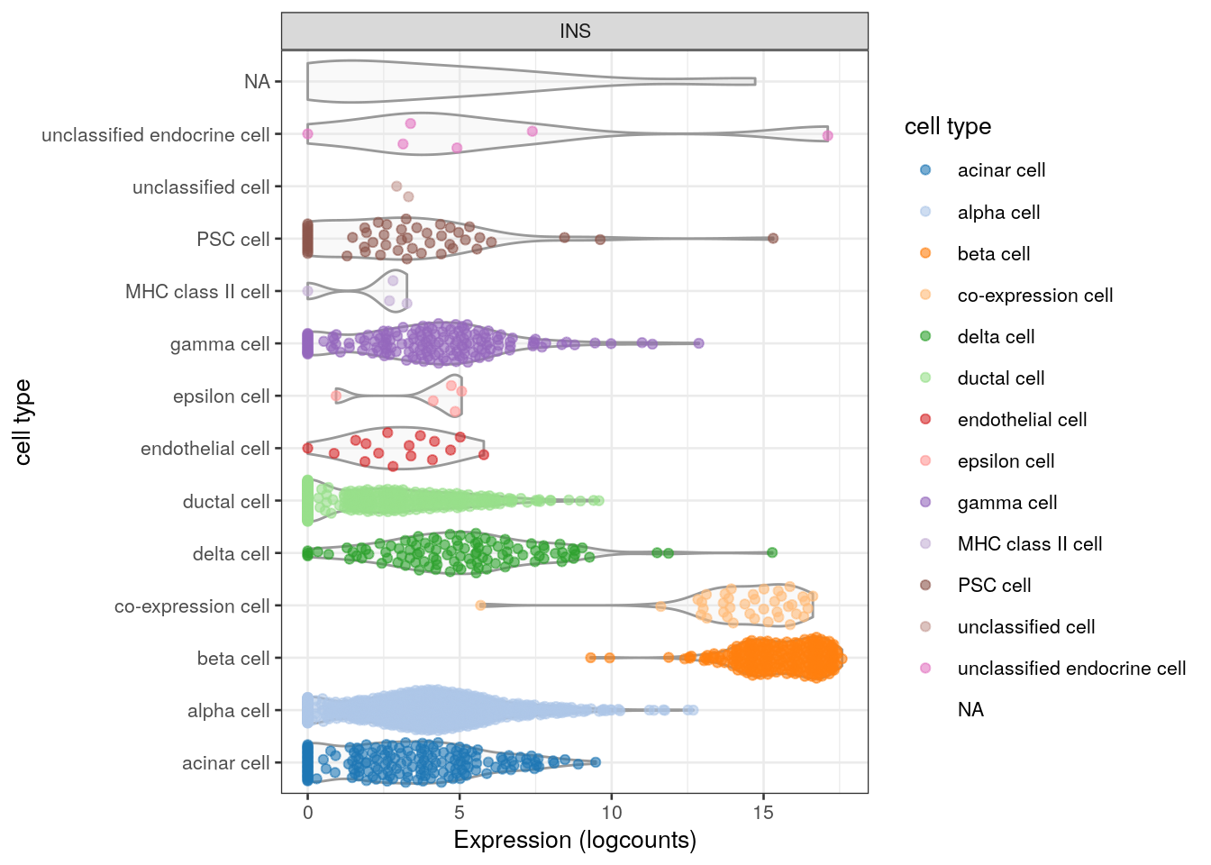
Figure 2.1: Distribution of INS expression in each cell type of the Segerstolpe dataset. Each point represents a cell and is colored by its assigned cell type for an extra touch of aesthetics.
It might seem redundant to color by the same variable on the axis, but this can be particularly useful in more complex plots. Color-coding in Figure 2.2 allows us to easily compare expression across the same cell type in different donors. We also add some grid lines to make it easier to compare across facets.
plotExpression(sce, features="INS", x="cell type", colour_by="cell type",
    other_fields="individual") +
    coord_flip() +
    facet_wrap(~individual) +
    theme(panel.grid.major.x = element_line(size=.1, color="grey"))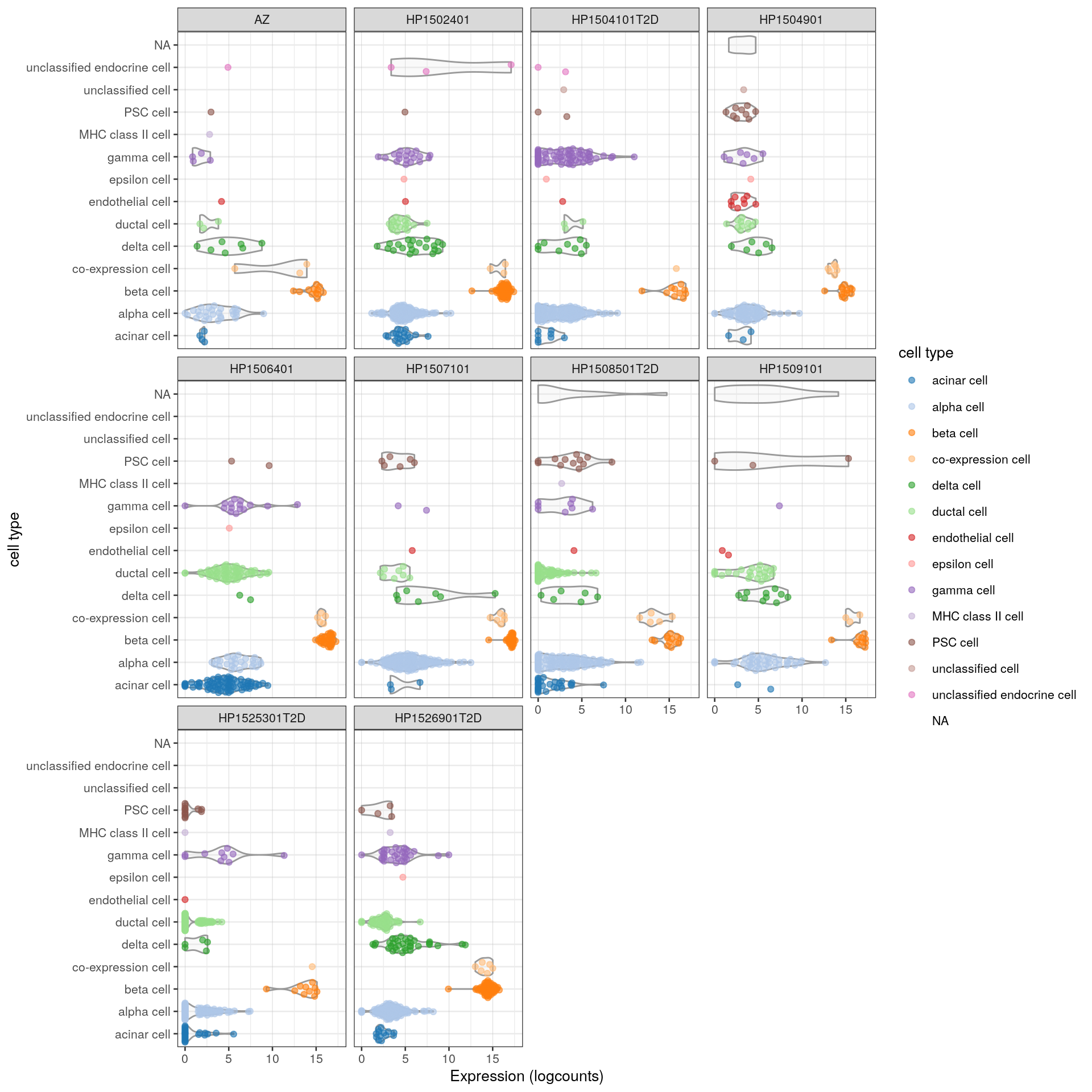
Figure 2.2: Distribution of INS expression in each cell type for each donor of the Segerstolpe dataset. Each point represents a cell and is colored by its assigned cell type, while each facet contains all cells from a particular donor.
More simply, we could color by any other interesting factor in colData(sce), such as the disease status (Figure 2.3):
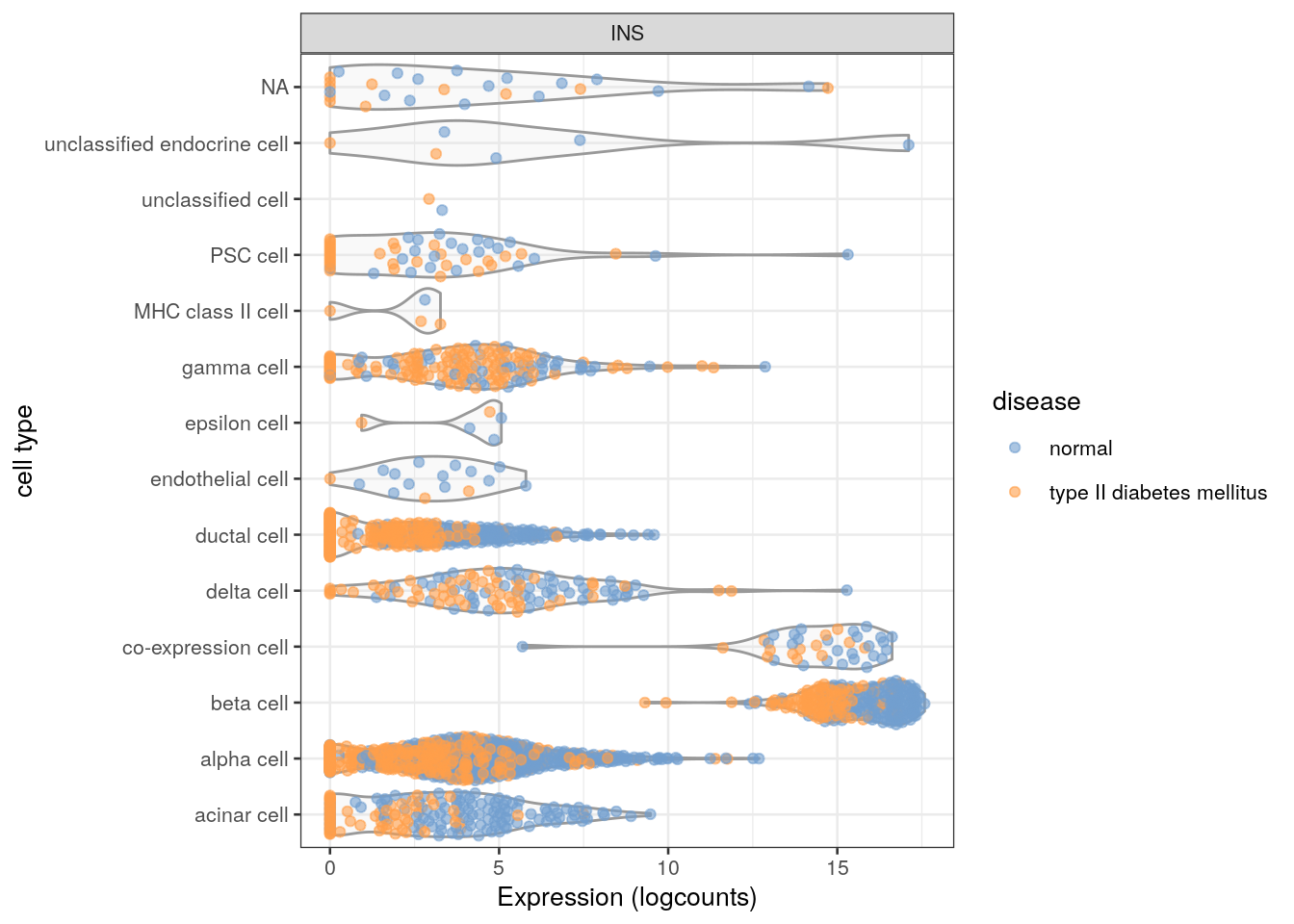
Figure 2.3: Distribution of INS expression in each cell type of the Segerstolpe dataset. Each point represents a cell and is colored by the disease status of its donor of origin.
Or possibly a continuous variable such as size factor for each cell (Figure 2.4).
Now, the colData() does contain a "sizeFactor" variable but we would like to color by the log-transformed size factor to improve resolution among low size factors.
This is easily achieved by log-transforming the size factors ourselves and then passing them to plotExpression() inside a DataFrame(); this tells the function to use the supplied values directly.
(An even more succinct method is to pass it inside an I() call, but this means we won’t be able to insert the "LogSizeFactor" name in the legend.)
log.sf <- DataFrame(LogSizeFactors=log2(sizeFactors(sce)))
plotExpression(sce, features="INS", x="cell type",
    colour_by=log.sf) + coord_flip()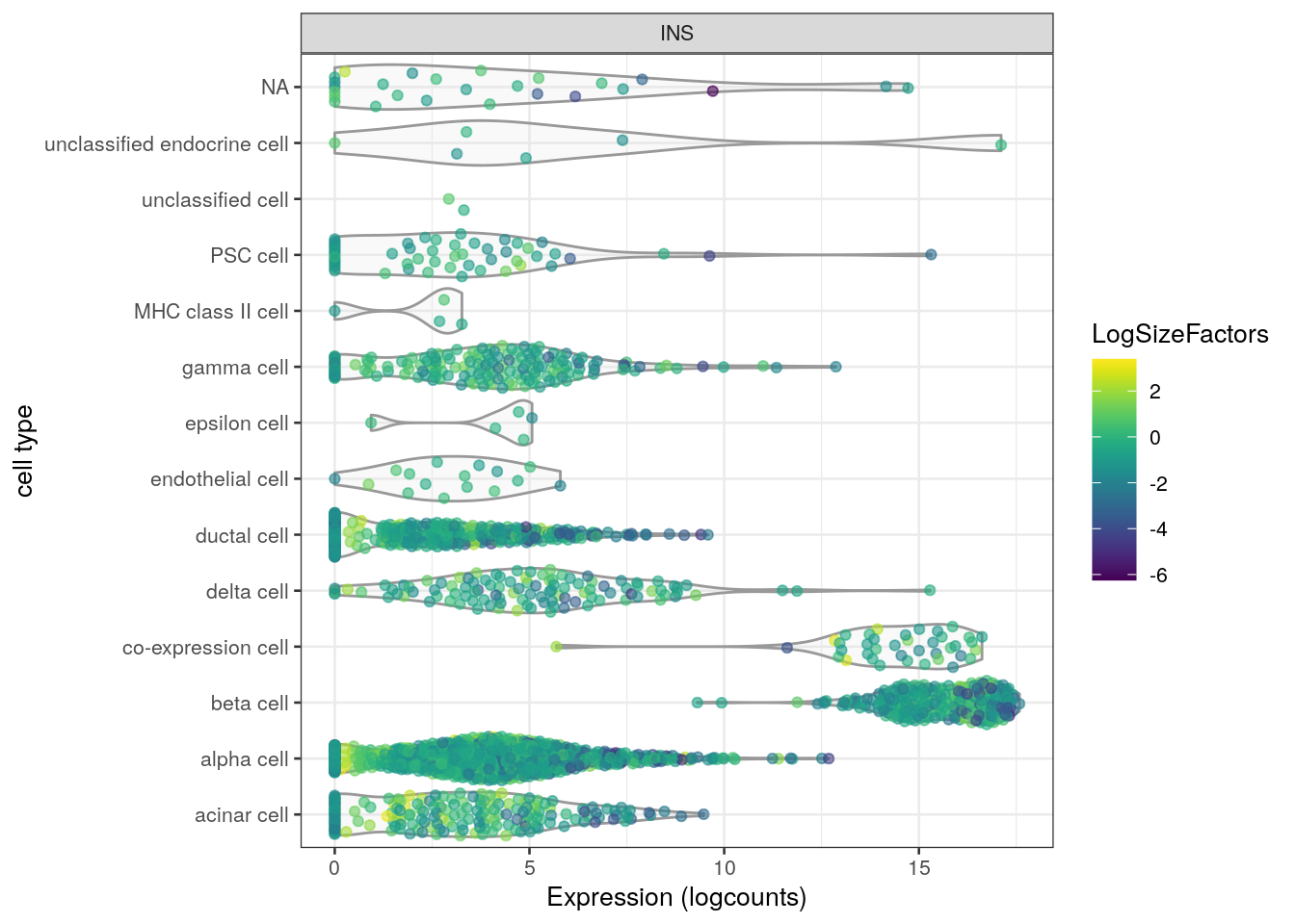
Figure 2.4: Distribution of INS expression in each cell type of the Segerstolpe dataset. Each point represents a cell and is colored by its log-transformed size factor.
Alternatively, we could color by the cell type while having the log-size factors on one of the axes (Figure 2.5).
plotExpression() is smart enough to detect the type of the variables on the axes to generate an appropriate plot - in this case, switching from those violins to a scatter plot.
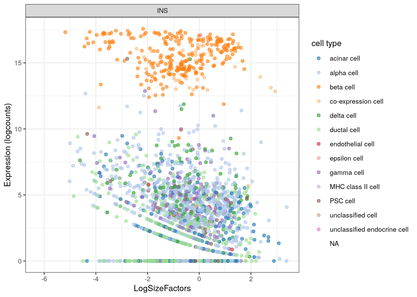
Figure 2.5: INS expression against the log-size factor in the Segerstolpe dataset. Each point represents a cell and is colored by its assigned cell type.
The same procedure also works with other genes. For example, we can plot INS against the other famous product of the pancreas, GCG (Figure 2.6).
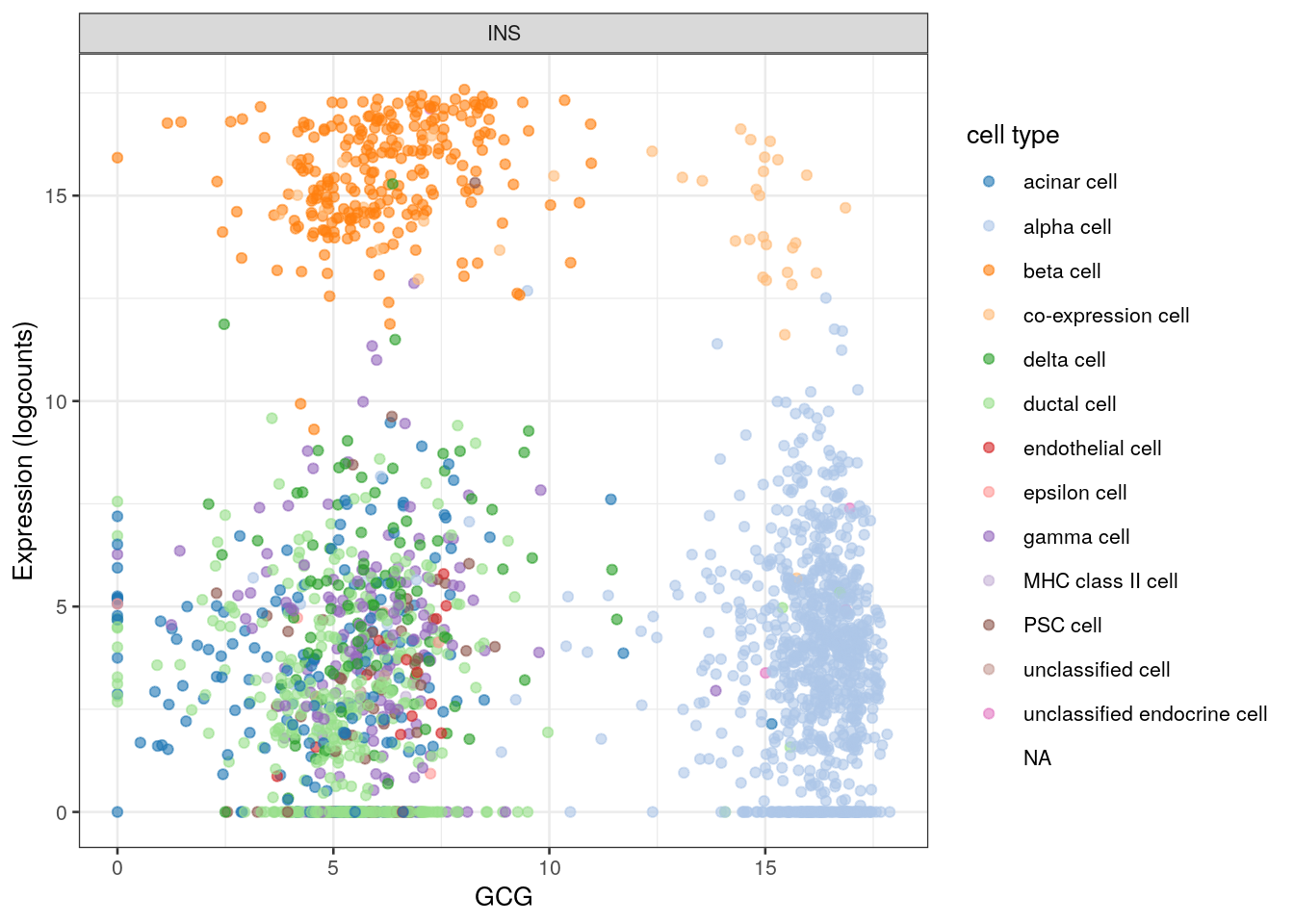
Figure 2.6: INS expression against GCG expression in the Segerstolpe dataset. Each point represents a cell and is colored by its assigned cell type.
Speaking of other genes, we can also pass a vector of gene names in features=.
When x= is also specified, this will create one facet per gene (Figure 2.7).
plotExpression(sce, features=c("INS", "GCG", "PPY", "SST"),
    x="cell type", colour_by="cell type") + coord_flip()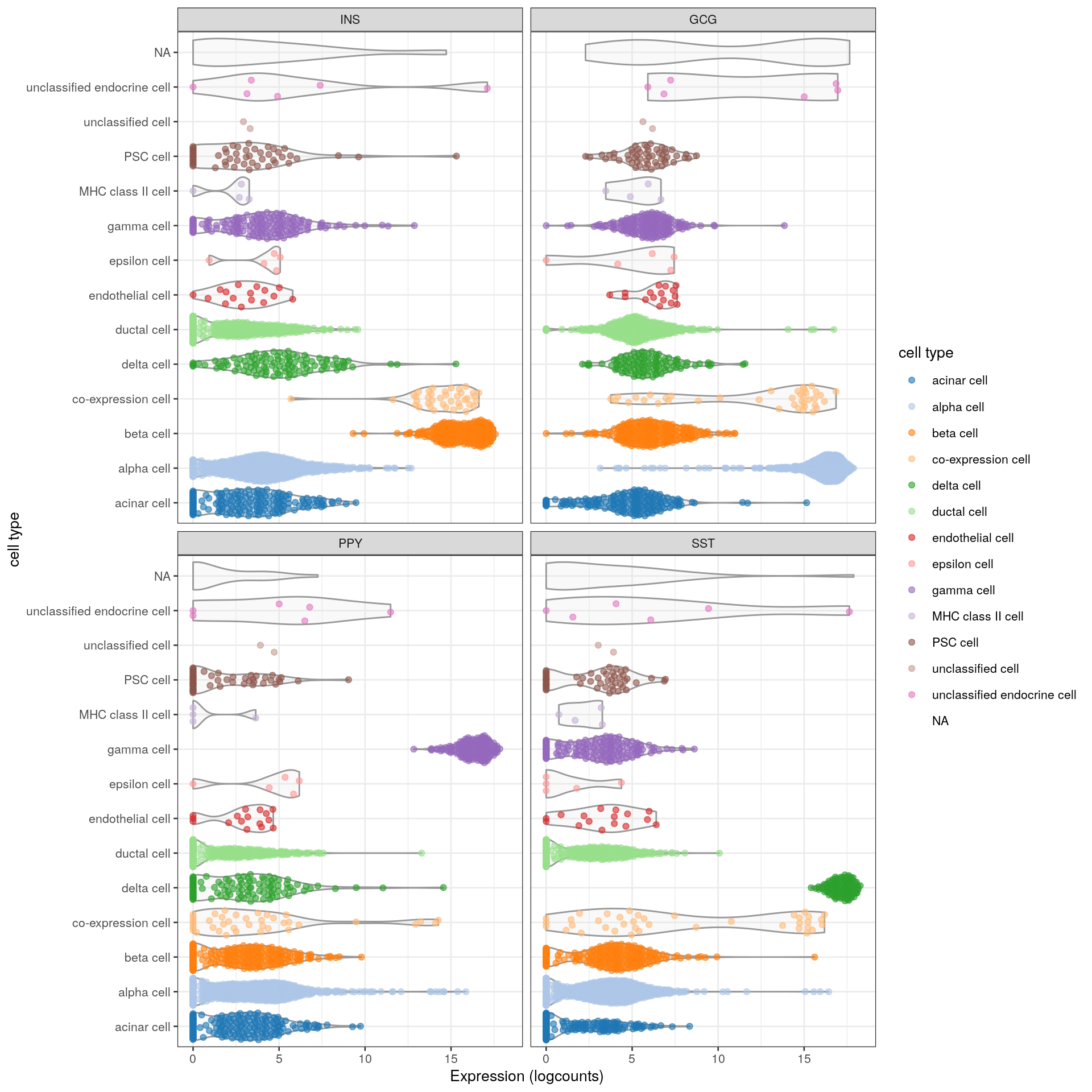
Figure 2.7: Distribution of the expression of various pancreas-related marker genes in the Segerstolpe dataset. Each point represents a cell and is colored by its assigned cell type, while each facet corresponds to a single marker gene.
Session information
R version 4.0.2 Patched (2020-09-10 r79182)
Platform: x86_64-pc-linux-gnu (64-bit)
Running under: Ubuntu 20.04.1 LTS

Matrix products: default
BLAS/LAPACK: /usr/lib/x86_64-linux-gnu/openblas-openmp/libopenblasp-r0.3.8.so

locale:
 [1] LC_CTYPE=en_US.UTF-8       LC_NUMERIC=C
 [3] LC_TIME=en_US.UTF-8        LC_COLLATE=en_US.UTF-8
 [5] LC_MONETARY=en_US.UTF-8    LC_MESSAGES=C
 [7] LC_PAPER=en_US.UTF-8       LC_NAME=C
 [9] LC_ADDRESS=C               LC_TELEPHONE=C
[11] LC_MEASUREMENT=en_US.UTF-8 LC_IDENTIFICATION=C

attached base packages:
[1] parallel  stats4    stats     graphics  grDevices utils     datasets
[8] methods   base

other attached packages:
 [1] scater_1.17.4               ggplot2_3.3.2
 [3] scRNAseq_2.3.13             SingleCellExperiment_1.11.6
 [5] SummarizedExperiment_1.19.6 DelayedArray_0.15.7
 [7] matrixStats_0.56.0          Matrix_1.2-18
 [9] Biobase_2.49.1              GenomicRanges_1.41.6
[11] GenomeInfoDb_1.25.11        IRanges_2.23.10
[13] S4Vectors_0.27.12           BiocGenerics_0.35.4
[15] BiocStyle_2.17.0            BiocManager_1.30.10

loaded via a namespace (and not attached):
 [1] bitops_1.0-6                  bit64_4.0.5
 [3] httr_1.4.2                    tools_4.0.2
 [5] R6_2.4.1                      irlba_2.3.3
 [7] vipor_0.4.5                   DBI_1.1.0
 [9] colorspace_1.4-1              withr_2.2.0
[11] gridExtra_2.3                 tidyselect_1.1.0
[13] processx_3.4.4                bit_4.0.4
[15] curl_4.3                      compiler_4.0.2
[17] rebook_0.99.5                 graph_1.67.1
[19] BiocNeighbors_1.7.0           labeling_0.3
[21] bookdown_0.20                 scales_1.1.1
[23] callr_3.4.4                   rappdirs_0.3.1
[25] stringr_1.4.0                 digest_0.6.25
[27] rmarkdown_2.3                 XVector_0.29.3
[29] pkgconfig_2.0.3               htmltools_0.5.0
[31] highr_0.8                     dbplyr_1.4.4
[33] fastmap_1.0.1                 rlang_0.4.7
[35] RSQLite_2.2.0                 shiny_1.5.0
[37] DelayedMatrixStats_1.11.1     farver_2.0.3
[39] generics_0.0.2                BiocParallel_1.23.2
[41] dplyr_1.0.2                   RCurl_1.98-1.2
[43] magrittr_1.5                  BiocSingular_1.5.0
[45] GenomeInfoDbData_1.2.3        scuttle_0.99.13
[47] Rcpp_1.0.5                    ggbeeswarm_0.6.0
[49] munsell_0.5.0                 viridis_0.5.1
[51] lifecycle_0.2.0               stringi_1.5.3
[53] yaml_2.2.1                    zlibbioc_1.35.0
[55] BiocFileCache_1.13.1          AnnotationHub_2.21.5
[57] grid_4.0.2                    blob_1.2.1
[59] promises_1.1.1                ExperimentHub_1.15.3
[61] crayon_1.3.4                  lattice_0.20-41
[63] CodeDepends_0.6.5             knitr_1.29
[65] ps_1.3.4                      pillar_1.4.6
[67] codetools_0.2-16              XML_3.99-0.5
[69] glue_1.4.2                    BiocVersion_3.12.0
[71] evaluate_0.14                 vctrs_0.3.4
[73] httpuv_1.5.4                  gtable_0.3.0
[75] purrr_0.3.4                   assertthat_0.2.1
[77] xfun_0.17                     rsvd_1.0.3
[79] mime_0.9                      xtable_1.8-4
[81] later_1.1.0.1                 viridisLite_0.3.0
[83] tibble_3.0.3                  AnnotationDbi_1.51.3
[85] beeswarm_0.2.3                memoise_1.1.0
[87] ellipsis_0.3.1                interactiveDisplayBase_1.27.5
Bibliography
McCarthy, D. J., K. R. Campbell, A. T. Lun, and Q. F. Wills. 2017. “Scater: pre-processing, quality control, normalization and visualization of single-cell RNA-seq data in R.” Bioinformatics 33 (8): 1179–86.
Segerstolpe, A., A. Palasantza, P. Eliasson, E. M. Andersson, A. C. Andreasson, X. Sun, S. Picelli, et al. 2016. “Single-Cell Transcriptome Profiling of Human Pancreatic Islets in Health and Type 2 Diabetes.” Cell Metab. 24 (4): 593–607.