Predict Method for Collection of Gene Set Signatures
Source:R/plot-methods.R, R/predict-methods.R
predictSignatures.RdThese method signatures apply gene set signatures optionally augmented with
(semi-)quantitative information to the prediction of sample and cell identities
in SummarizedExperiment objects.
barplotPredictionCount(se, highlight = character(0), labels = TRUE)

barplotPredictionProportion(se, highlight = character(0),
  labels = TRUE)

reducedDimPrediction(se, highlight = character(0), redDimType = "PCA",
  x = 1, y = 2, labels = TRUE)

# S3 method for GeneSetCollection
predict(object, se, assay.type = "counts",
  method = c("ProportionPositive", "PP"), ...)

# S3 method for Sets
predict(object, se, assay.type = "counts",
  method = c("ProportionPositive", "PP"), ...)
Arguments
| se | An object of class inheriting from |
|---|---|
| highlight | Character vector indicating names of signatures to highlight. |
| labels | Logical value indicating whether to display labels. |
| redDimType | Name of the reduced dimension result type to display. |
| x | Name of the covariate to display on the x-axis. |
| y | Name of the covariate to display on the y-axis. |
| object | A set of signatures of class inheriting from |
| assay.type | A string specifying which assay values to use, e.g., |
| method | Prediction method. See section "Prediction methods". |
| ... | Additional arguments affecting the predictions produced. |
Value
The object se, updated as follows:
in the
metadataslot, a"hancock"item is added (or updated) with information tracing the prediction process (e.g., method, signatures).in the
"colData"slot, aDataFrameis nested in a new (or updated)"hancock"column. This DataFrame contains predicted labels in the first column and additional information in further columns for each column inse.
Functions
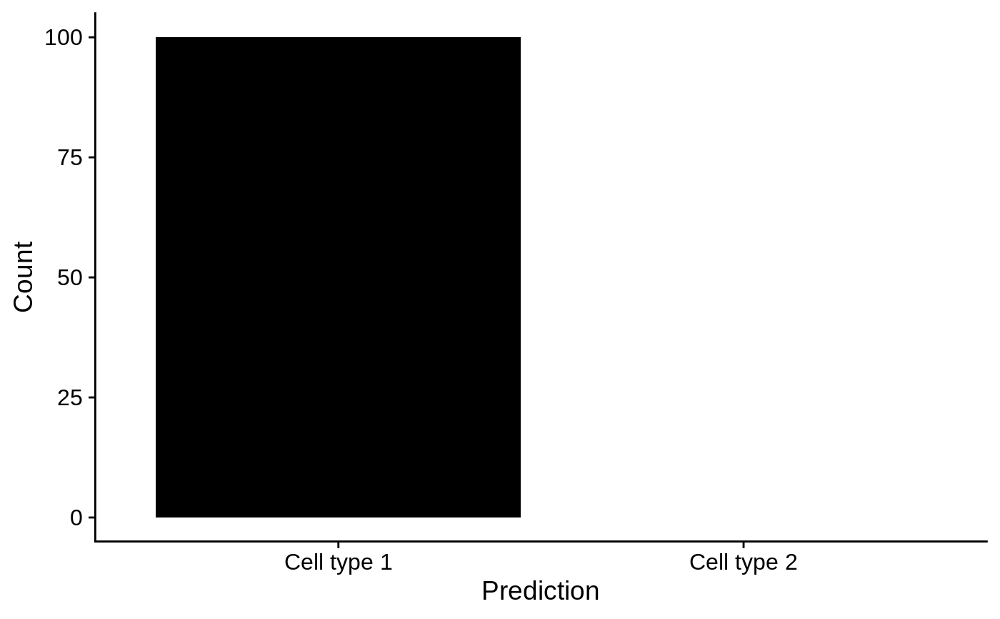
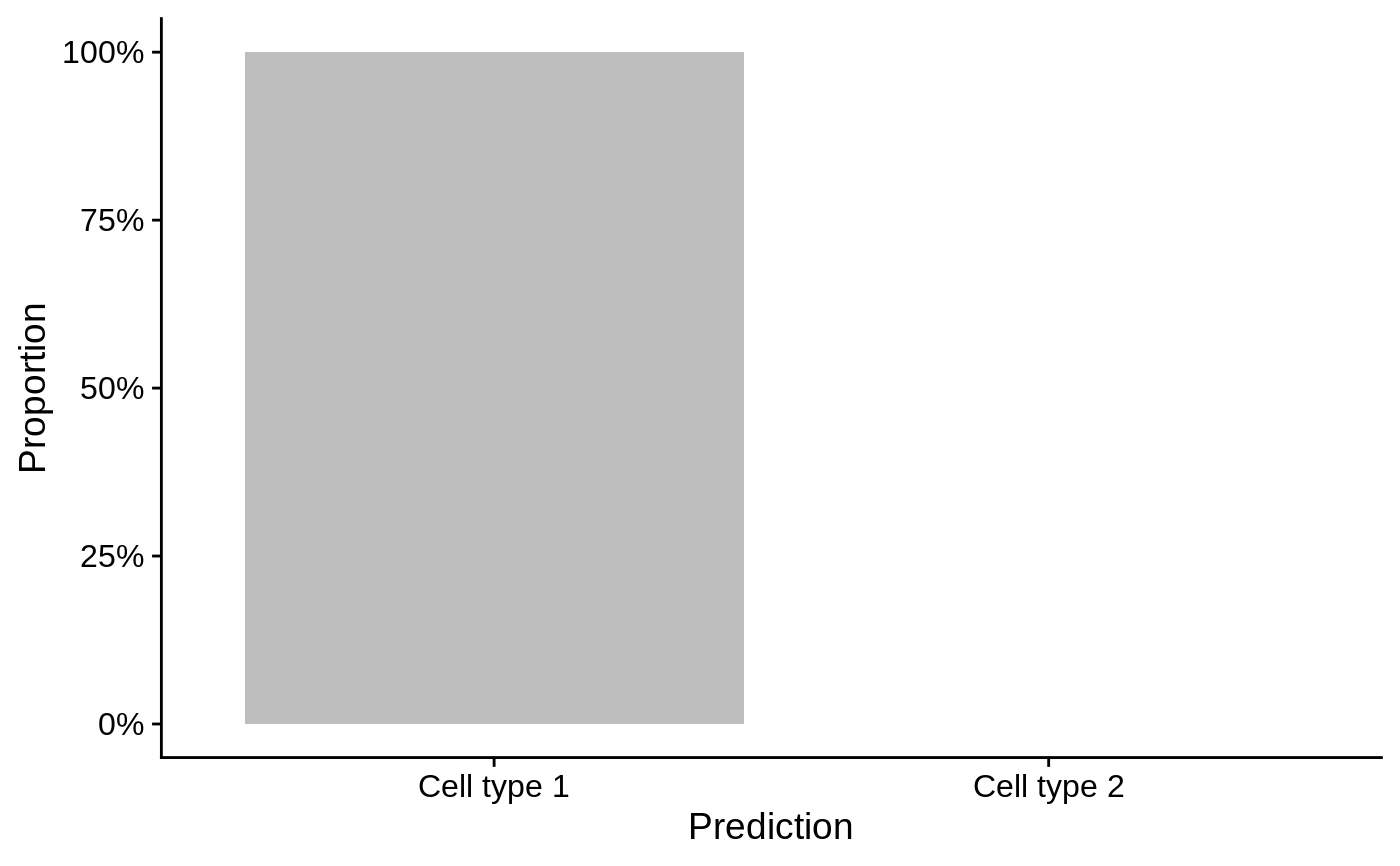
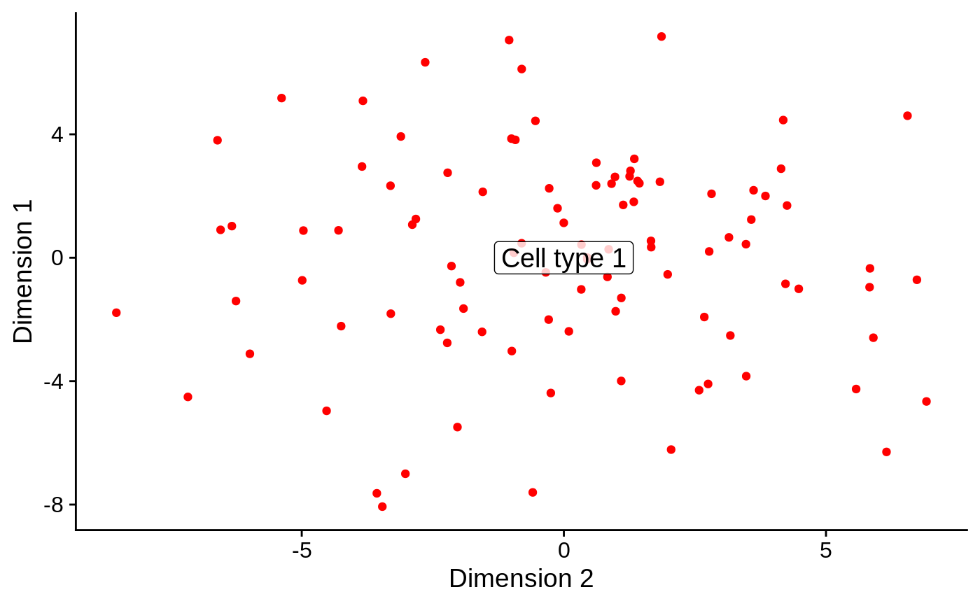
barplotPredictionCount: Returns aggplotbar plot displaying the count of samples predicted for each gene signature.barplotPredictionProportion: Returns aggplotbar plot displaying the proportion of samples predicted for each gene signature.reducedDimPrediction: Returns aggplotscatter plot displaying the first reduced dimension result inreducedDims(se).
Prediction methods
Requires prior cluster membership information. Computes the proportion of samples positive for each signature in each cluster. Assigns to each cluster the signature detected in the highest proportion of samples.
See also
Examples
# Example data ---- library(SummarizedExperiment) nsamples <- 100 u <- matrix(rpois(20000, 2), ncol=nsamples) rownames(u) <- paste0("Gene", sprintf("%03d", seq_len(nrow(u)))) colnames(u) <- paste0("Cell", sprintf("%03d", seq_len(ncol(u)))) se <- SummarizedExperiment(assays=list(counts=u)) bs <- Sets( relations=DataFrame( element = c("Gene001", "Gene002", "Gene003", "Gene004"), set = c(rep("Cell type 1", 2), rep("Cell type 2", 2)) ) ) # Example usage ---- se1 <- se colData(se1)[, "cluster"] <- factor(sample(head(LETTERS, 3), ncol(se1), replace=TRUE)) se1 <- predict(bs, se1, method="ProportionPositive", cluster.col="cluster") # Visualise the count of samples predicted for each signature in each cluster barplotPredictionCount(se1, highlight=c("Cell type 1"))library(SingleCellExperiment) sce1 <- as(se1, "SingleCellExperiment") reducedDim(sce1, "PCA") <- prcomp(t(assay(sce1)))$x reducedDimPrediction(sce1, highlight="Cell type 1", redDimType="PCA", x=1, y=2)